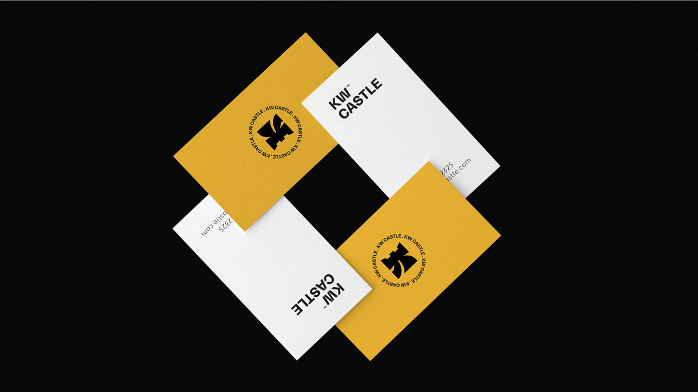
KW Castle is an up-to-date clothing brand that is lively, sophisticated and full of contrast. The Logo reflects the sophistication and boldness of the brand. Starting with the icon, it represents the three main elements: the letter K, The letter W and the castle shape. The letter K, being the design’s main hero, is designed so that it appears rooted and steady to the ground at its bottom so that it gives a revolutionary feeling of stability and boldness. The letter W is obvious on the icon’s left side and is part of the letter K as well. Finally, if you look at the icon from a different perspective you’ll recognize the shape of a castle with a pathway. The pathway to the castle appears in the negative space in the middle of the icon (between the top and bottom sides of the letter K). Also in the word “Castle”, the negative space in the letter A gives the shape of a watch tower reflecting the architectural shape of a castle.
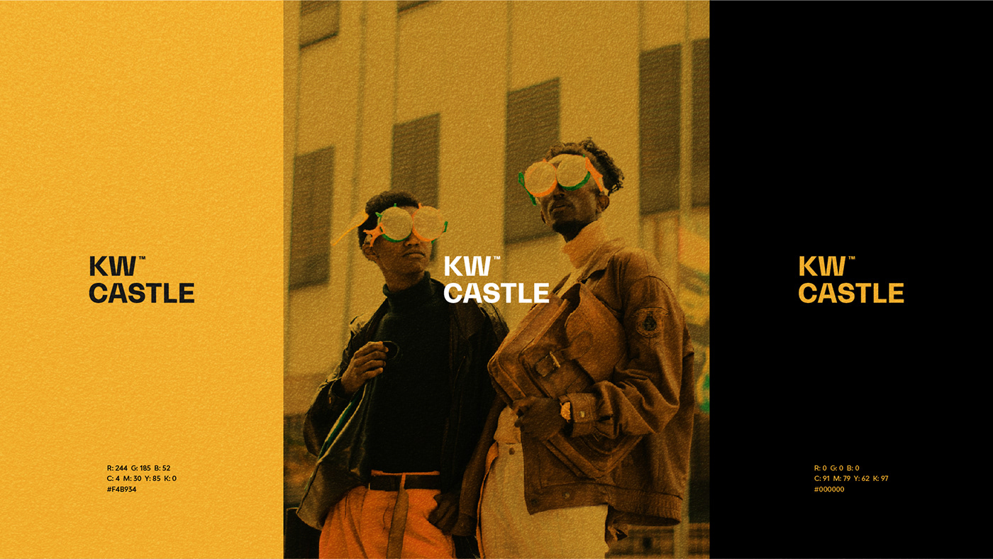
The colors used reflect a spirited, lively and youthful brand personality. Yellow is a daring color, it gives a feeling of brightness and light. It is also the color of friendship, self-growth and serenity. According to this, Yellow was chosen to represent the brand to reflect those feelings to the target audience.