


Nie Design
Branding & Stationery
Branding & Stationery
Nie Design is my own personal brand identity with a passion for providing graphic design, branding, art direction web design and illustration services for print, digital and advertising space.
The brand is centred on an exploration of my personal experiences and history through design and the arts. As an Art Director, I use a representation of my skill set as various graphical elements depicting a simple, youthful and contemporary visual identity.
My aim is to bring an original and extensive approach to all projects and strive for more than what is expected given the imagined plan and scope.


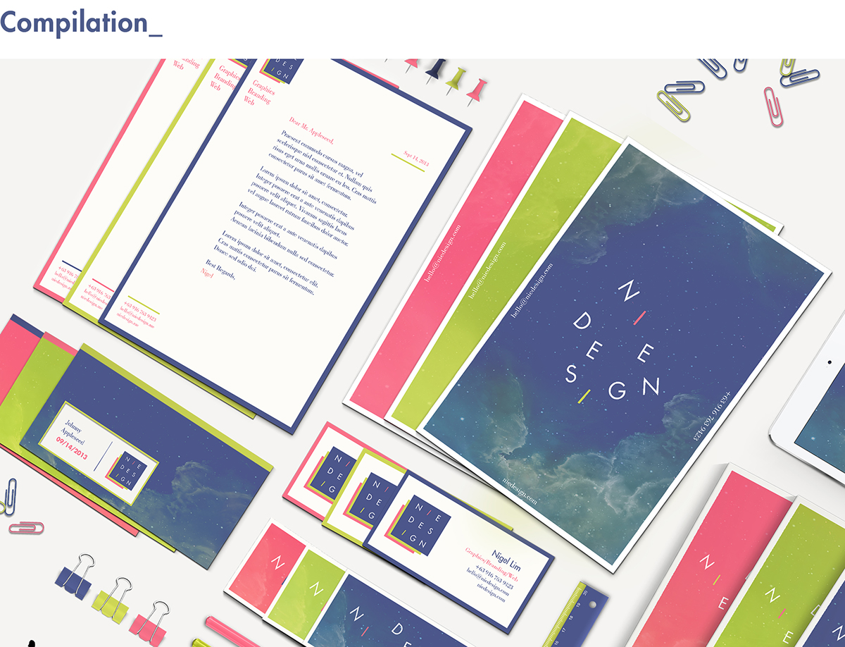
The colour palette uses a bright array of hip and youthful tones.
The vivid shades of chartreuse green gives accent to the subtly darker colors of cerise pink and slate blue which merge effectively with the graphical elements.
The vivid shades of chartreuse green gives accent to the subtly darker colors of cerise pink and slate blue which merge effectively with the graphical elements.

The basic elements of the typefaces was utilized to complement various applications to different media. Futura LT was used as the primary typeface and Bodoni as the secondary typeface.

Business cards are used by employees to advertise themselves to potential clients.
The front side contains the primary contact information, while the opposite side contains the stylized version of the logo printed on 350gsm white van Nouveau paper.
The front side contains the primary contact information, while the opposite side contains the stylized version of the logo printed on 350gsm white van Nouveau paper.

The stationary letterhead is important for solidifying brand identity while performing its task of communicating the brand’s values to the clients. Printed on A4 120gsm premium matte paper.


For any inquiries please contact:
Email: hello.niedesign@gmail.com
Email: hello.niedesign@gmail.com


