


Where cutting edge technology meets
the best of handcrafting.
the best of handcrafting.
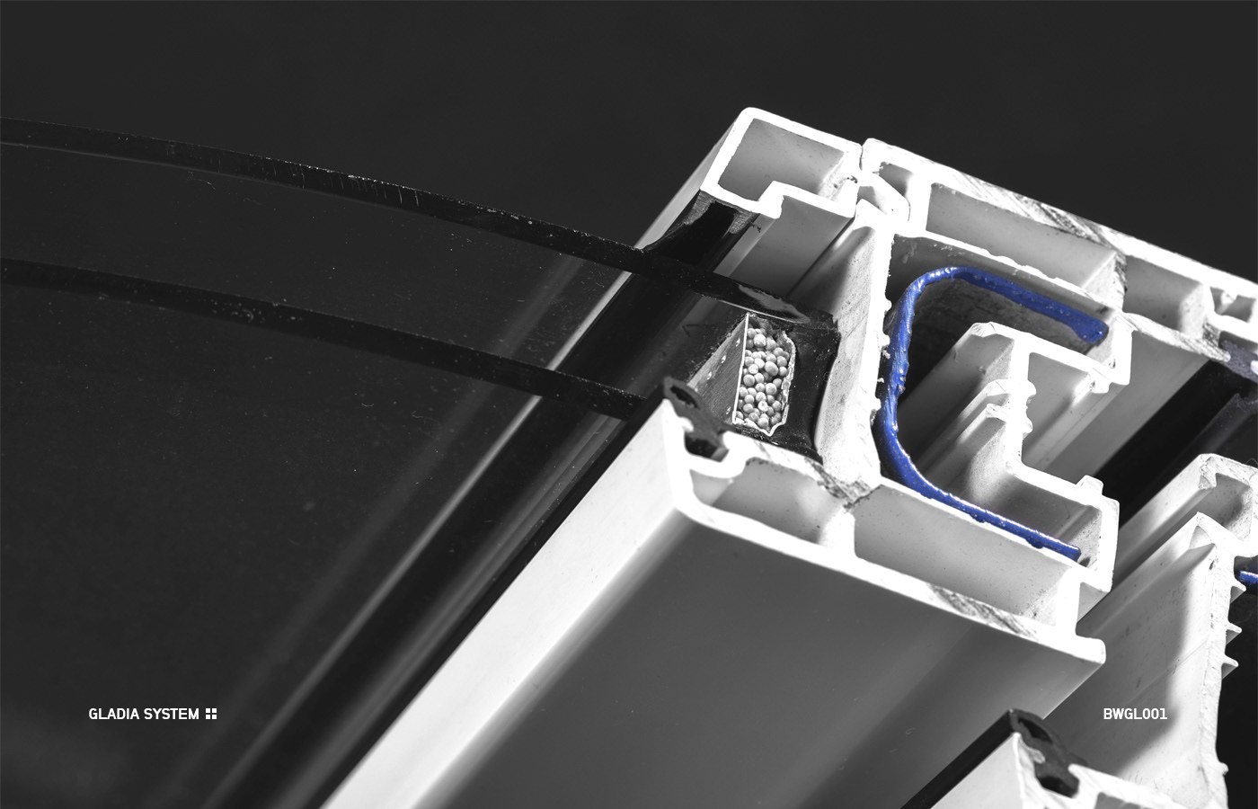
Brand identity and art direction for Berliner Holzfenster,
manufacturer of wide range of quality windows,
window frames and accesories.
manufacturer of wide range of quality windows,
window frames and accesories.


Logo idea
Basing on the input from the client, focus went on developing as much product oriented symbol as it can be. During the interview, bottom line criteria were produced, which also included industrial presence, professionalism, but no too exaggerated, precision, use of technology and premium materials. Main goal was to create a symbol, that could be easily associated with the industry.

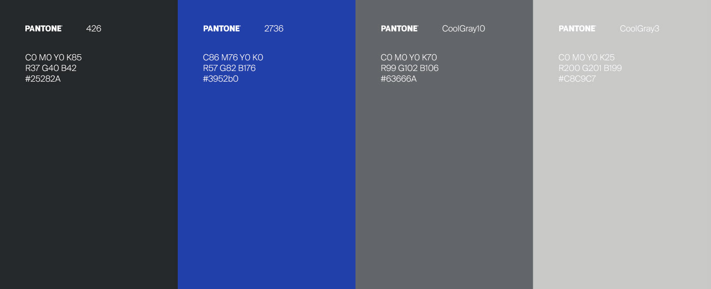
Color pallette


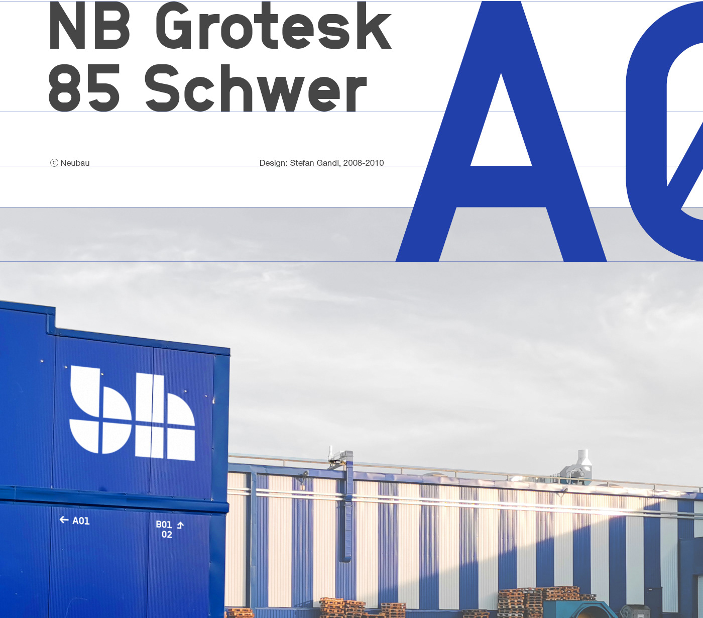
Headline typeface


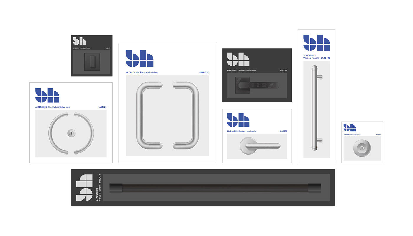
Product range
Goal was to achieve distinctive and easy recognizable look on the shelf.
Products are meant to pop up whenever they are stored, and should
be recognizable and easy to see and identify for the customers.
There are two main branches of production in the company:
1. Windows and window frames
2. Accessories.
Both in two lines - silver and black.

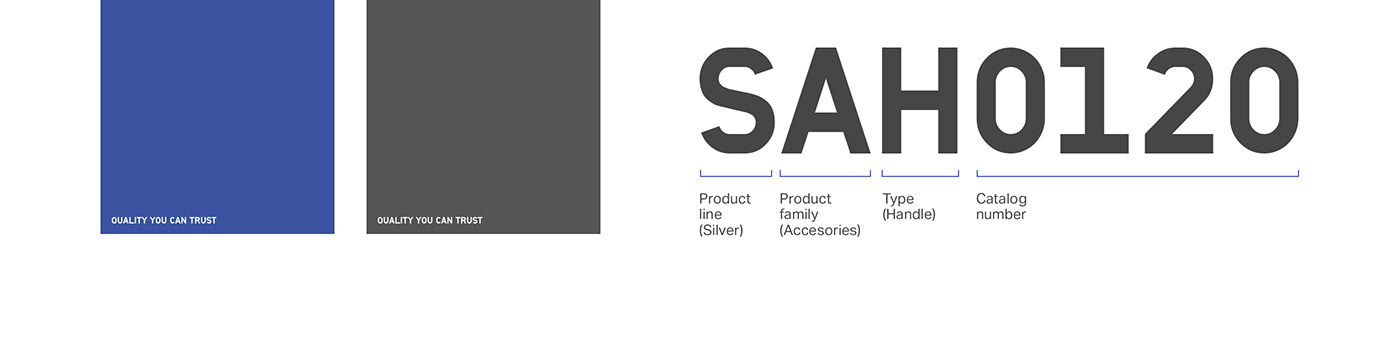
Tagline application Product codenames
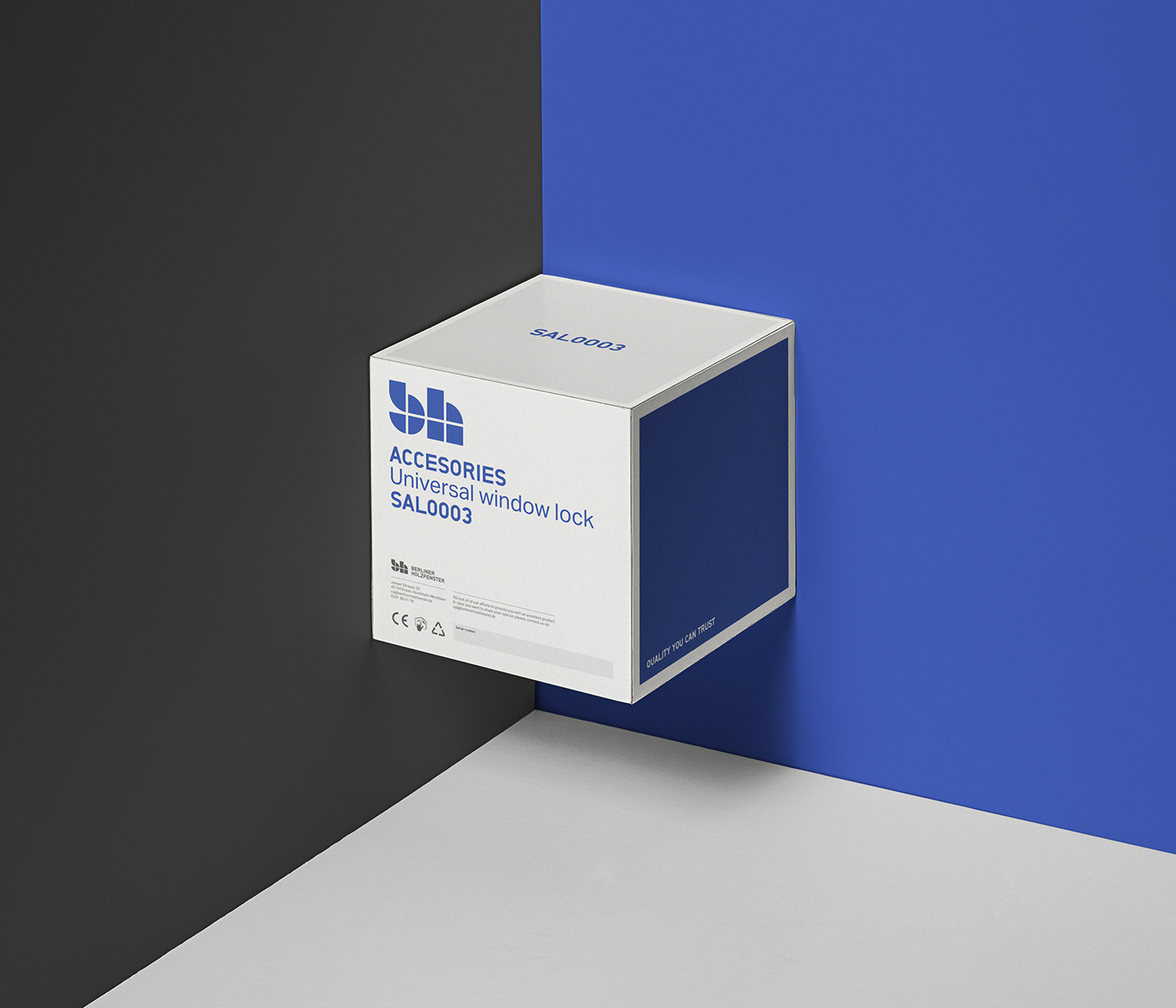
Box example


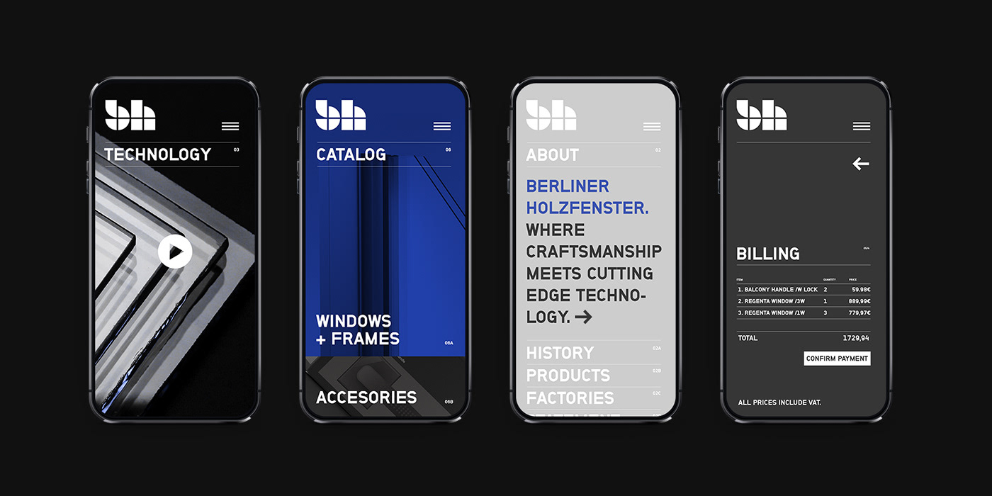
Company website & shopping experience
Main goals set for the design was to:
A. Introduce the company and its products in clean and cohesive way.
B. Design whole shopping experience in clean and easy steps.
C. Integrate it with company shipping and storage management systems.


Designed in 2020.
Thanks for watching.
OFFKR


