

'The Art of Superstition', is an exhibition of illustrations by members of Illustrators Ireland.
With this project I would like to give you an idea of the steps involved during my sketching and concept phase. I have included a selection of the images that were most influential in guiding my decisions on concept and composition. After which I have put up just a few screen shots of the progress during the digital production phase of the illustration.
Thanks for stopping by and I hope you enjoy.
~
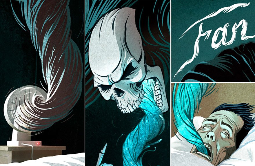
Fan Death - Close Up Details
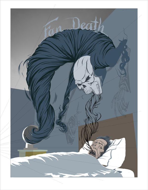
Fan Death - In South Korea, it is widely believed that, if you go to sleep with a fan switched on in a room where the windows are closed, you will die of Asphyxiation!
As soon as I read about the superstition of Fan Death I knew that this would be my chosen subject for this exhibition.
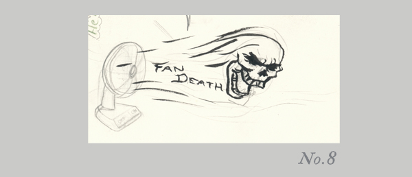
No.1 - No.3
I began with small, thumbnail sketches in order to figure out a composition that included the three elements I wanted: The victim in his bed, his fan beside him still running and the words "Fan Death" above his head somewhere.
In my head I was picturing a scene that would show the moment AFTER the victim had died. Something reminiscent of a poster for and old, murder mystery film. Or maybe even a gig poster. So I felt the addition of the typography would be important.

No.4 - No.7
I began to work on the idea of linking the text with the fan. By giving it a sense of movement I could highlight the fact that the fan was still switched on.
After many different sketches it became clearer to me that the visual of the text EMERGING FROM the fan was working best. That's when I came up with the concept in sketch No.8
~
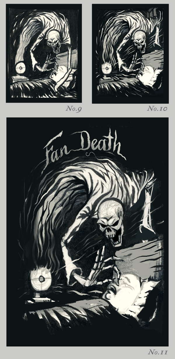
No.9 - No.11
I developed this new concept of Death emerging from the fan by creating a more sinister, imposing character.
To illustrate my concept I drew Death holding the victim's nose. I was going to have his other hand over the victim's mouth but felt that it interfered too much with the sleeping character.
I also thought about leaving out the text for a moment, but in sketch No.11 you can see a rough version of some title text jumping in
~
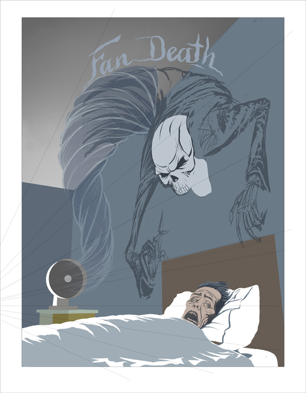
No.12
At this stage I worked on all elements in the scene. From it's overall perspective, the angle of the demon's skull, The features of the man in the bed and the style of typography for the title.
I decided that the demon would look more fiendish if he didn't make physical contact with the victim. So, instead of holding the victim's nose, the demon simply floats menacingly overhead.
In order to illustrate the moment of asphyxiation during Fan Death, I added the visual element of a ghoslty plume being orally extracted from the victim by the demon.
This made the scene all the more haunting too. Mainly because, instead of looking at the corpse of a victim of Fan Death, the viewer becomes a witness to the very moment in which the life being drained from the man in his bed occurs.
At this stage I worked on all elements in the scene. From it's overall perspective, the angle of the demon's skull, The features of the man in the bed and the style of typography for the title.

~
From Pencils to Pixels:
The preliminary lines of the skull and the man's face were then added. For our victim I wanted him to look like he was aware but too weak, helpless and emaciated from the ordeal to do anything.
~
For the body of the demon I wanted it to look like it had mass but that it was ghostly and floating at the same time. I wanted to give the impression that his body would be in a constant swirling motion while his head remained perfectly still.
The ghostly plume exiting the victim's mouth was treated in a similar way in keeping with the swirling theme of the demon.
~
Below, the walls were darkened, shaded and given a texture, while the demon's jaw and hands were finished in a flat colour.
The fan was given a small red light and a cable. This was important to get across the point that the fan was still switched on at the time.

~
In the next image you will see all of the shading had been added. Most notably to both characters, the furniture and the bed sheets. I lit the contents of the scene to imply moonlight entering a window from the left. The demon's body had been made darker too.
I felt that the bright white sheets at the bottom of the image were a bit too strong. In order to balance the composition I changed the colour of the title text to a similar white. This gave the title an equal importance in the illustration and it also sat nicely within the white border of the page.
As a result, it really forced me to re-work the typography.

~
A spot of Illustrative Typography:
No.13
It was important that the title fit in with the rest of the illustration. I liked the idea of a clean legible title that was also involved with the scene at the same time.
This was already partly achieved by wrapping the text across the demon's back and giving it whispy, trailing ends to imply some motion.

No.14 - No.15
This was the first render of the text in Adobe Illustrator using my graphics tablet.
I later went back in to Illustrator and rendered the text again. This time with a slightly thicker body and a smoother finish. (No.15)


~
The biggest change at this stage is the plume of energy being sucked out of the victim and the affect it has on the rest of the scene.
I decided to give this element a much more vibrant colour to convey the feeling of energy and life passing through space. I added several different layers of textures along with a glow. Of course with such a glowing mass in the middle of the night it would cause some ambient highlights in the scene.
You can see the results of this glow in the demon's skull, his hands, the headboard, the man's face and his pillow.
The addition of a soft, dark vignette effect gave it more depth. along with textures

~
Finally, the lines of the demon's body were given a highlight to show the outside light and the inside ambient turquoise glow. A few carefully chosen layers of colour were then laid over certain parts of the image to change the hue and add a tiny amount of contrast.
The finished illustration is below.
Thank you for visiting
Thank you for visiting


Fan Death - close-up details


