WOOE
World Olive Oil Exhibition
2020
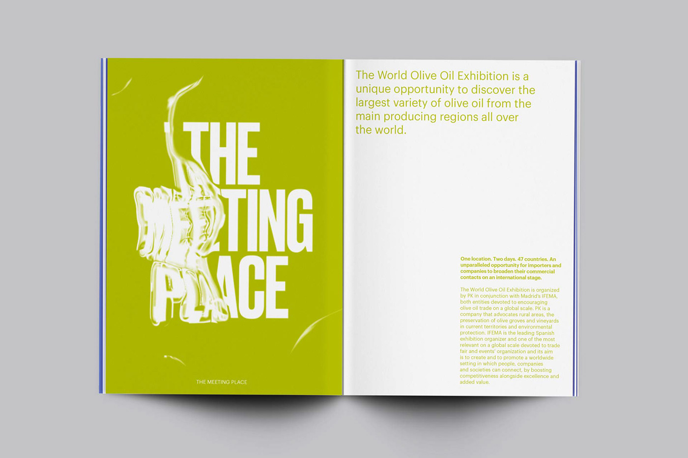
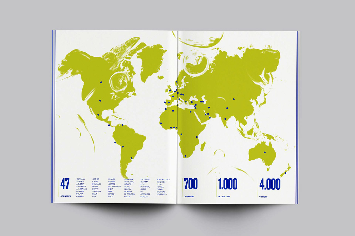
World Olive Oil Exhibition is the largest fair in the world dedicated to the olive oil business celebrated at IFEMA (Madrid, Spain). Two days, one space, and one goal: to be the meeting point between olive oil-producing countries from around the world that seek to open new markets, buyers and oil mills, marketers and packers.
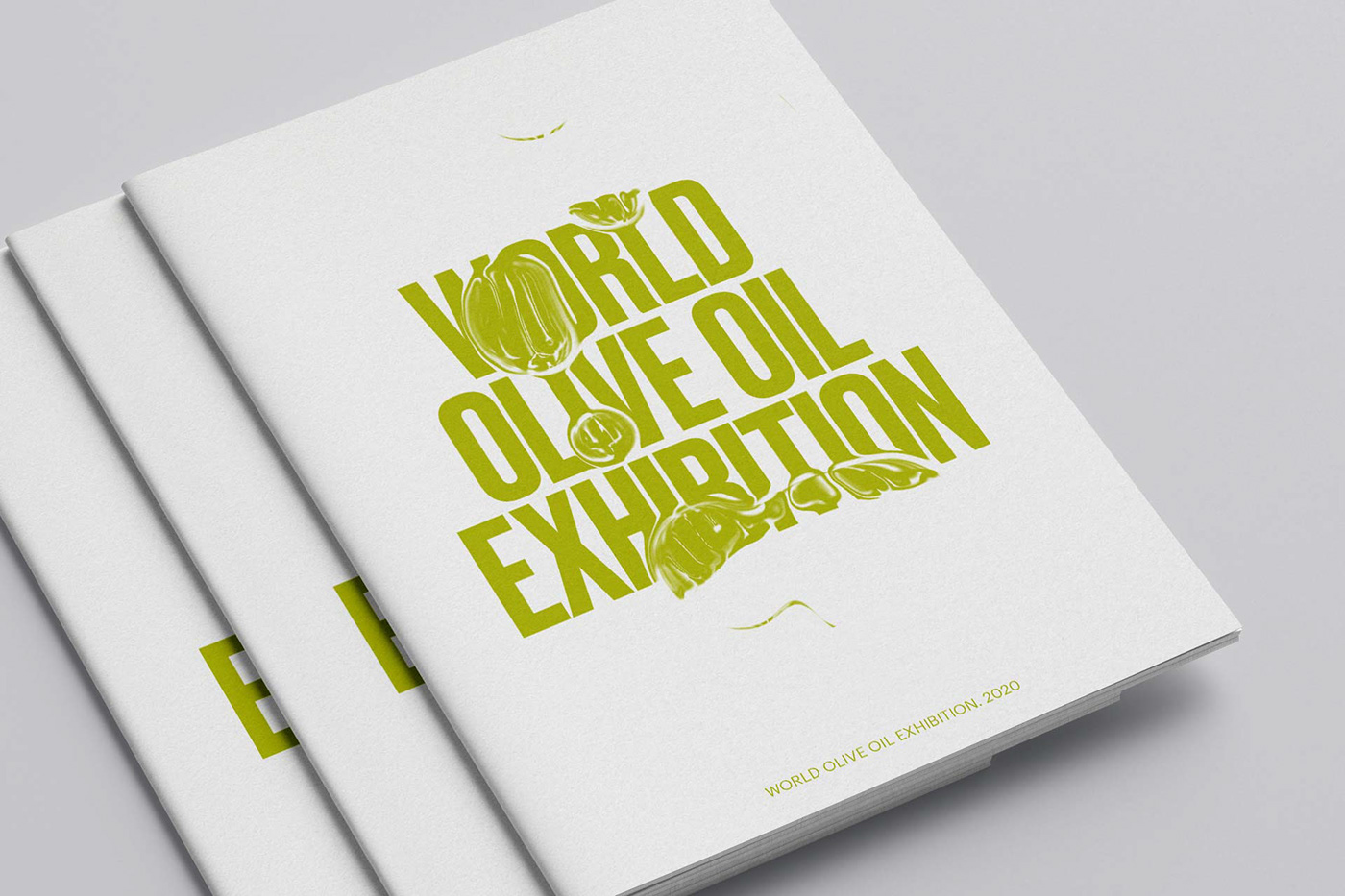
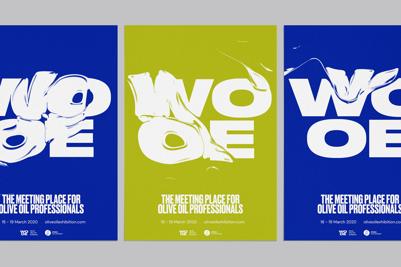
The brand was redesigned and created a new dynamic visual identity with a new concept applied to all graphics for the 2020 edition. Different elements necessary for the visual communication of the event were developed from commercial dossiers, billboards, banners and space design.
Unfortunately for health reasons due to Covid-19 the event had to cancel a few days before its celebration.
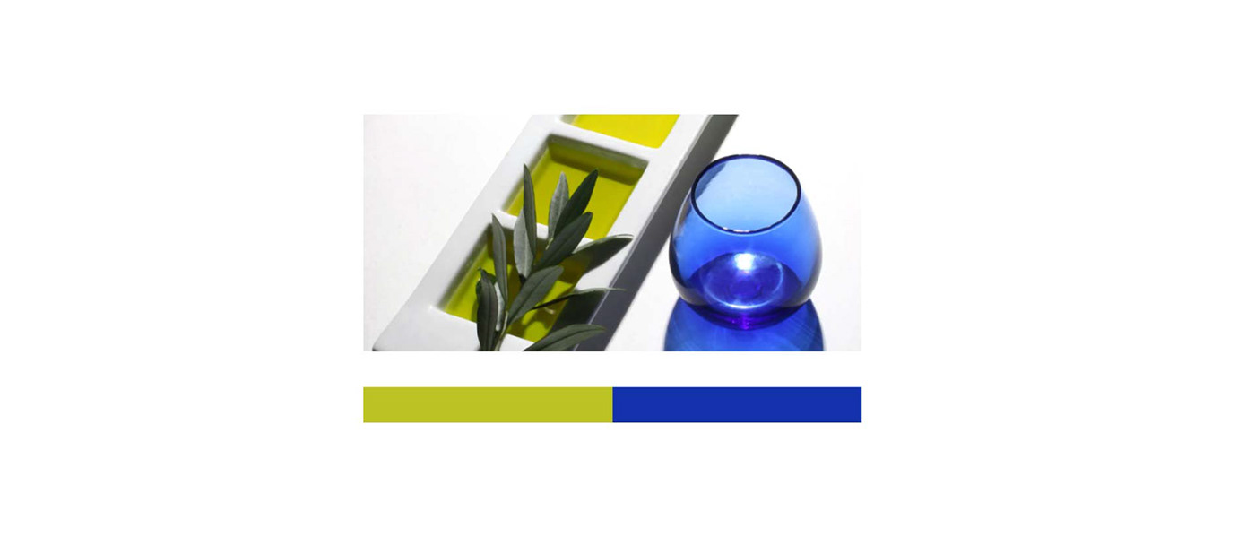
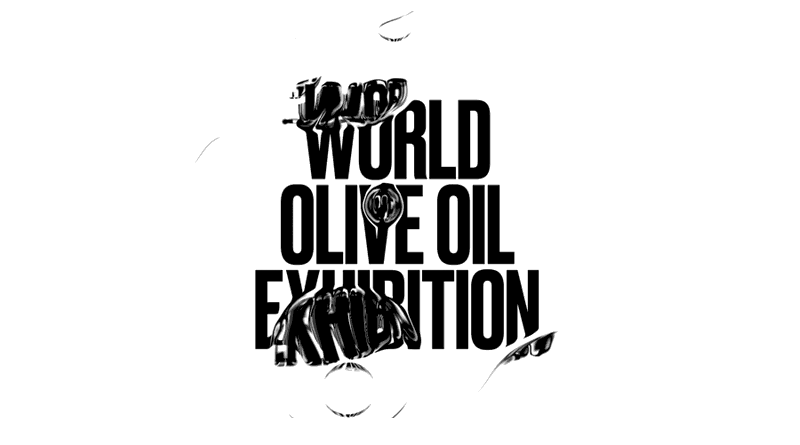
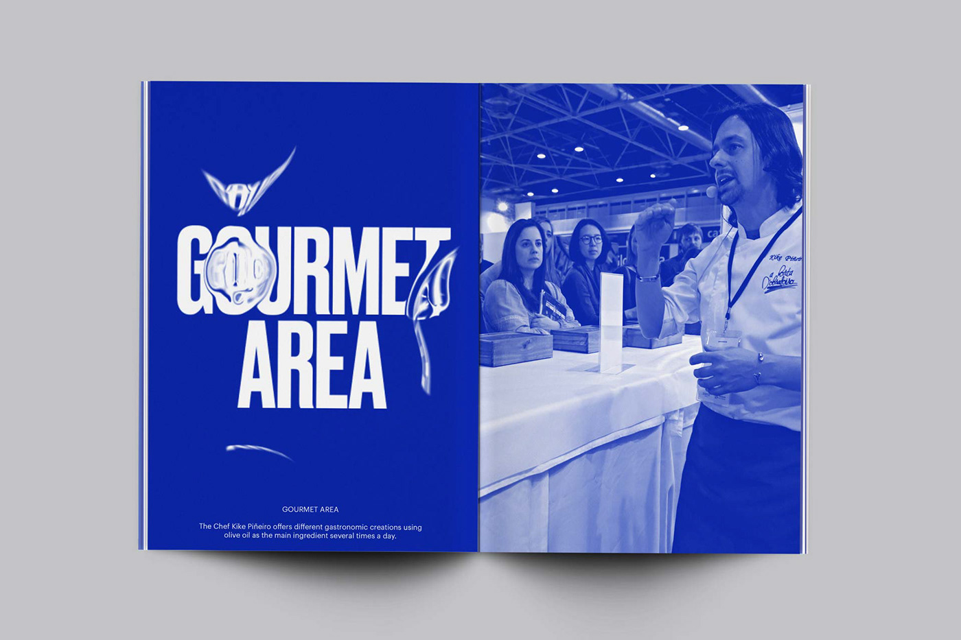
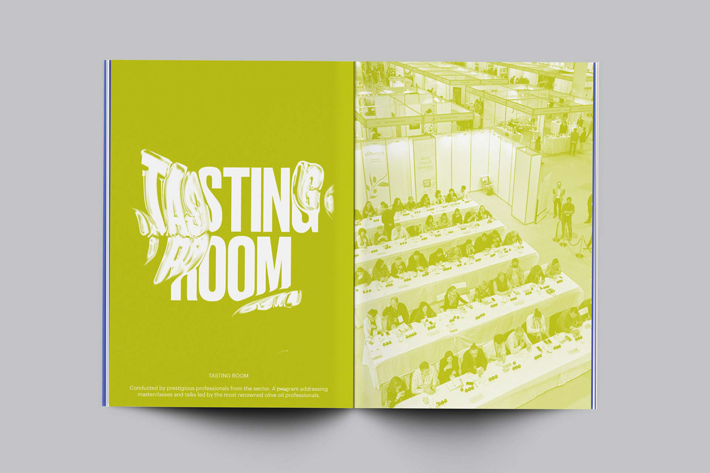
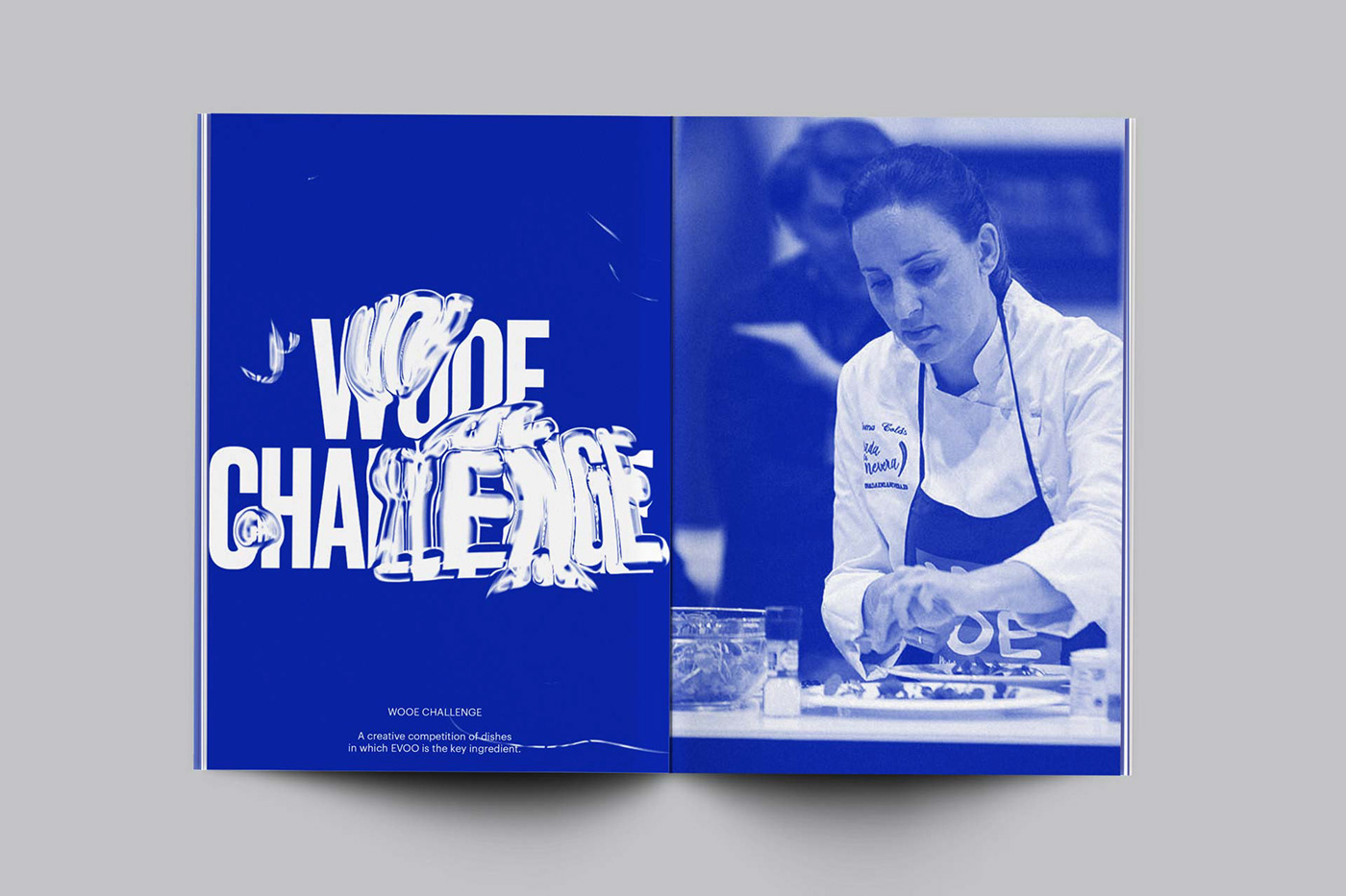
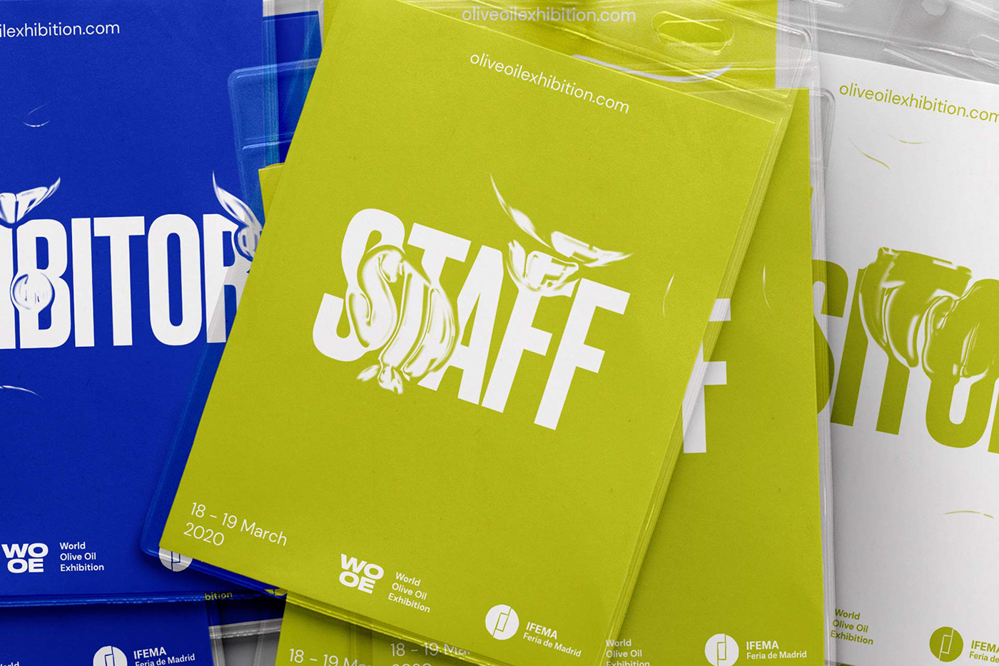
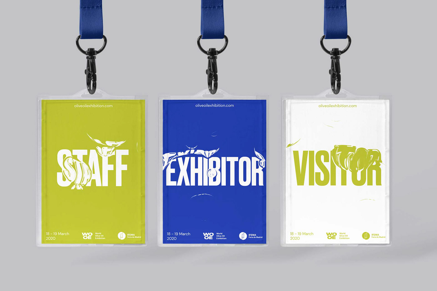
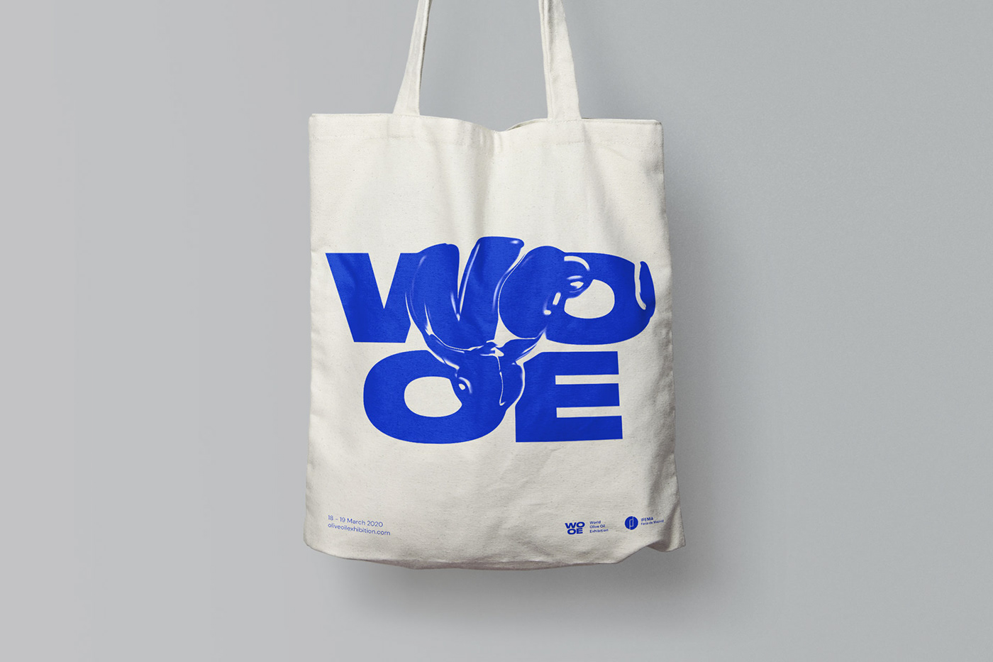
The design concept is based on reproducing and capturing the movement of the olive oil. The colors that have been used are bright tones starting from the olive oil color range for green, and the blue color of the tasting glasses that are usually used and that have a special color.
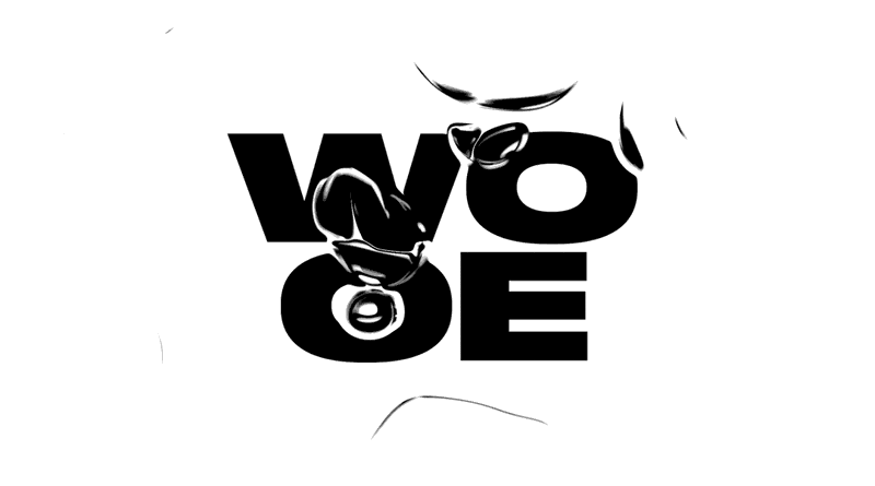
Each movement, second or frame is a unique and exclusive image, creating a fluid and liquid graphic linked to the essence of the event, applied to different media, without losing the essence of the brand, a visual system is created for the rest of the applications.
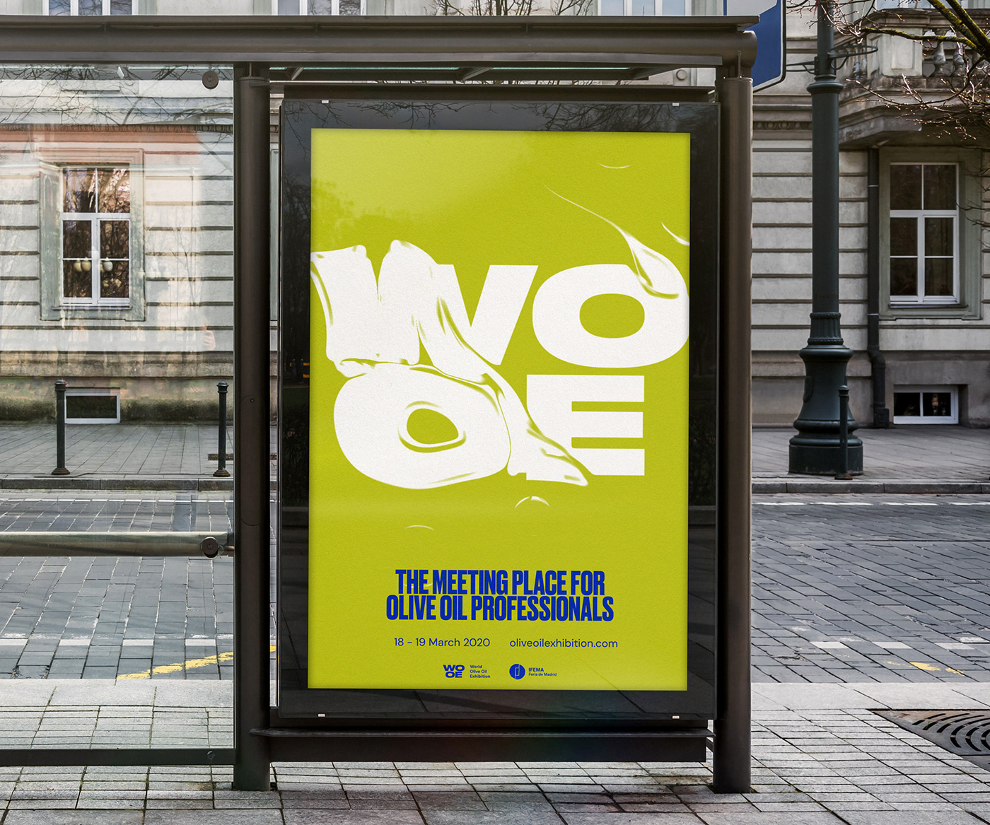
Druk typeface is inspired by the ways in which type was used in the past, rather than the way the typefaces themselves were drawn or cut, a bold and expressive typeface. Combined with DM Sans, a low-contrast sans serif geometric design, designed for use on smaller text sizes by Colophon Foundry (UK).