

Fabrilis Logo Design
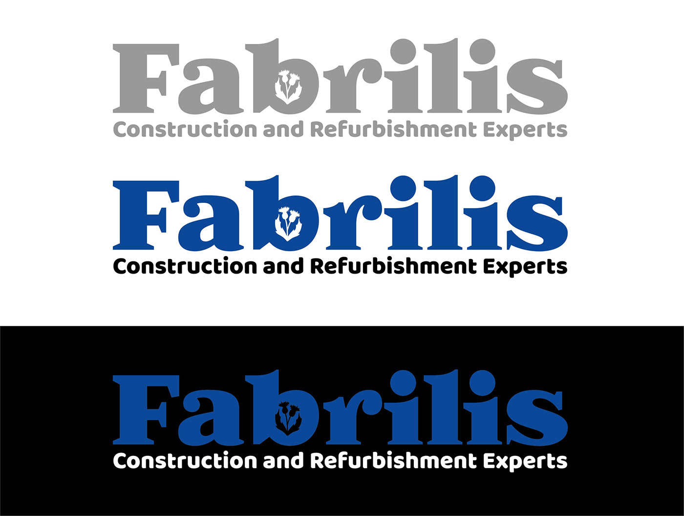
This logo design was created for a building company in Scotland. The word Fabrilis is latin for carpentry. They handle all the parts of construction. The two founders are both Scottish and asked for a "subtle reference" of this in their logo. I asked if they had a specific style that they worked on and was told the company works all many different kinds of construction projects, but they are "quite traditional" and "a young trendy team".
I had several designs sketched out, but decided to do a word mark. I did'nt want to portray a certain style of construction when they do many different kinds of work. I chose a fun bold font to make it trendy. The color blue I chose is the offical blue in the Scotland flag and I included two buds of the Scottish thistle (National flower) as the cut out in the "b" to represent the two founders.
This logo was part of a logo design contest for the company Fabrilis. Even though my design wasn't chosen, it was a good experience and helped me start getting my designs in front of people.

