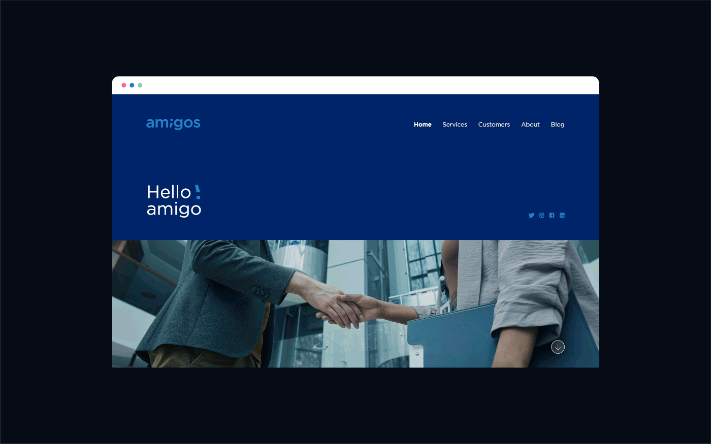
Amigos brand has built with new generation mindset and behavior that stands on being connected and trend driven!
Amigos is a tech company providing tech solutions for those who seek fast tech services with the latest trends and industry updates that results a unique and easy customer experience.
The icon represents handshaking with simple lines speeding towards our clients in sign of fast service delivery, while the lines itself represents the typing concept that includes our coding services. Thus, the blue color is dominant in signification of the tech industry, green for youth and purple shades for sophistication.
The hand curves and smooth edges in the icon focus on how detail and customer oriented our brand is to find solutions in the tiniest details of our consumers’ needs.
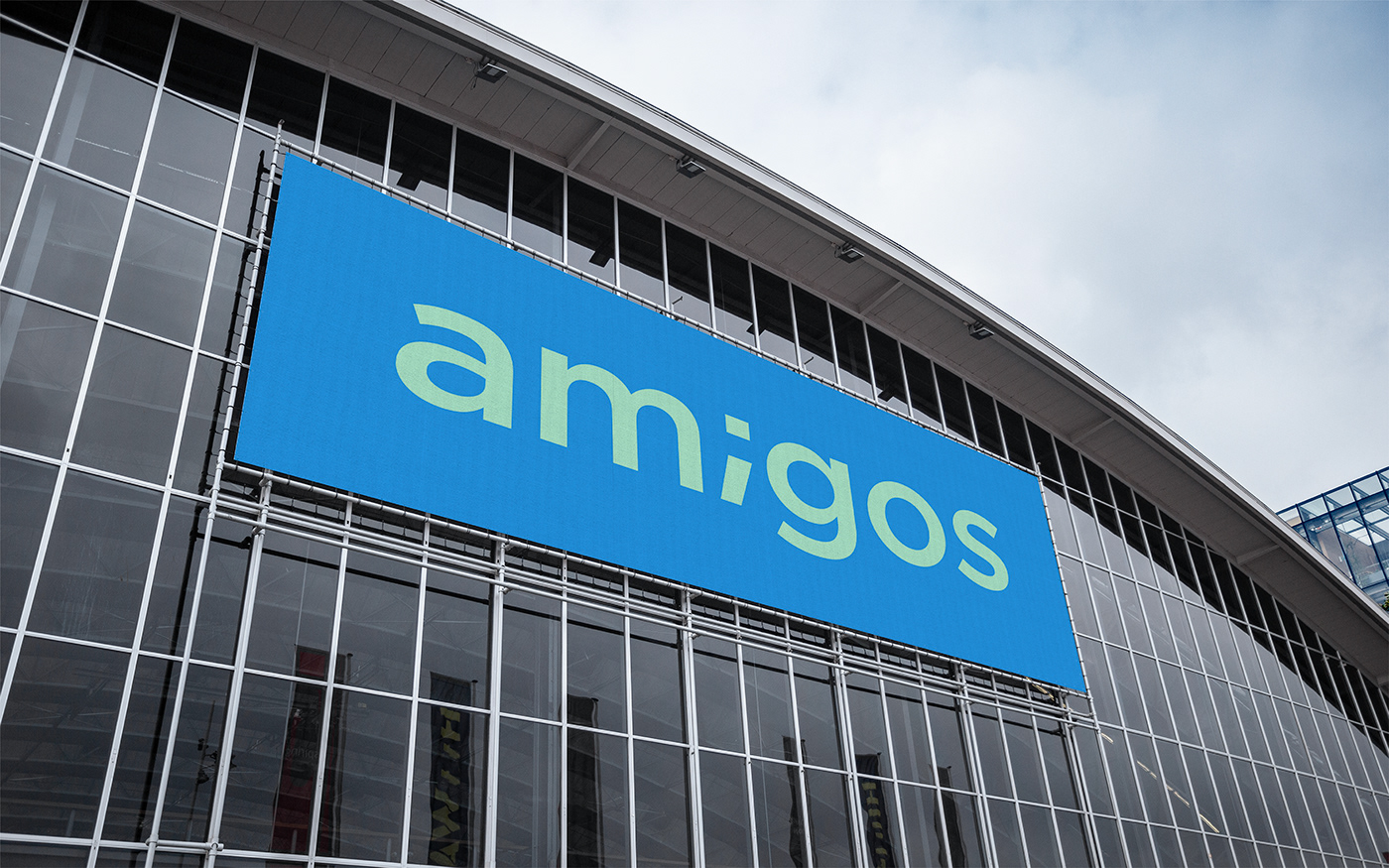
The semicolon in the middle of the wordmark used to present a sense of coding style and to be read as the letter “i” however, the sans serif font represents the simplicity and modernity which is relevant to our brand identity and targeted segments as well to speak their language.