

S E M M E L W E I S U N I V E R S I T Y | B R A N D I N G
Semmelweis University is a medical school in Budapest, Hungary founded in 1769. It's tradition and unique focus on health care makes it one of the leading universities of medicine and health sciences in Hungary and the Central European region.
The logo is based on the university's coat of arms, carrying the over 250 years old tradition of the institution. The brief was pretty strict with the elements that could be used in the emblem, but needed a fresh, modern appearance. All the graphic design solutions and decisions were made to elevate these elements, and make them suitable for present day usage. The primary colors are the updated versions of the previous scheme.
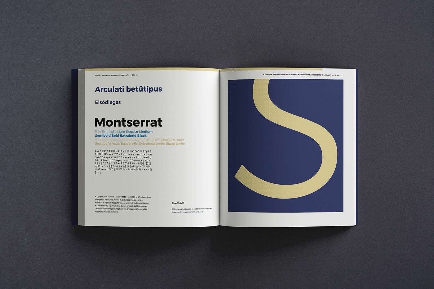
The project's biggest part was to create an extensive, user friendly brandbook, for print and digital use. It's layout is designed so that a spread's ratio is exactly 16:9, but it's size is still economical to print.
The diploma also received a new appearance, based on a ~100 year old certificate.
Client S E M M E L W E I S U N I V E R S I T Y
Art direction S E M M E L W E I S B R A N D A N D M A R K E T I N G D I R E C T O R A T E


S T A T I O N A R Y E L E M E N T S


T H E B R A N D B O O K


T H E D I P L O M A


T H A N K Y O U F O R W A T C H I N G !


