Smart Branding for a Smart Energy Provider
Home energy solutions provider Elevation is one of the fastest-growing companies in the United States. That said, despite being a multi-year Department of Energy Contractor of the Year, Elevation had a brand strategy problem: It was known for what it used to do, not for what it’s capable of.
Elevation offers residential energy solutions, including energy monitoring technology and energy efficiency products and services. But the market perceived the company as a solar panel installer. To rethink its positioning and unlock its full potential, Elevation hired Ozan Karakoc Design Studio.
COMPREHENSIVE Brand Check-Up
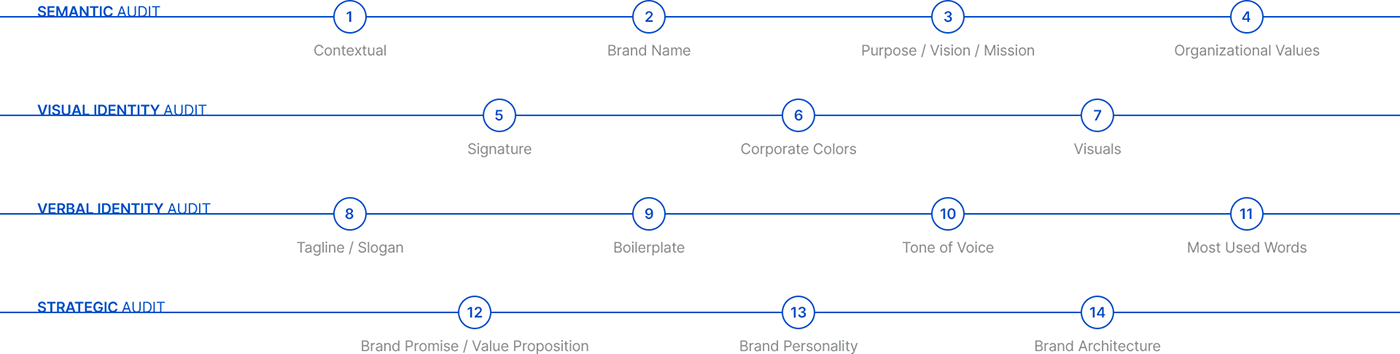
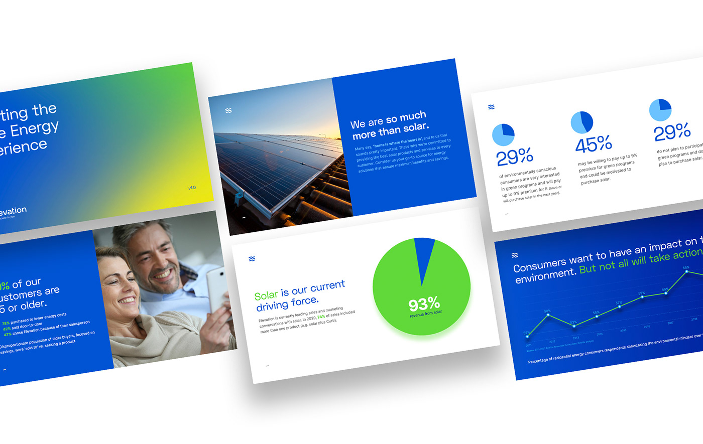
Our first step was to conduct a comprehensive brand analysis. We used our proprietary 14-Point Brand Audit to evaluate Elevation's and its competitors' position in the marketplace. Our detailed analysis revealed how Elevation and its portfolio of brands were performing. We identified what has worked and what has not, creating a blueprint for recalibrating the brand.
Our first step was to conduct a comprehensive brand analysis. We used our proprietary 14-Point Brand Audit to evaluate Elevation's and its competitors' position in the marketplace. Our detailed analysis revealed how Elevation and its portfolio of brands were performing. We identified what has worked and what has not, creating a blueprint for recalibrating the brand.
DIFFERENTIATING BRAND STRATEGY
Armed with such invaluable insights, we deployed an inclusive and highly-engaging strategic process to discover the fuel powering Elevation. The senior management and key stakeholders were interviewed using the Appreciative Inquiry methodology.
We, first, discovered the noble purpose of the firm and the archetypal role it plays.
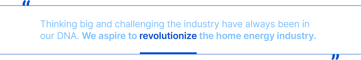
The founders of Elevation never intended to become just another solar company. Thinking big and challenging the industry have always been in their DNA. They aspired to revolutionize the home energy industry. As the Revolutionaries of the market, they exist to change how people think about energy by informing, educating, empowering homeowners.
Next, we identified the core values that keep the organization together, the unique personality of the brand, and the laser-focused value proposition of its products and services.
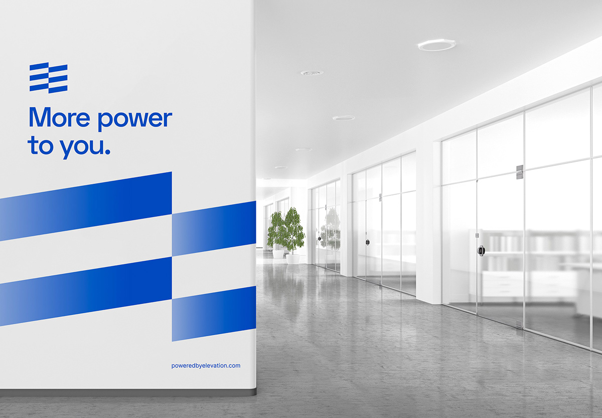
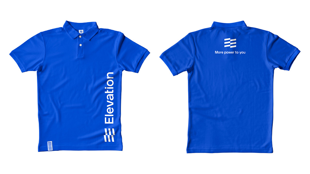
Finally, we captured the company's spirit with a strong and highly memorable slogan: "More Power to You."
EFFICIENT BRAND ARCHITECTURE AND ACTIONABLE TACTICS
We also embarked on a brand architecture process through which we structure Elevation's brand portfolio to optimize the company's marketing efficiency and performance.
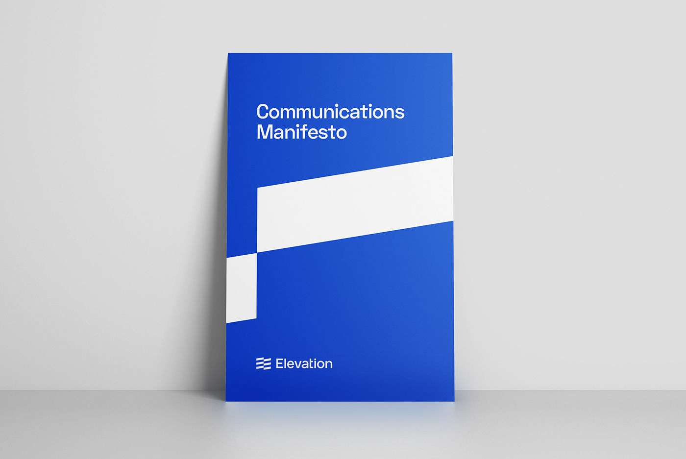
As the final step of the strategy process, we compiled an extensive collection of evidence-based brand tactics to maximize the effectiveness of Elevation's communications.

POWER-FILLED VISUAL IDENTITY
Having discovered and crystallized Elevation's brand story, we were ready to go on to the next phase of the project: designing the new brand identity.
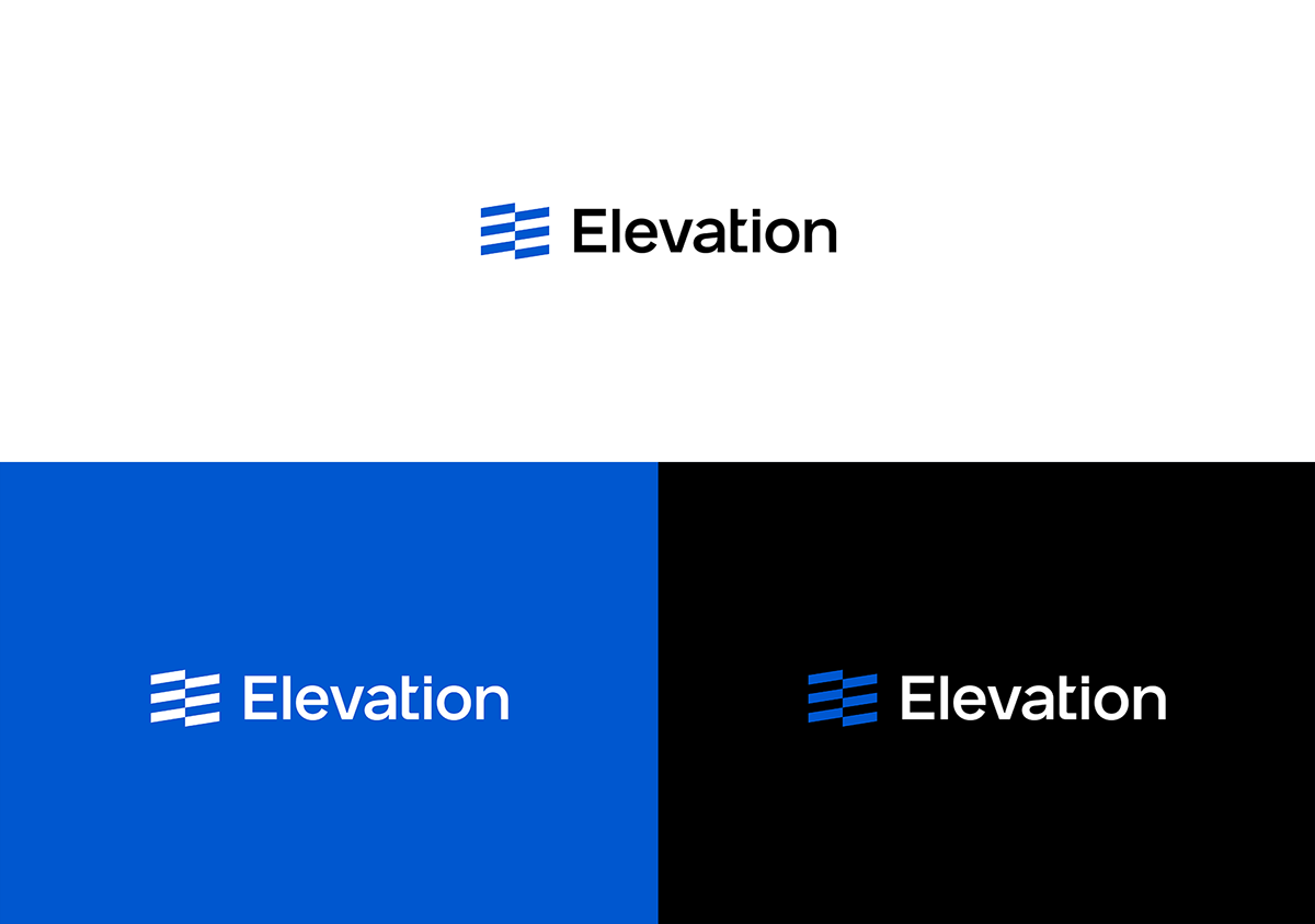
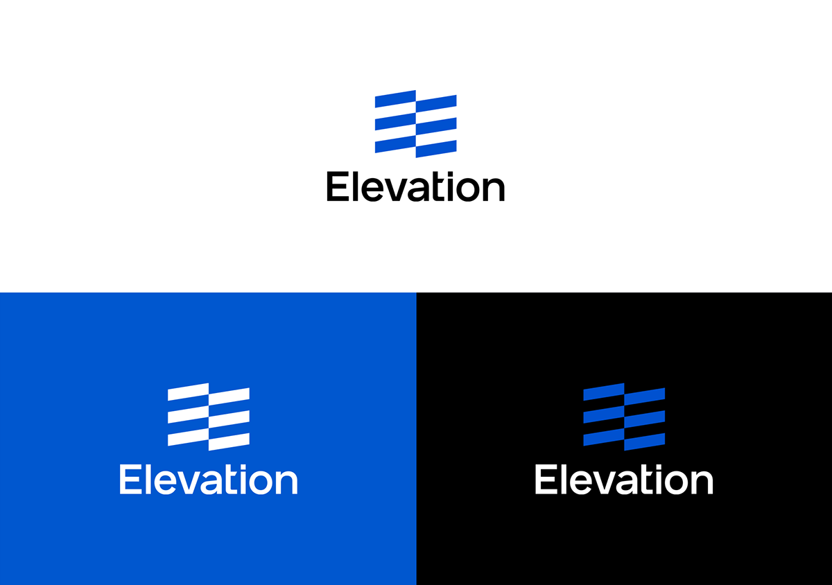
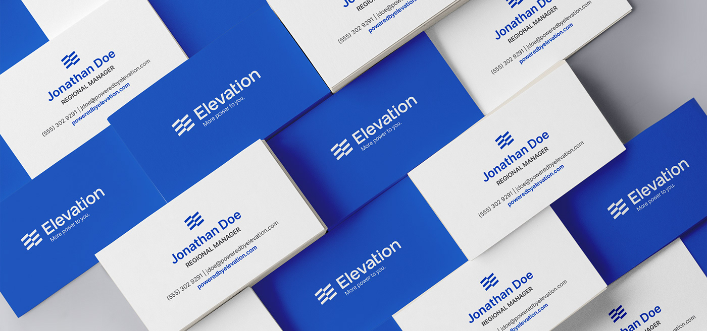
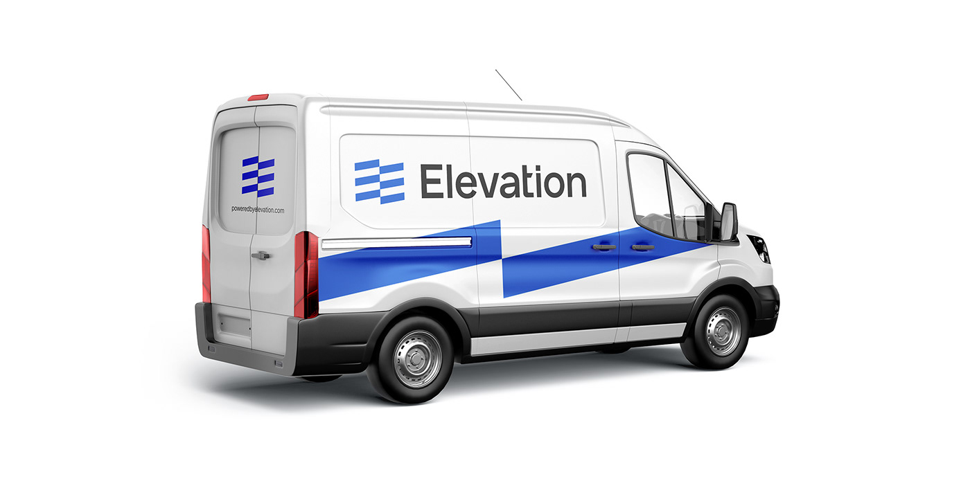
In the officially selected design, we highlighted the 'revolutionary' quality of the Elevation brand by creating a stylized flag symbol. While that's the core idea for the new identity, we also hid other meanings inside the emblem, which were the letter 'E' (to increase memorability), the symmetrical layout of the solar panels (to subtly mention the most important service the company offers), and the upright movement that the name 'Elevation' immediately suggests (to tie the emblem to the name for an easier perception).


With the use of modern yet timeless type, we completed the logo design of the Elevation brand. While the primary logo is horizontal, we also created a vertical lock-up for cases where there is not enough space.

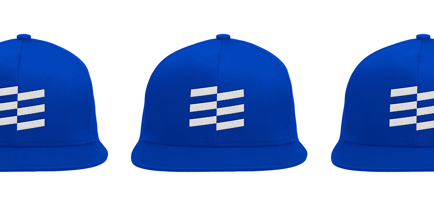
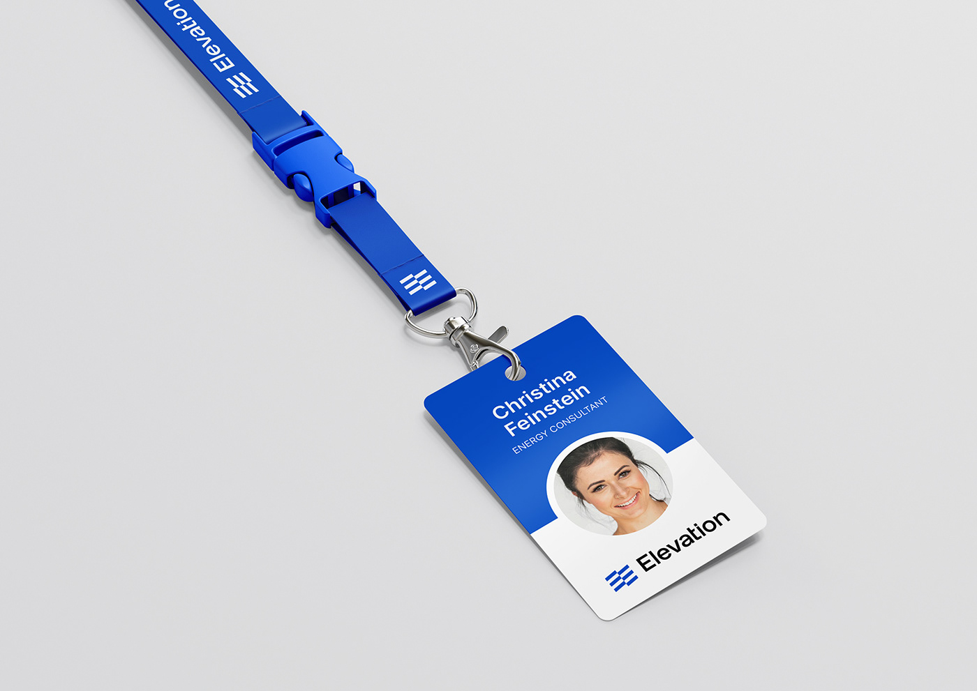
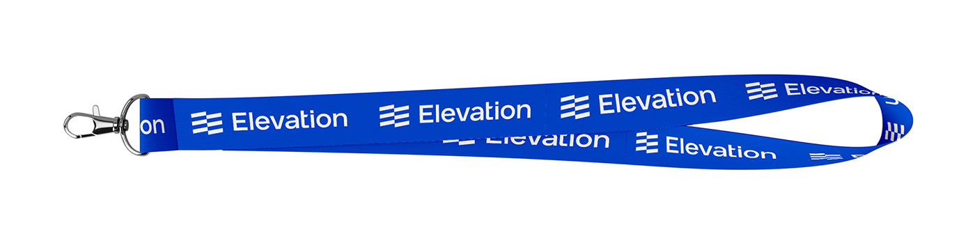
SALES TEAM
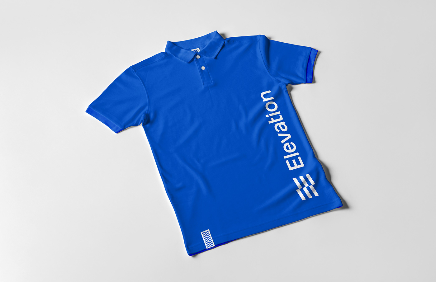
We completely changed the look and feel of the Elevation sales experience by redesigning the sales representatives' shirts, hats, ID badges, presentation materials and vehicles.
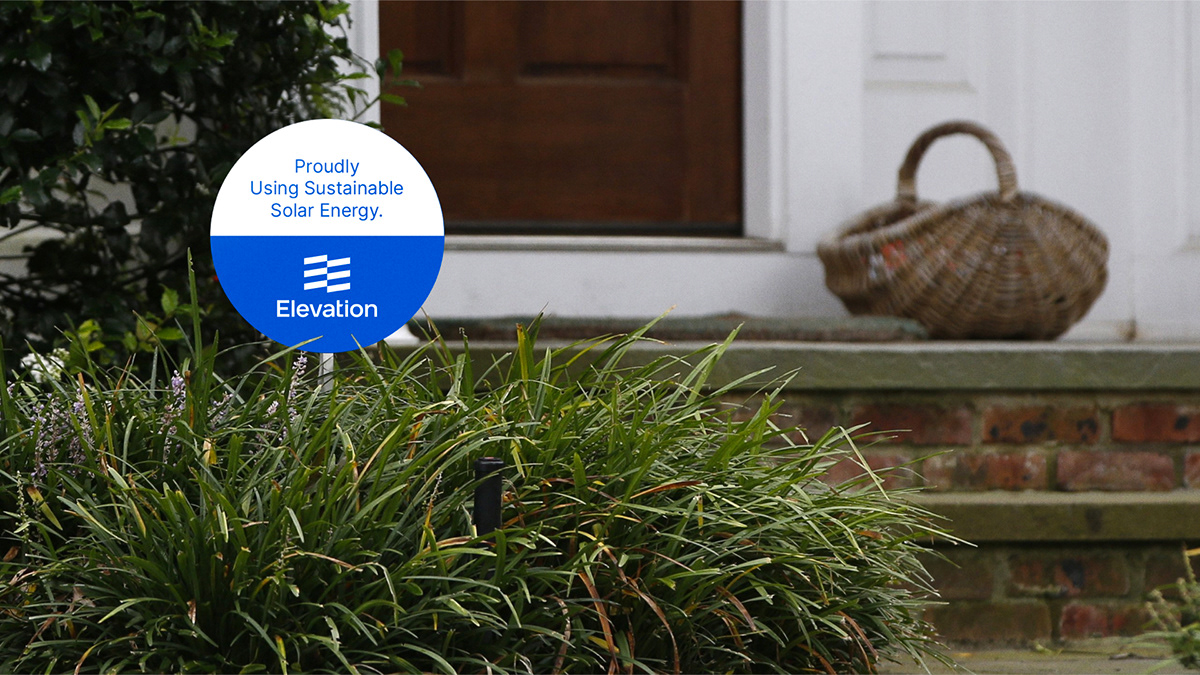
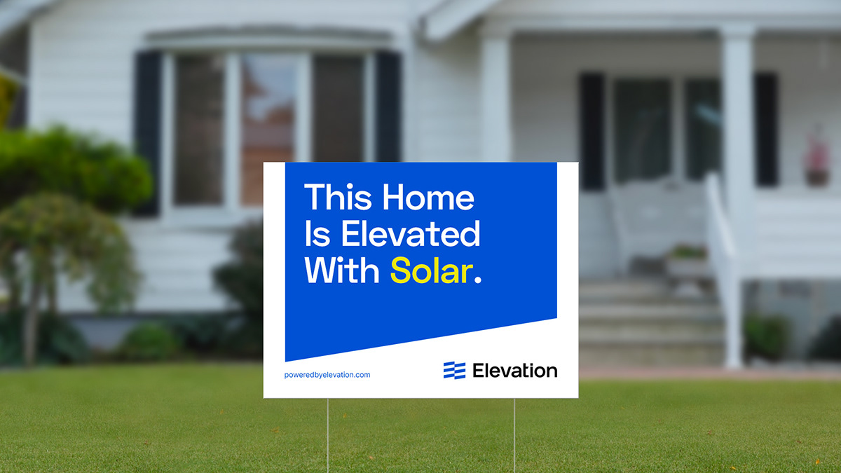
YARD SIGNS
As one of the most efficient local advertising tools for companies like Elevation, we redesigned their yard signs to increase brand awareness and give the customers the chance to share their conscious decision on choosing a sustainable and environmentally friendly way to use their energy more efficiently.
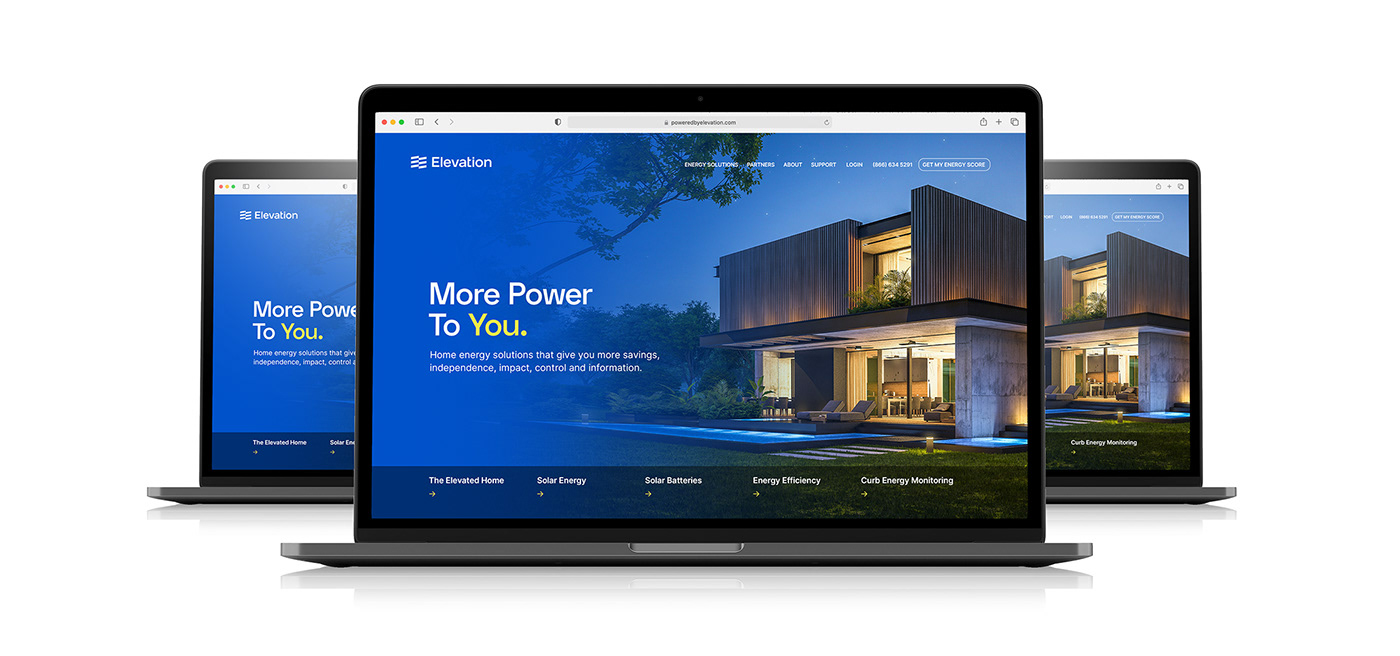
WEBSITE
Then came the online presence of Elevation. The brand had four separate websites for different services, such as solar energy, energy efficiency, customer education, and Curb energy monitoring system. That was not only confusing for the viewers, but also not an efficient way of representing the brand for the company since potential customers should have been aware of all four websites to be able to understand that Elevation is a full-service energy solution provider they can trust.
Therefore, we decided to merge all into one website, poweredbyelevation.com.

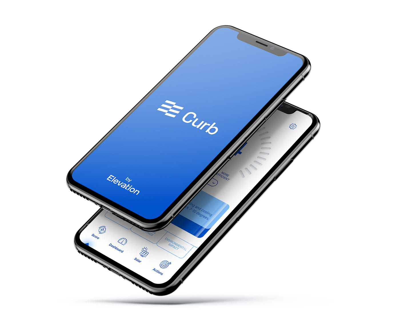
CURB
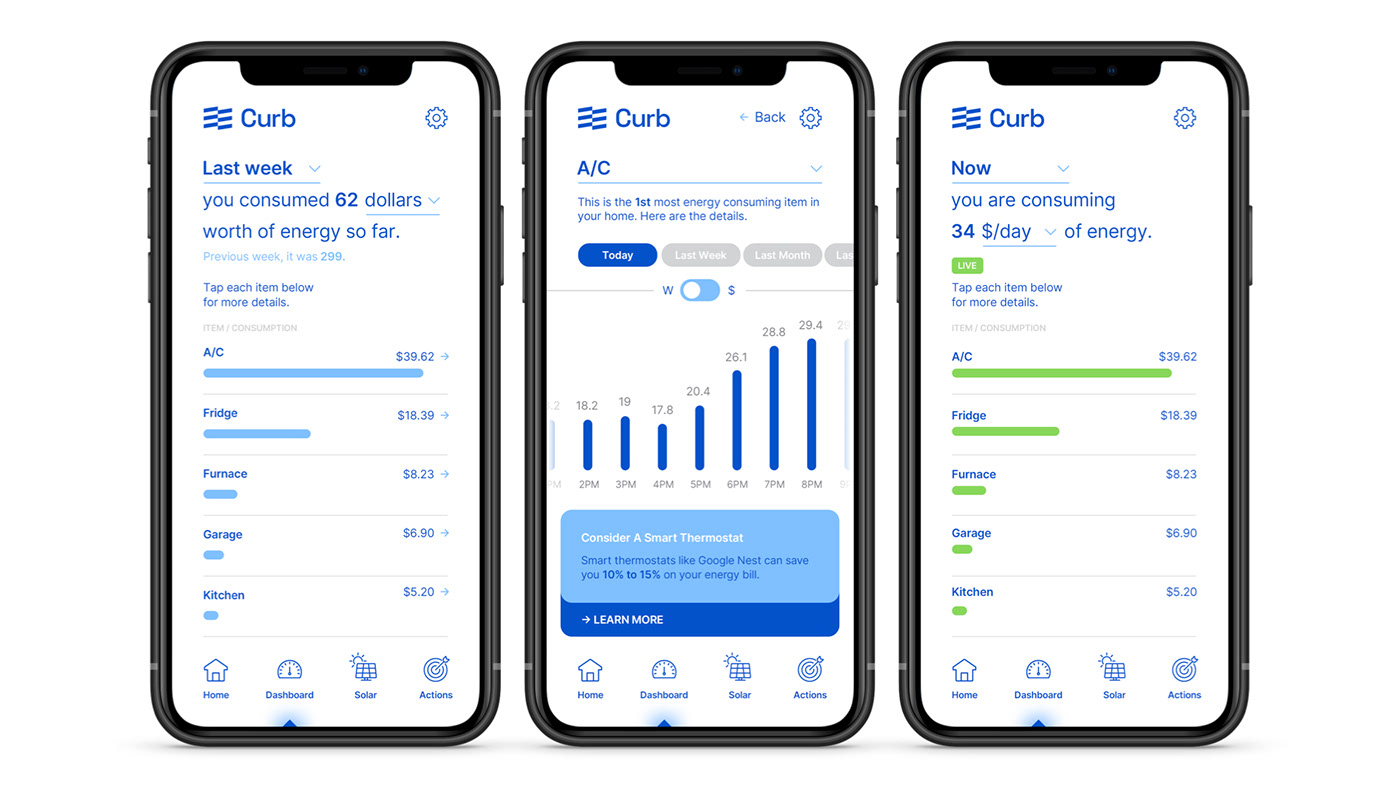
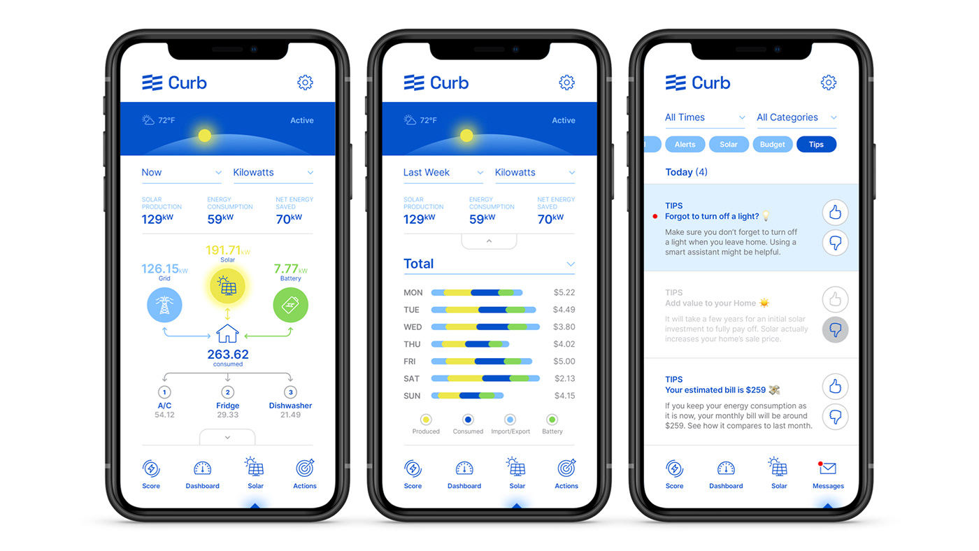
In 2020, Elevation acquired Curb Energy to add smart energy monitoring technology to its whole home solution.
Curb connects to home's electrical system to provide the homeowners real-time data on energy consumption so that they can make smarter decisions about how they use electricity. By doing that, you understand the costs, take control of your energy bills, and eliminate wasted energy.

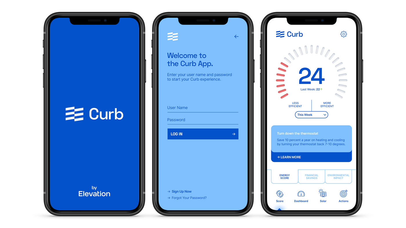
THE CURB APP
As we decided during our Brand Architecture process, we included Curb into the Elevation brand ecosystem, instead of leaving it as a separate entity. We designed its new logo and then rethink the entire user experience after several productive conversations with the product team.
Our goal was to create a beautifully designed, intuitive, easy-to-use Curb App experience to reduce the learning curve and help the users immediately start benefiting from it without any questions or concerns.
We designed one app for professional electricians to make the installation process hassle-free, and one app for the homeowners to easily track their energy usage.
OTHER ELEMENTS AND AN ONGOING 'PARTNERSHIP'
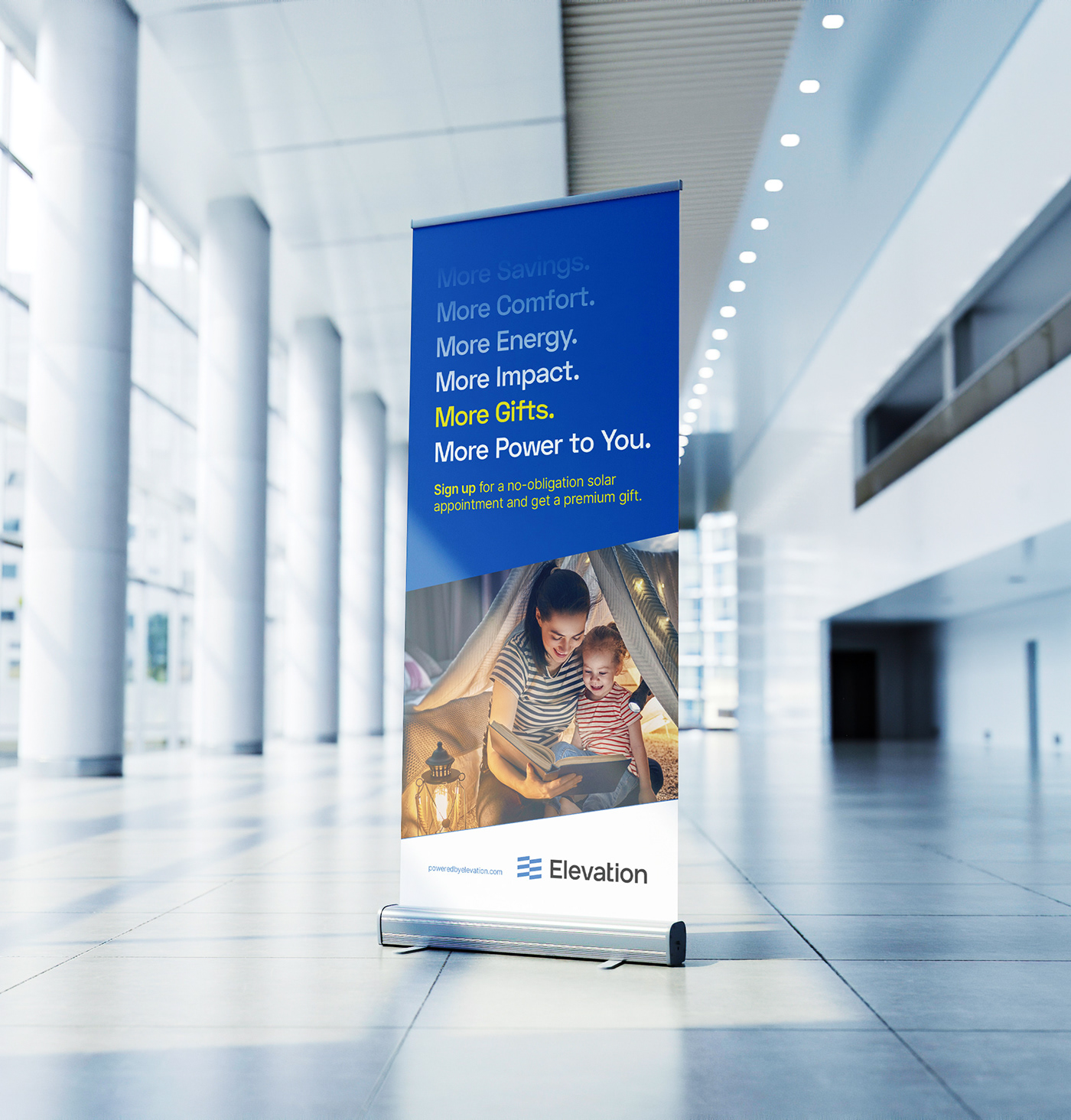
From roll-up banners to postcards, intranet sites to newsletters, office wall mural to Microsoft Teams background graphics, we've designed plenty of other elements for Elevation and we've been proudly continuing to serve their design and strategy needs.
We sincerely thank the wonderful Elevation Team for choosing us, and you for viewing this case study.