The new logo of the Academic Association of the University of Aveiro (AAUAv) was inspired in Ponte do Crasto, a bridge that connects the University of Aveiro campus to the AAUAv headquarters.
The symbol is a visual representation of the bridge, but it is also the concept of the work. It is the path that every student have to walk trough at some point in their academic life. So, AAUAv and it's logo represents all the students of the University of Aveiro.




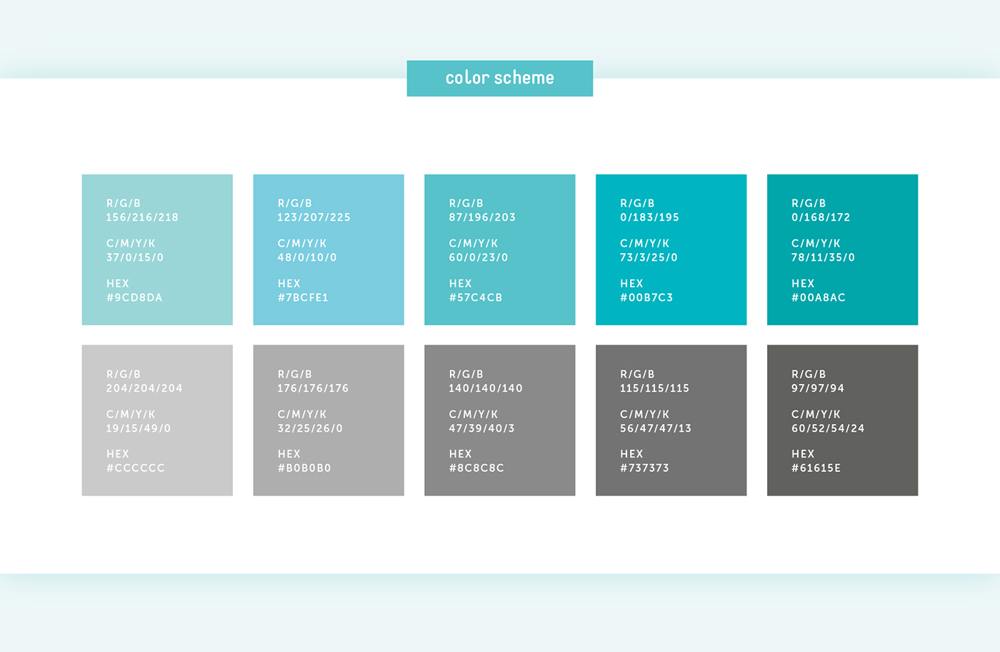
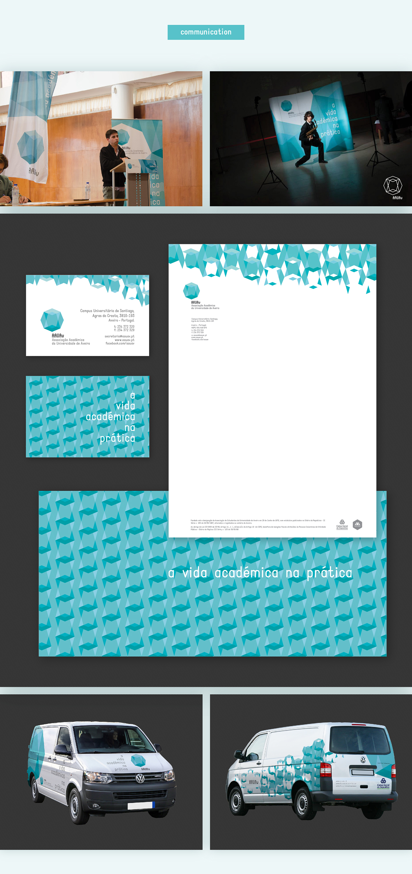
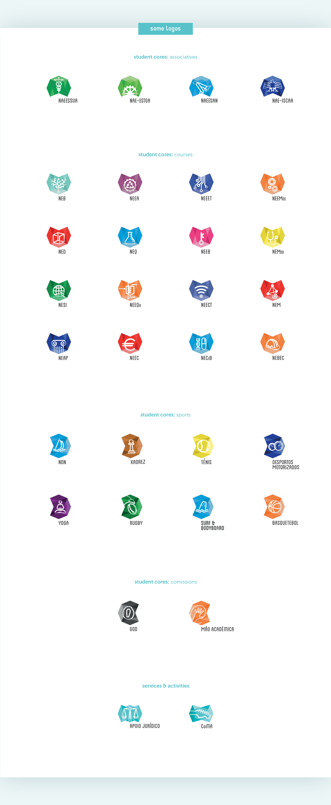
Now that we have the AAUAv logo ready we must procced to the second phase of the project, which is aply this visual language to all services, activities and student cores of AAUAv.
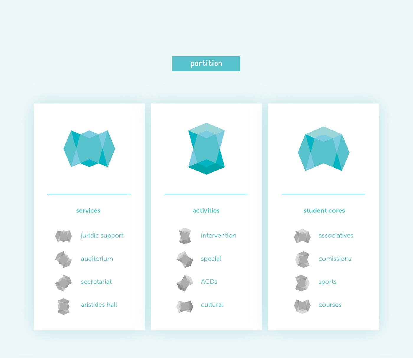
As the new symbol represents the whole AAUAv, as a metaphore,we have used parts of the symbol to represent parts of AAUAv. See the video below with the concept:

