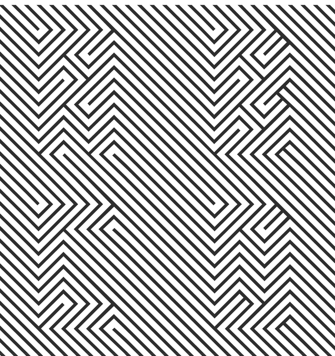
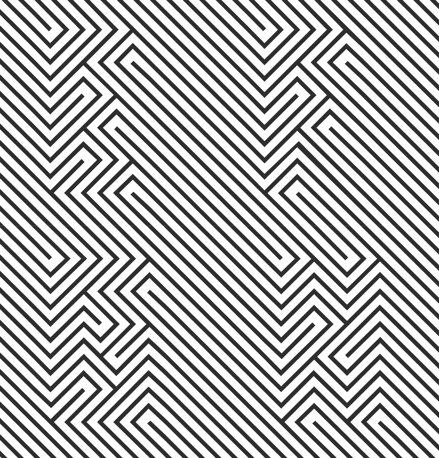
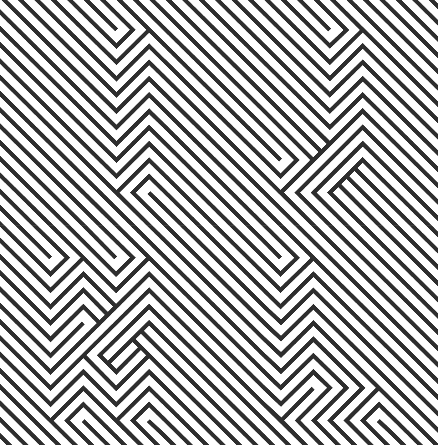
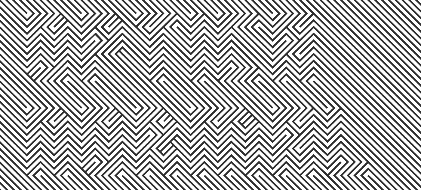
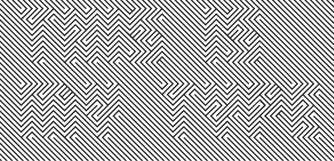
OPTICA NORMAL
OPTICA Normal is a typeface built with the help of orthogonal lines assembled together in a fixed order. In this optic game we can perceive a pattern texture but if you analyze the line directions you will see the text inside. This type performs better at large sizes. OPTICA Normal is a tribute to the Colombian artist Omar Rayo´s optic art.
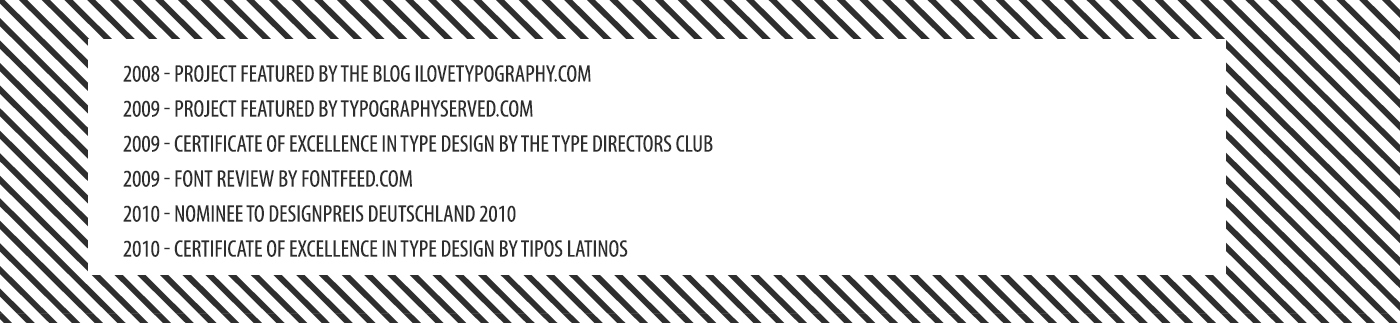
JUGDGE'S CHOICE | RICHAR KEGLER | Type Director Club 2009 |
The premise of Excellence in Type Design made the judging of the 165 entries difficult. There were many designs that demonstrated skill and understanding of type design to a level of excellence but were still eliminated for various reasons. Perhaps the field of type design grows so much every year that the cumulative pool of designs make the truly unique and exceptional harder to reveal themselves. To contribute something new to such a studied and focused field risks failure or redundancies at every turn.
This entry was thought at first to be possibly a put-on. It wasn't until several hours of judging and returning to this design bleary-eyed that the letters finally emerged for me. Before then, it was simply an engaging piece of op art. The seamless lockup as a solid field of intersecting lines at 90-degree angles, even in the negative space, creates something quite jarring. As a readable, functional font, it is, well, not. As a display face, it is unique, clever, and once deciphered, very memorable. The level of engagement is the polar opposite of Beatrice Warde's "Crystal Goblet" treatise. It was unknown at the time of judging that the designer was from Mexico, but the Aztec-Mayan pattern filtered via the Mexico '68 Olympic identity system seemed to be the clearest precedent for this, making it culturally authentic as well as excellent.