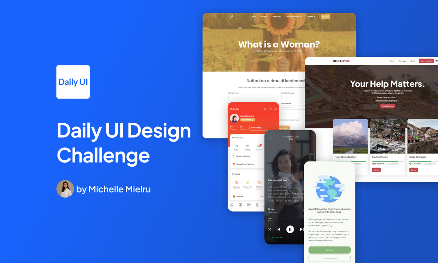
Status: ongoing 🔥
Daily UI is a series of daily Design Challenges Inspiration and Surprise Rewards sent to my inbox everyday (except weekend!). I joined this challenges to become a better designer! 💪😊
I have used resources in the form of icons from Material Design Icons and stock images from Unsplash.

I designed a sign-up page for Majalah Pearl's e-Conference. It was in Bahasa Indonesia because the main user target of Majalah Pearl is Indonesian.

A mobile app credit card checkout page.

From this late November to December 2022, there were a lot of natural disasters happened in my country, Indonesia. Starting from the Cianjur earthquake that caused at least 334 people died, the Garut earthquake, to the Mount Semeru eruption.
These inspired me to create a donation landing page.
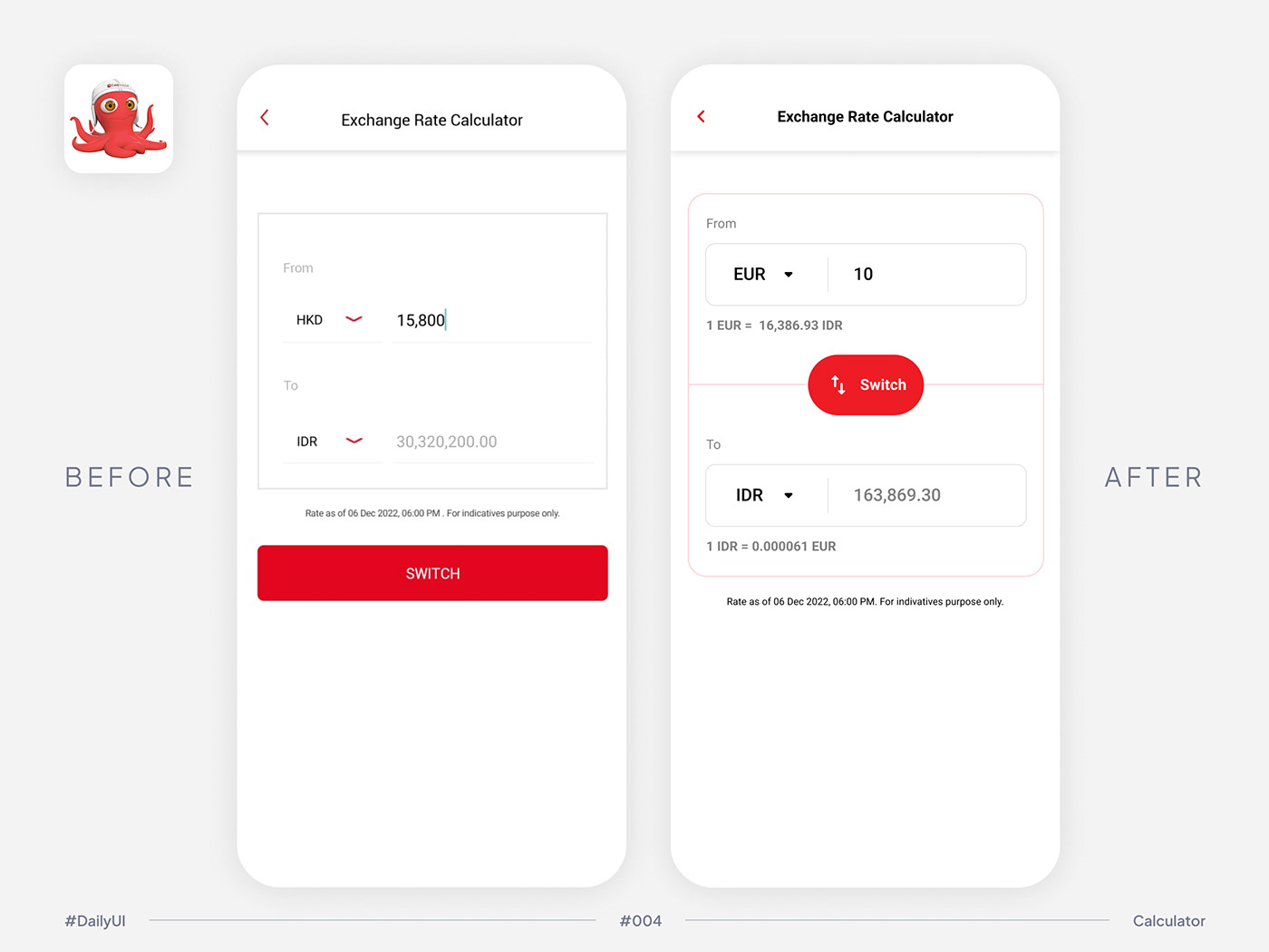
I wanted to design an exchange rate calculator page, but instead of designing a fake product, I chose to redesign the page from OCTO Mobile by CIMB Niaga.

I designed the simple logo as well as the app icon of Gojo.
Gojo is a fake product project of my boot camp study at Binar Academy.
Gojo (abbreviation of Go Ijo - translated as Go Green) is an Indonesian application where users (or we call it Sobat Gojo - translated as Buddy Gojo) can get information about plastic recycling. This application also provides a community feature so that users can share inspiration and enthusiasm.
The logo is a combination of the letter G, a leaf, and the color green.

My take on the buyer's profile page of Shopee. Do you use the "Videos" feature?

Redesigned Shopee's account settings. And I added a search bar for convenient sake.

Gojo is a fake product project of my boot camp study at Binar Academy.
Gojo (abbreviation of Go Ijo - translated as Go Green) is an Indonesian application where users (or we call it Sobat Gojo - translated as Buddy Gojo) can get information about plastic recycling. This application also provides a community feature so that users can share inspiration and enthusiasm.
Here I designed 404 Page of the app in two languages: Bahasa Indonesia and English.

I used #Spotify as my main music player on daily basis. Nowadays, users could view a short looping video while playing the music, but unable to look at the lyrics at the same time. Hence, this was my take on redesigning the UI and UX of Spotify mobile app.
Featuring #Ditto by #NewJeans. What a beautiful song 🥰

Continuation of the previous challenge. This time I tweaked #Spotify's share the music page.
Still featuring #Ditto by #NewJeans.
Still featuring #Ditto by #NewJeans.

A simple success and error (from no internet) modal pages.
I used illustrations (credit to Blush Design) and played with the squircle button shape. I have never used this shape in my design before, and it is suitable for more playful theme.

This is a single-item view of an e-commerce shop. I designed it based on e-commerce platforms that I enjoy using in my daily life.

A continuation from previous post. It's a direct messaging design of an e-commerce shop.

Inspired by #Samsung #Android's Timer, which I really love and enjoy using, I tweaked it a little bit by adding a feature to customize more presets and organize them in a tab. What do you think?

I love to use Reader View during my reading session on my desktop. The original placement of the color scheme is inside the Type Control. I pulled it out and placed the toggle button outside so users could toggle the color scheme effortlessly.
Oh, there is also a Sepia color scheme available. Do you use it?

This time, I created a subscribe and a cookie popup design for Tech in Asia website. What do you think?


