Brand Design Identity for Whitney Houston and Sony Music Entertainment
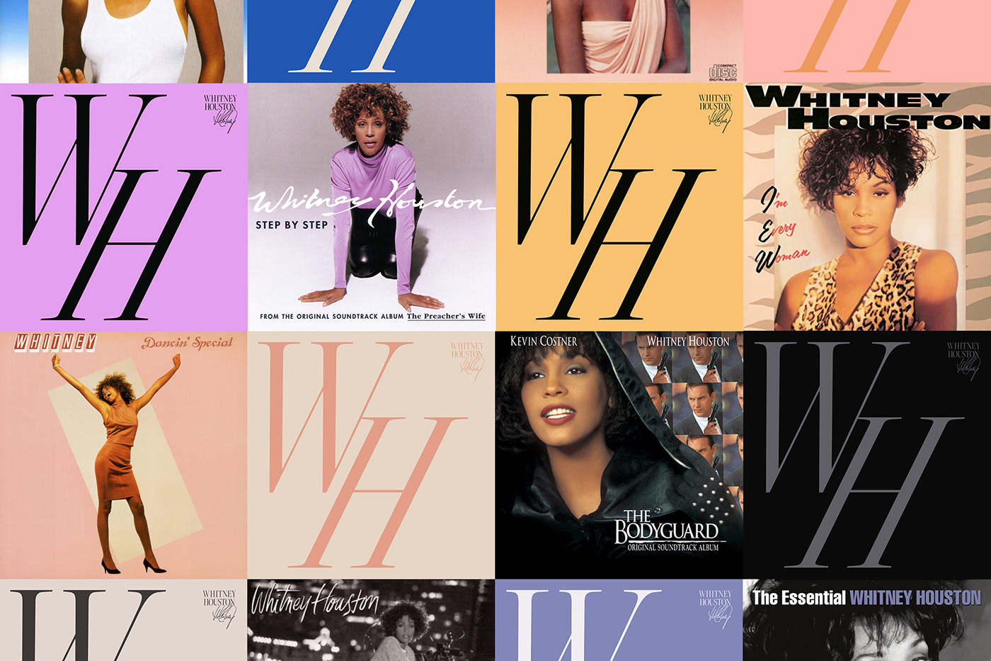
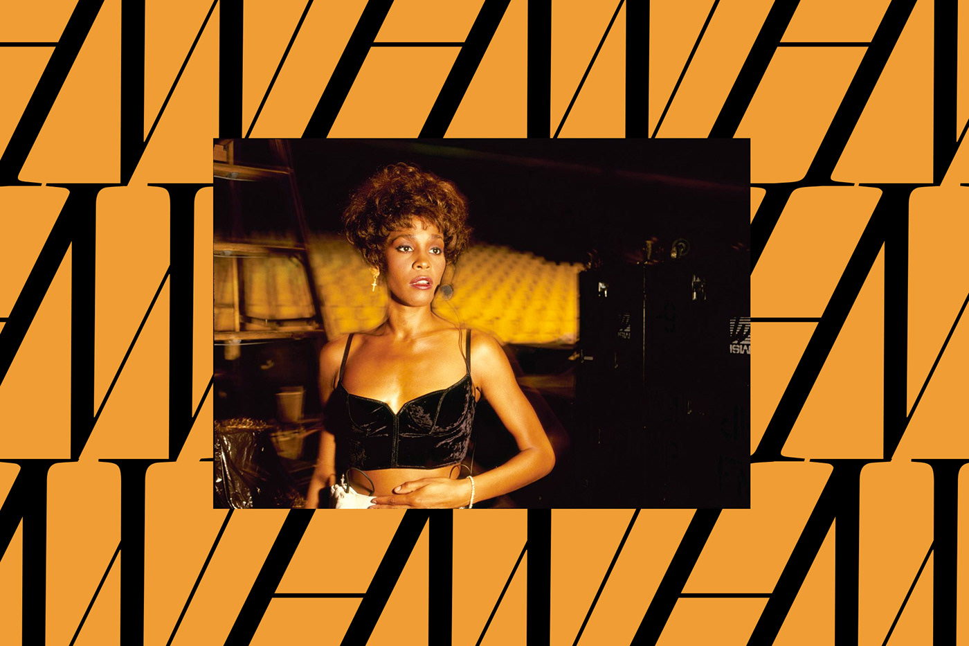
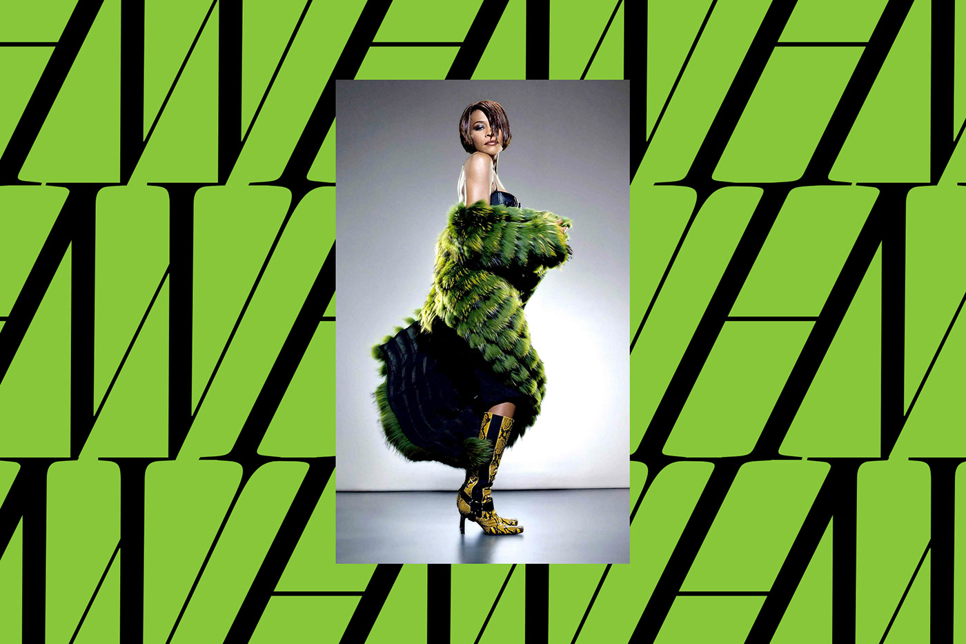
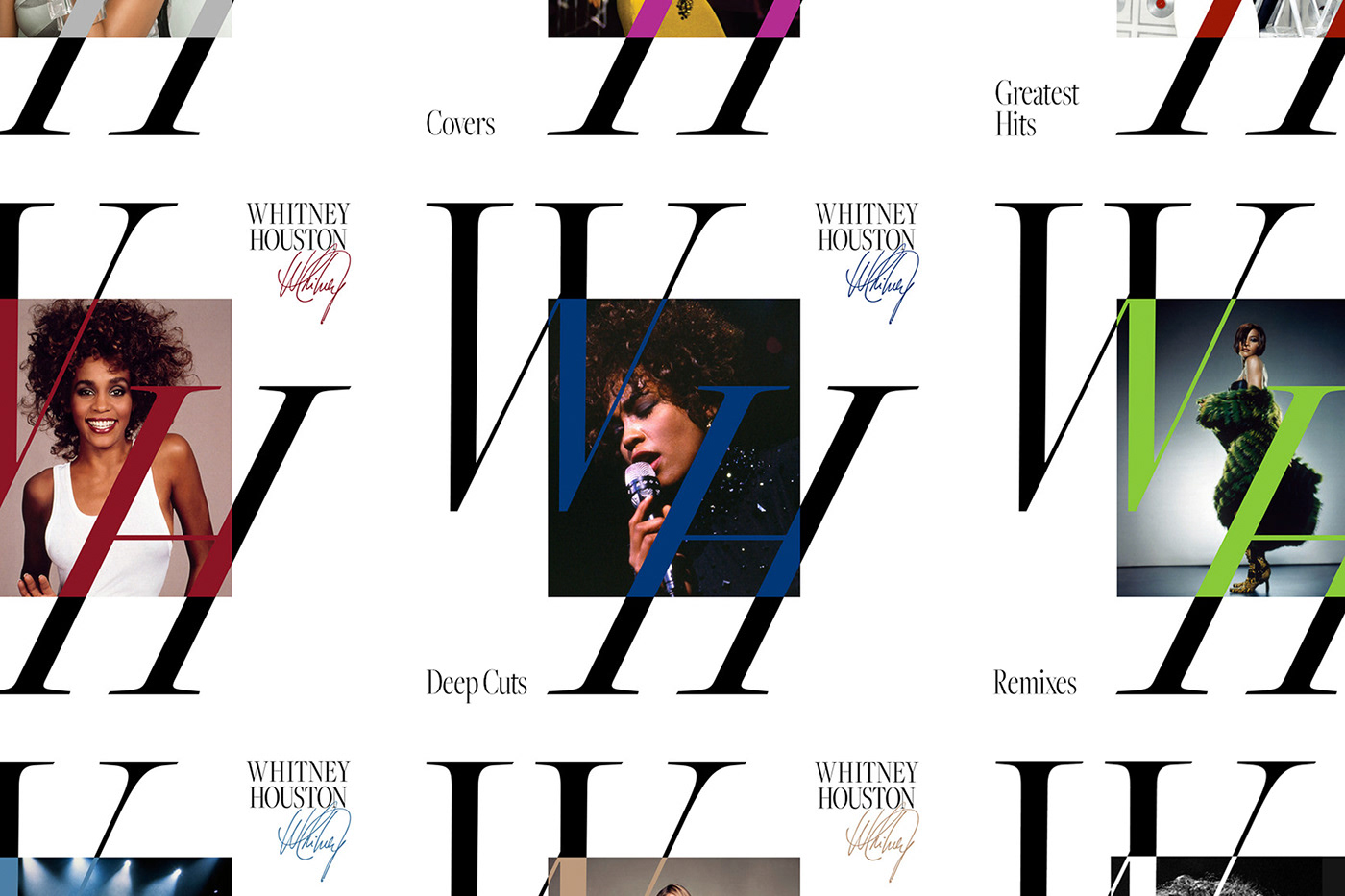
Throughout Whitney’s career she influenced countless people with her powerful voice, sense of perfection, and her unique ability to re-imagine herself for new releases and performances. When taking a look at Whitney’s discography one can see a broad variety of graphic expressions.
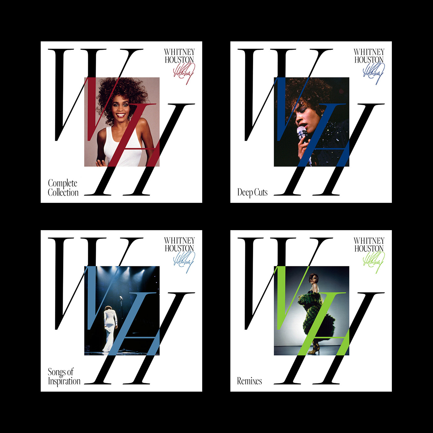
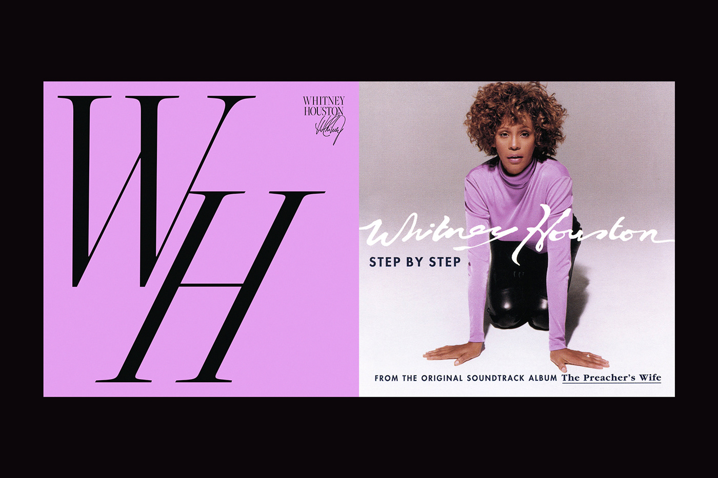
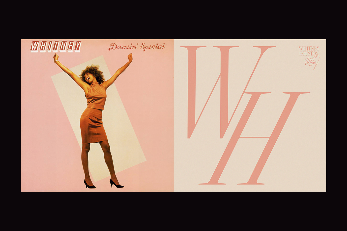
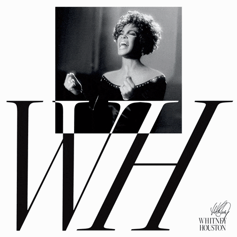
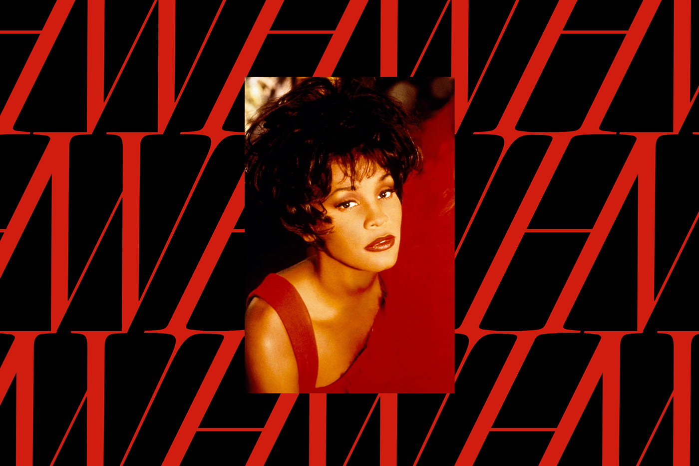
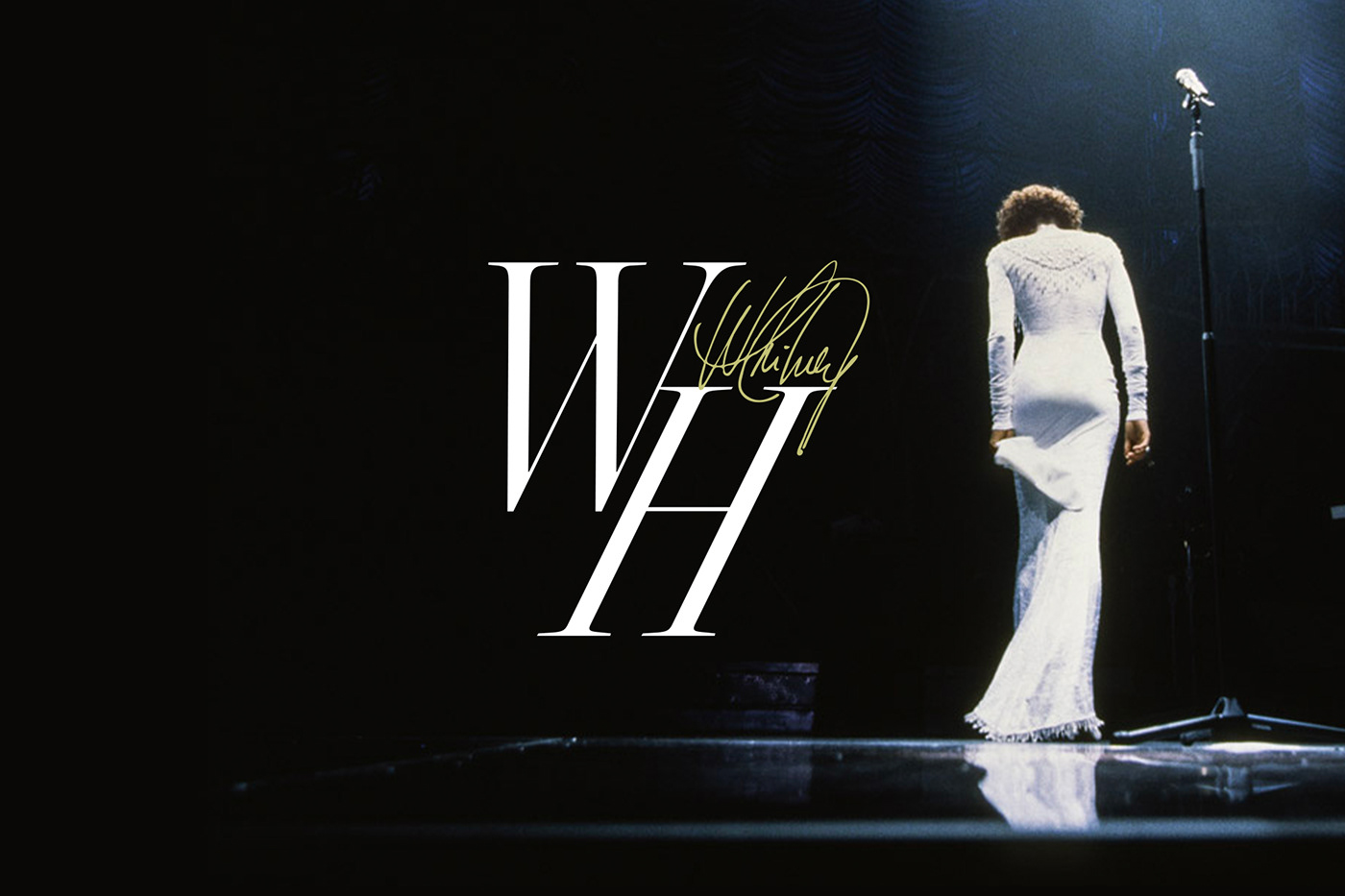
With this in mind we created a systematic visual identity that seamlessly intertwines her photography through typography, dynamic color adaptation and a confident logo that can transform for different applications.
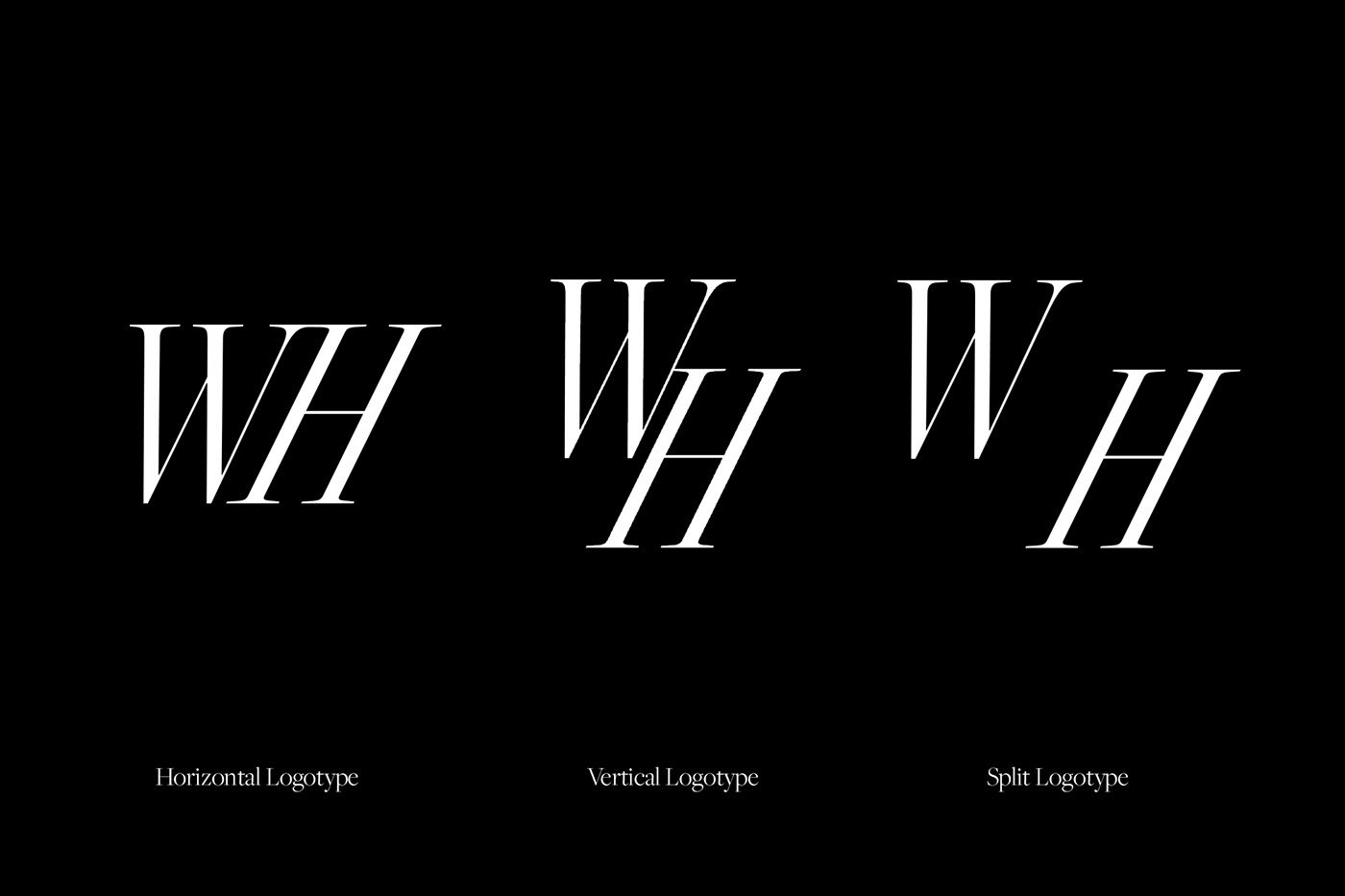
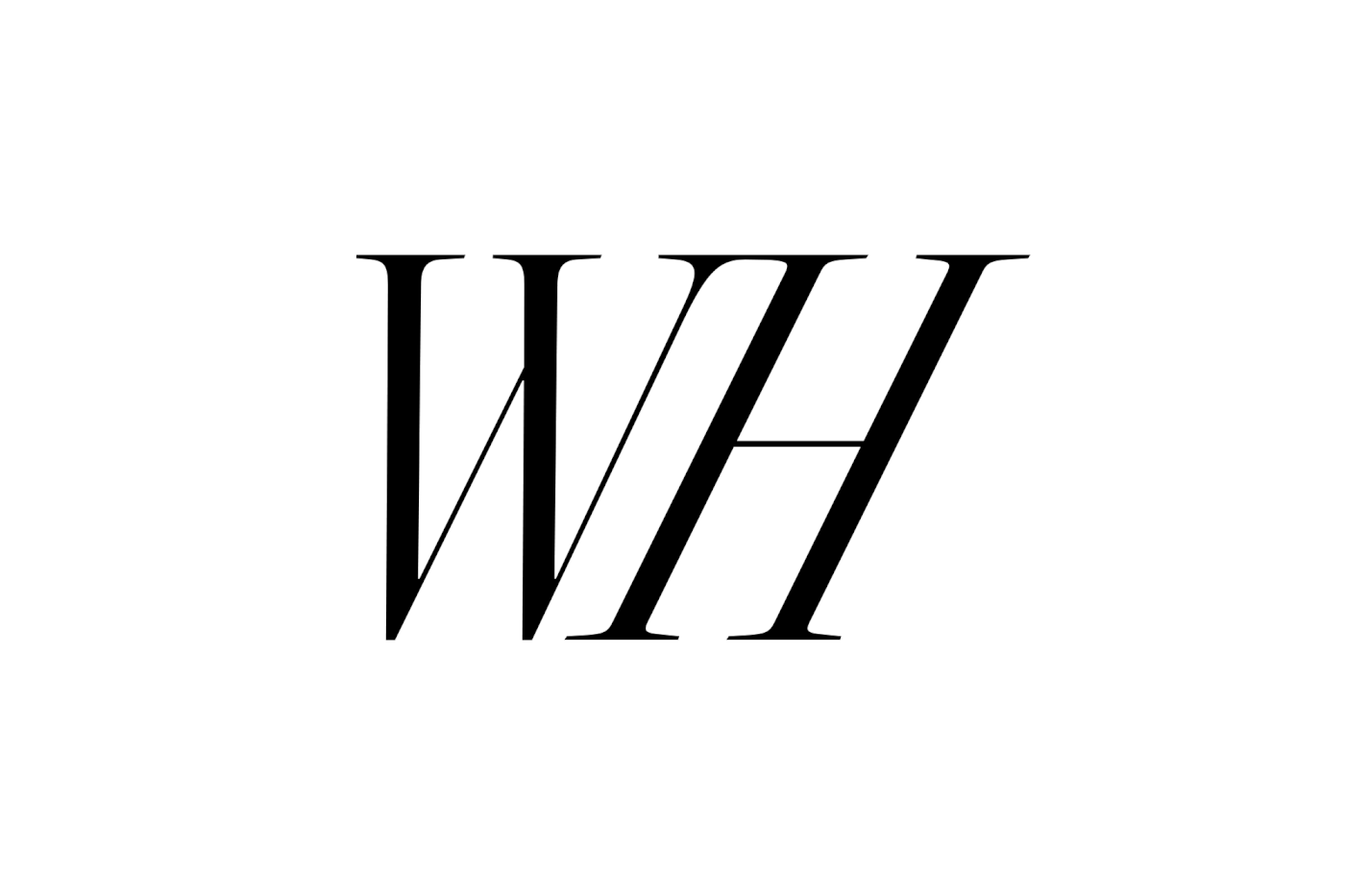
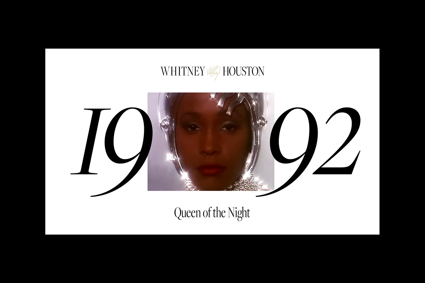
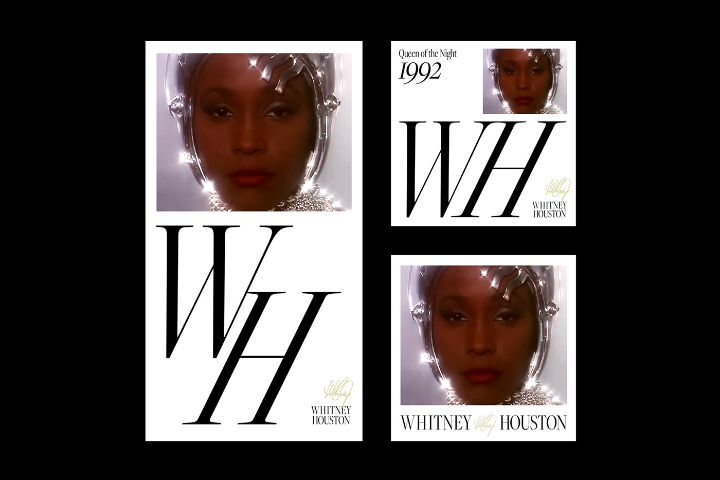
In our research, we discovered that Whitney had been using only initials at times, like in the official ‘All The Man That I Need’ music video. Based on that insight we could then create responsive logo system that consists of a combination of her initials, signature and full name. With this dynamic solution we ensured that the identity would thrive in any given situation.
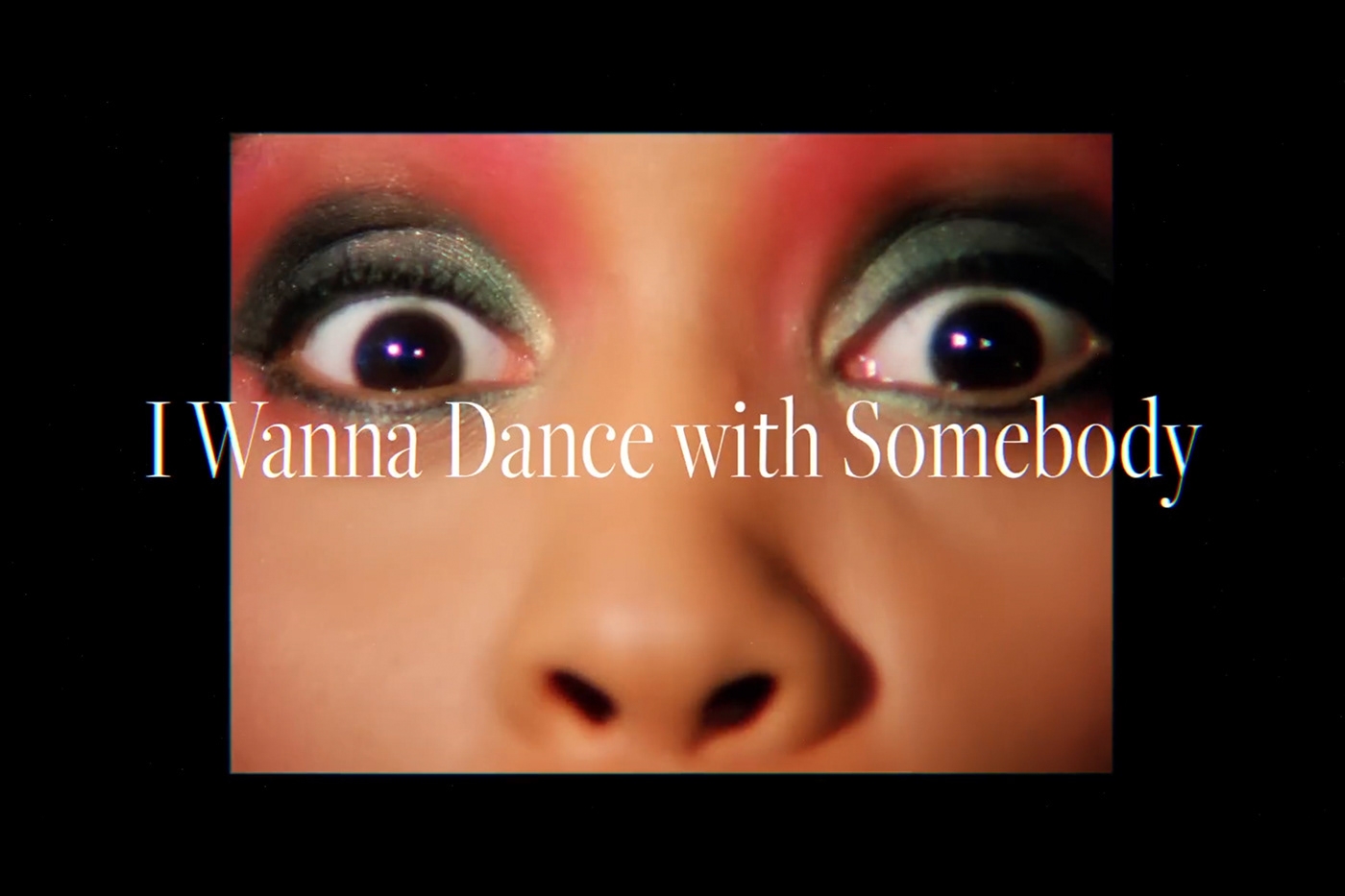
Throughout her career serif typefaces were frequently used in different ways, and we decided to find a typeface that unites it all in a way that pays respect to that legacy. With an impactful type hierarchy we aimed to create a memorable identity that will draw attention and will work as a reflection of Whitney's uniqueness.
Client: Sony Music Entertainment
Design & Art Direction: Erik Herrström and Maya Gomez
Motion Design: Tobias Raschbacher
Features: Creative Review, The Brand Identity, Creative Boom, Creative Bloq