


KREN —
Visual identity
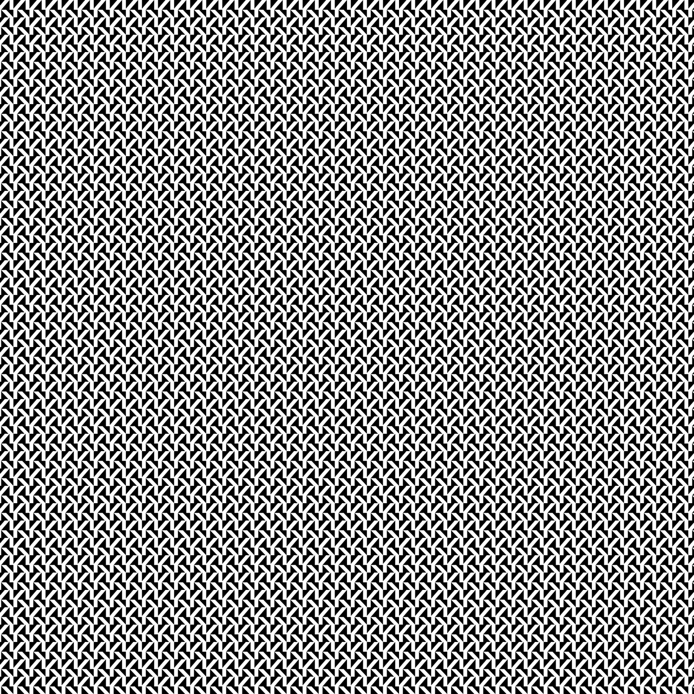
Logotype and visual identity made for Kren, a communication agency from Trieste (Italy). Kren is a spicy condiment, typical for the Trieste-made dishes. The agencys' name is a homage to this strong flavoring; its aim is, in fact, to spice up the communication of their clients, adding in each work that 'spicy pinch' that enhances and creates vigor. Breaking the cliches of standard communication, shamelessly, with bold attitude; but with weighting and reliability. This 'breaking' + 'balance' concept is figuratively (and graphically) transposed in the logotype: the type is diveded horizontally in two, but is optically balanced and stable. The K trademark —extrapolated from the logotype— can be used as a texture element. The pattern, repeated and reduced, creates a deliberate glitch effect, a "noise in the analog frequency". Widely metaphorically speaking: the glitch effect in the agency visual identity represents the clients' search for a re-tuning of the analog, of the obsolete, of the boring; an operation that can be carried out by the trusted communicative antenna-fixers: Kren agency! P.S.: the word 'kren' sounds similar to 'kern': it is not a nod to anything specific; or is it? :)


The K glitch pattern
Scaled 1, 2, 3 and 4 dimensions of the crafted texture with the K customized letter.


Some applications
Hoodie, logotype with payoff, business cards, envelope, cap.


Credits and details
Kren boss: Dorina Leka. Type in use: Suisse Int'l (customized) by Swiss Typefaces. Thanks for watching!


