


ILLIRYAMUSIC —
Visual identity
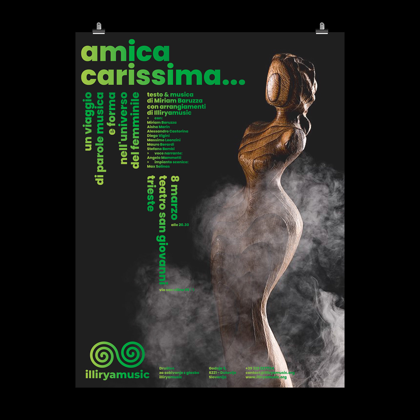
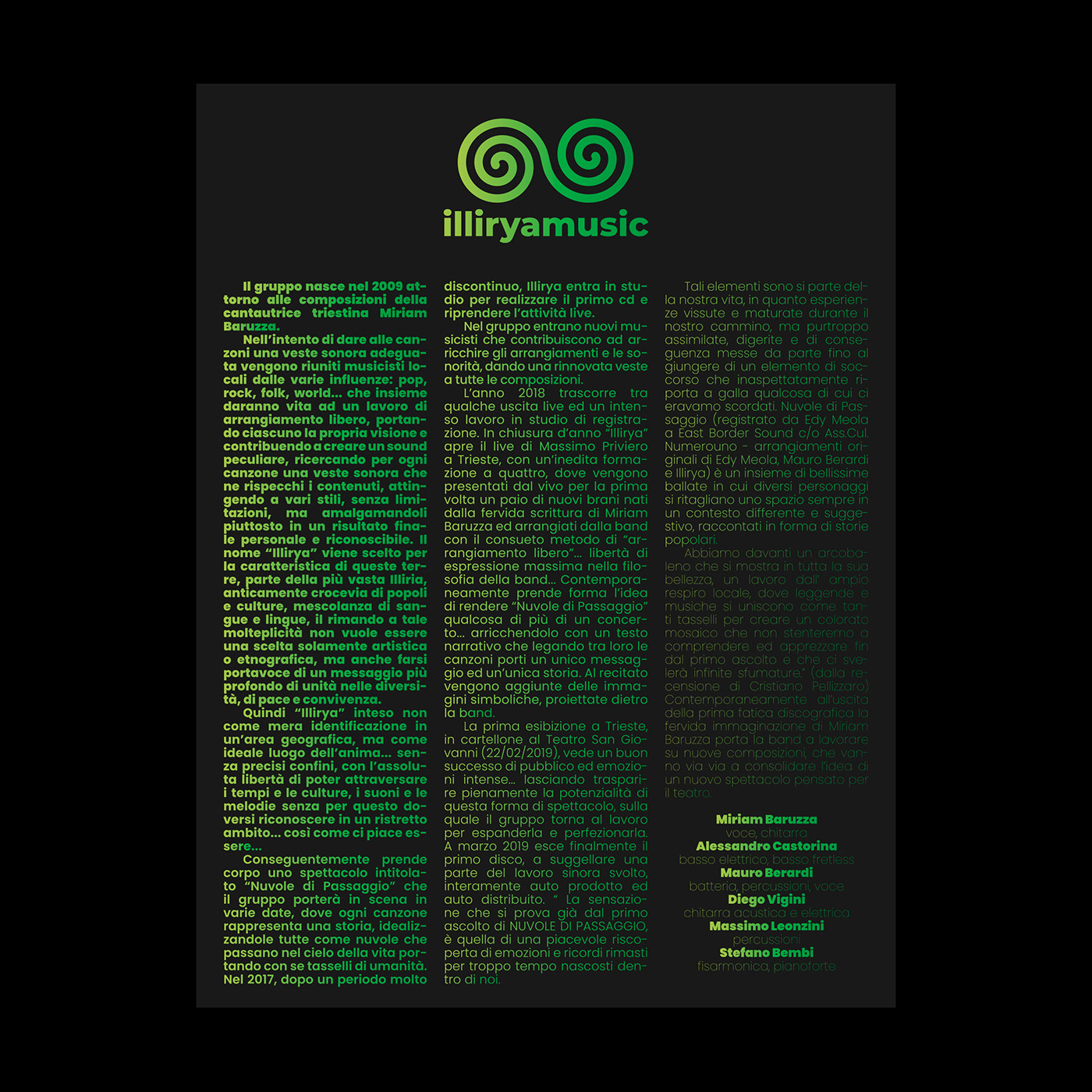
Illiryamusic is a non-profit association for coexistence. The goal of Illyriamusic is to promote music as a universal language common to all people. The purpose of the association's activities is the promotion of authors from the local community scene and authors of global origin, especially unrecognizable ones. But also the renewal and the study of musical and cultural traditions at the crossroads of cultures (Mitteleuropa) as a mixture of different ethnic, cultural and linguistic nations. The visual identity designed for the association reflects these values of coexistence: the logo is composed of two spirals joining and merging together (the spiral embodies the concepts of dynamism, cyclical continuity, development and expansion). The institutional green color (composed of two neon green colors that mix together in a gradient effect) symbolizes the concept of sharing, growing, hoping for self-confidence and inclusion. The branding also includes a catchy spiral motif on the promotional materials, a smart typeset for the various events' printed matter, always black background supports to to highlight the fluo of the in-use green graphic elements.


Technical details
Gradient colors in-use are Pantone Neons 802 C and 902 C. The green spot colors for the silkscreened materials (f.e. hoodies, tote bags, t-shirts), manually mixed in the pre-press phase, match the Pantone chromies listed above.


