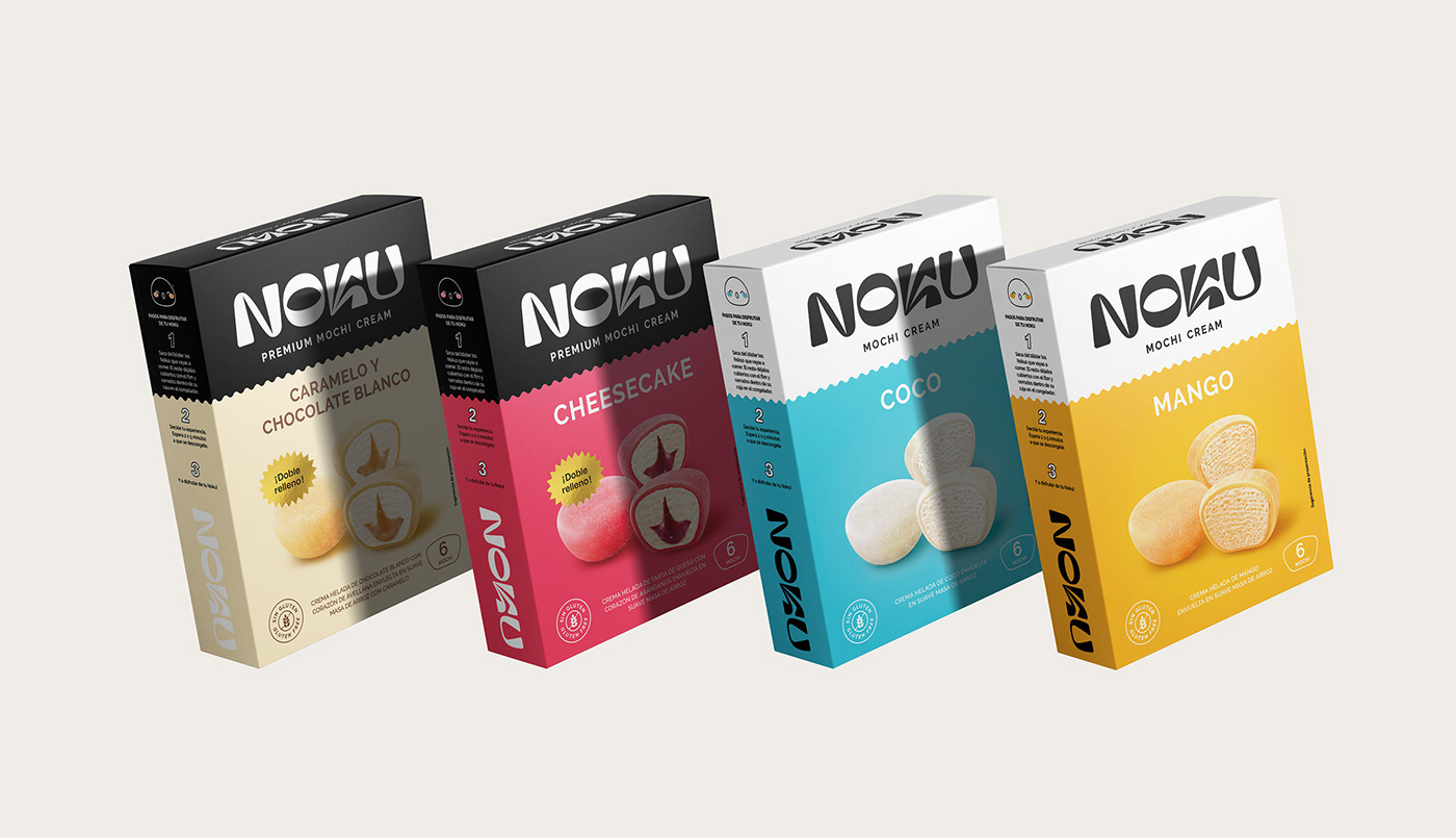
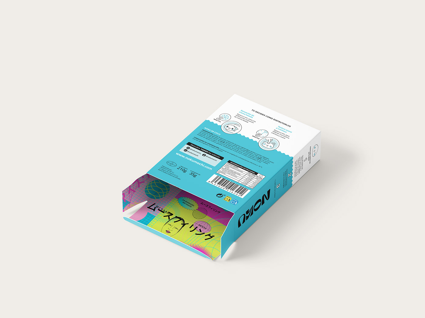
As irresistible on the outside as it is on the inside. Noku is a new brand for which Brandsummit developed its concept, naming and packaging.
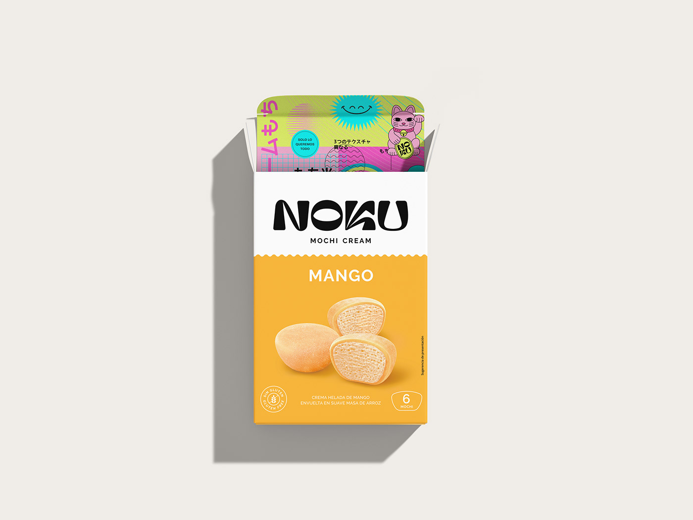
A branding work guided by the social concept Uchi-Soto, which in Japanese is understood as "inside-outside" and is related to the duality of "public-private" or "group-individual" of the Japanese country.
We looked for a name as irresistible as the product: bold, pleasant, inclusive, colorful, practical and diverse. We came up with Noku, marked by its sonority and relevant tone, easy to read and remember.
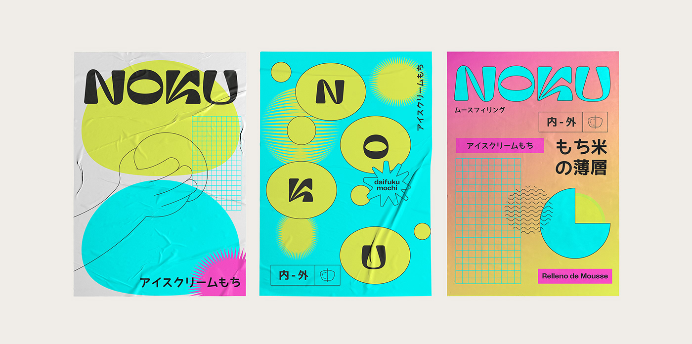
Its logo reflects the duality of the brand: modern yet traditional, tender as a mochi, but sharp as a katana, striking and elegant. We created a totally unique and customized logo following the uchi-soto concept, with shapes reminiscent of Japanese characters and contrasting soft and sharp shapes.
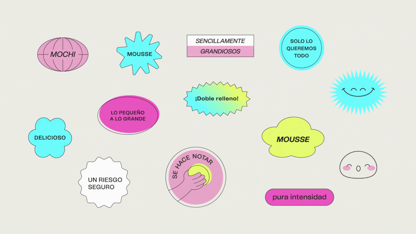
Its diversity as a product is reflected in its commitment to vibrant colors, the contrast of its textures (cover and filling), the exoticness of its origin and the explosion of flavor that it leaves in the mouth.
Graphic design: Alex Monzó
Mochis CGI: João Ramos