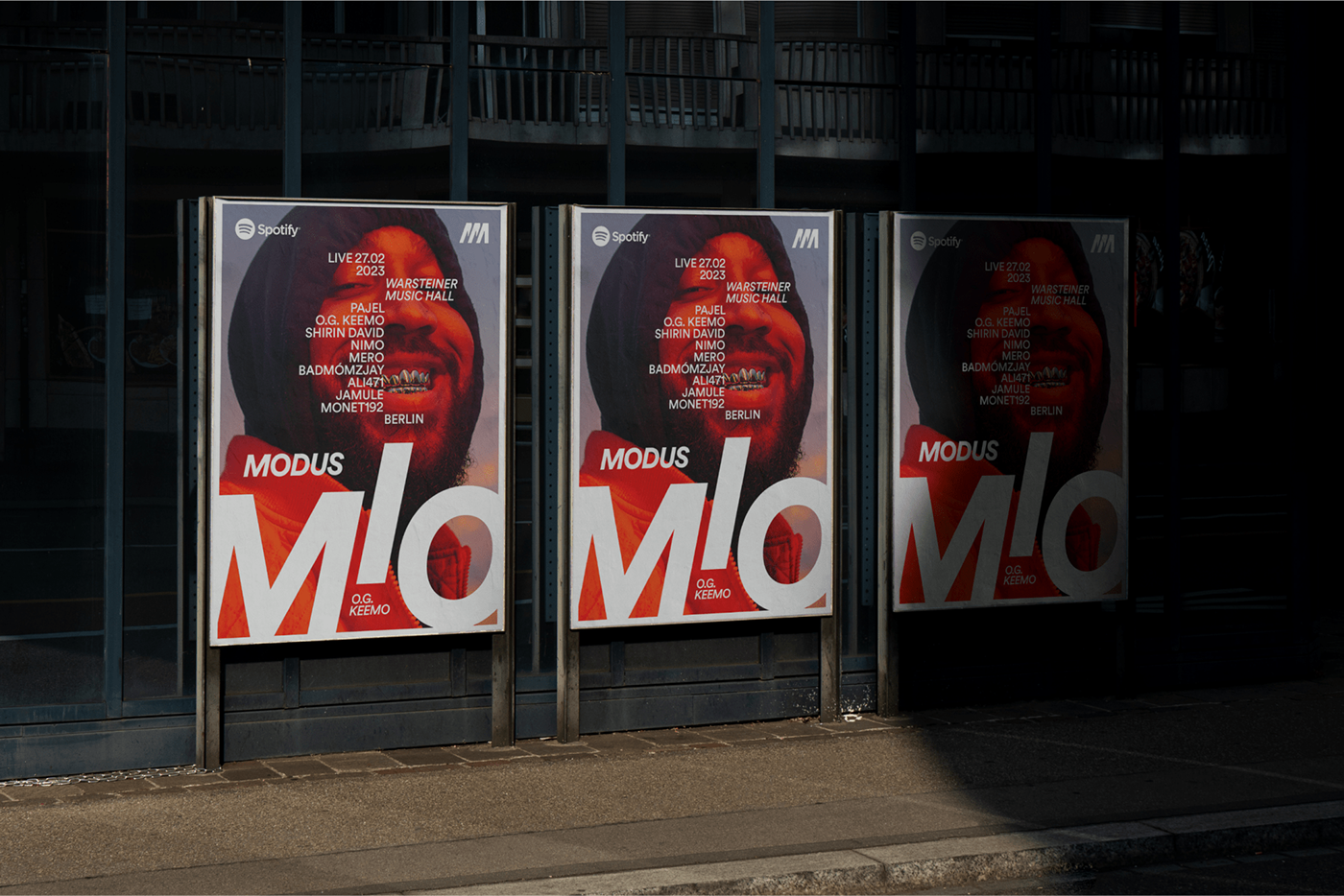
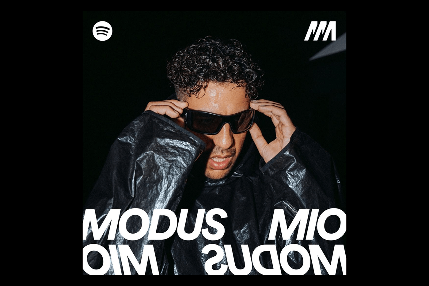
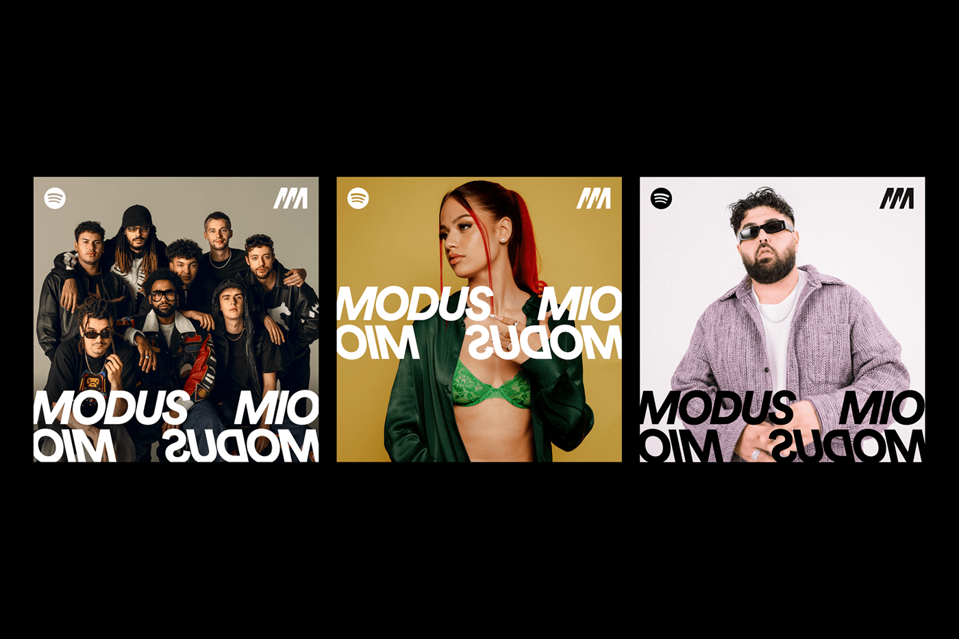
Brand Design Identity for Spotify’s Modus Mio – the most important hip-hop playlist in Germany, Austria and Switzerland. With now well over 1.8 million followers, Modus Mio is currently the most sought-after playlist in the hip-hop scene.
The graphic design and art direction allow the communications of “Modus Mio”, which means “My Mode” or “Mode Million”, to be loud when needed, and more toned down when necessary. The art direction helps artists in expressing that they sometimes can be big and bold, sometimes the complete opposite of you and everyone else. It’s all about reflecting on what hip-hop is all about.
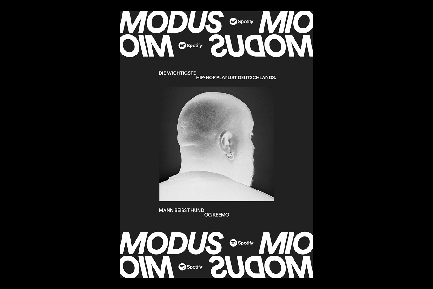
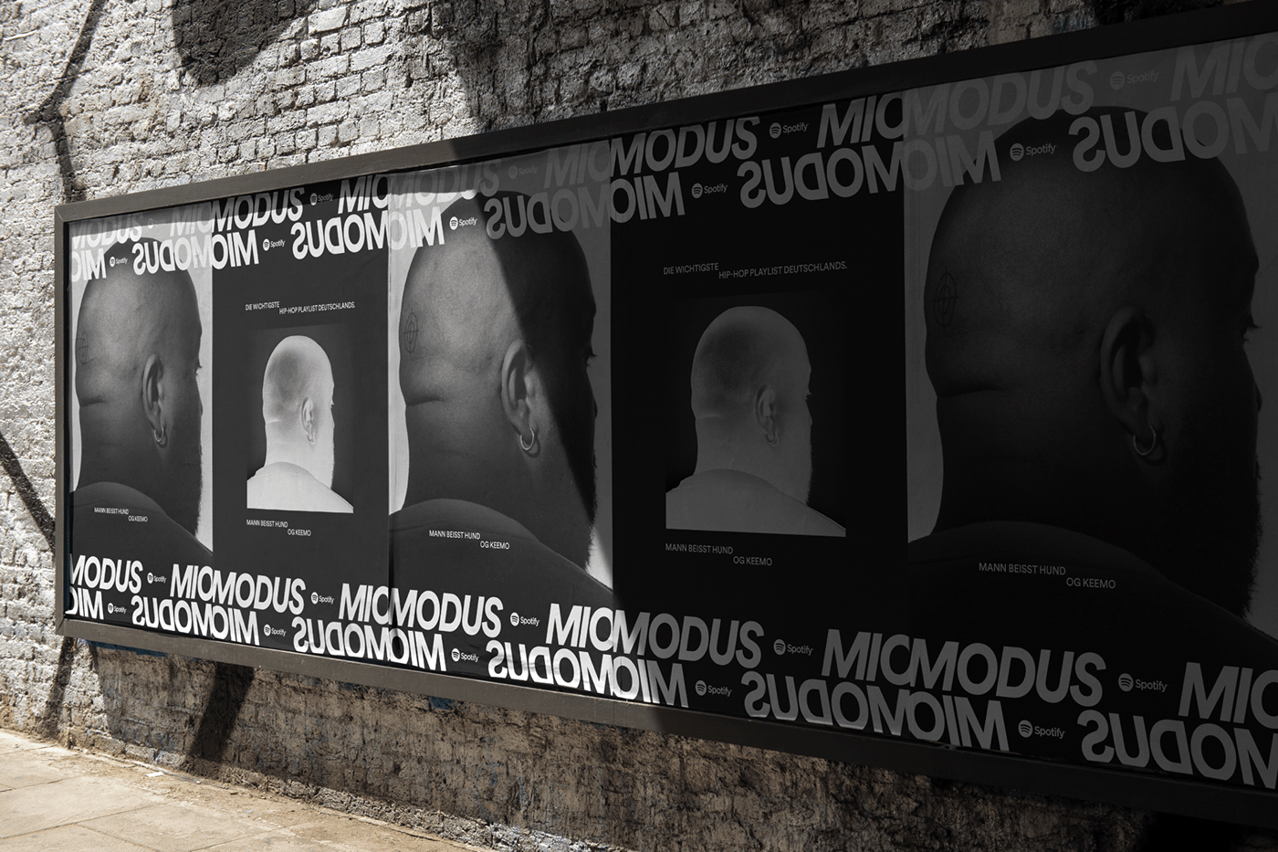
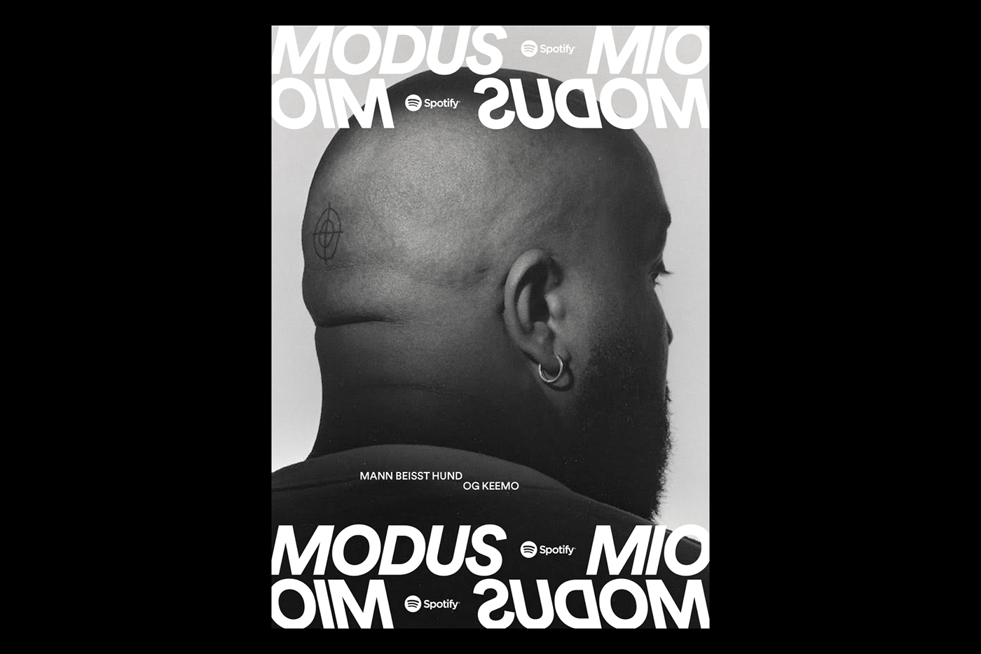
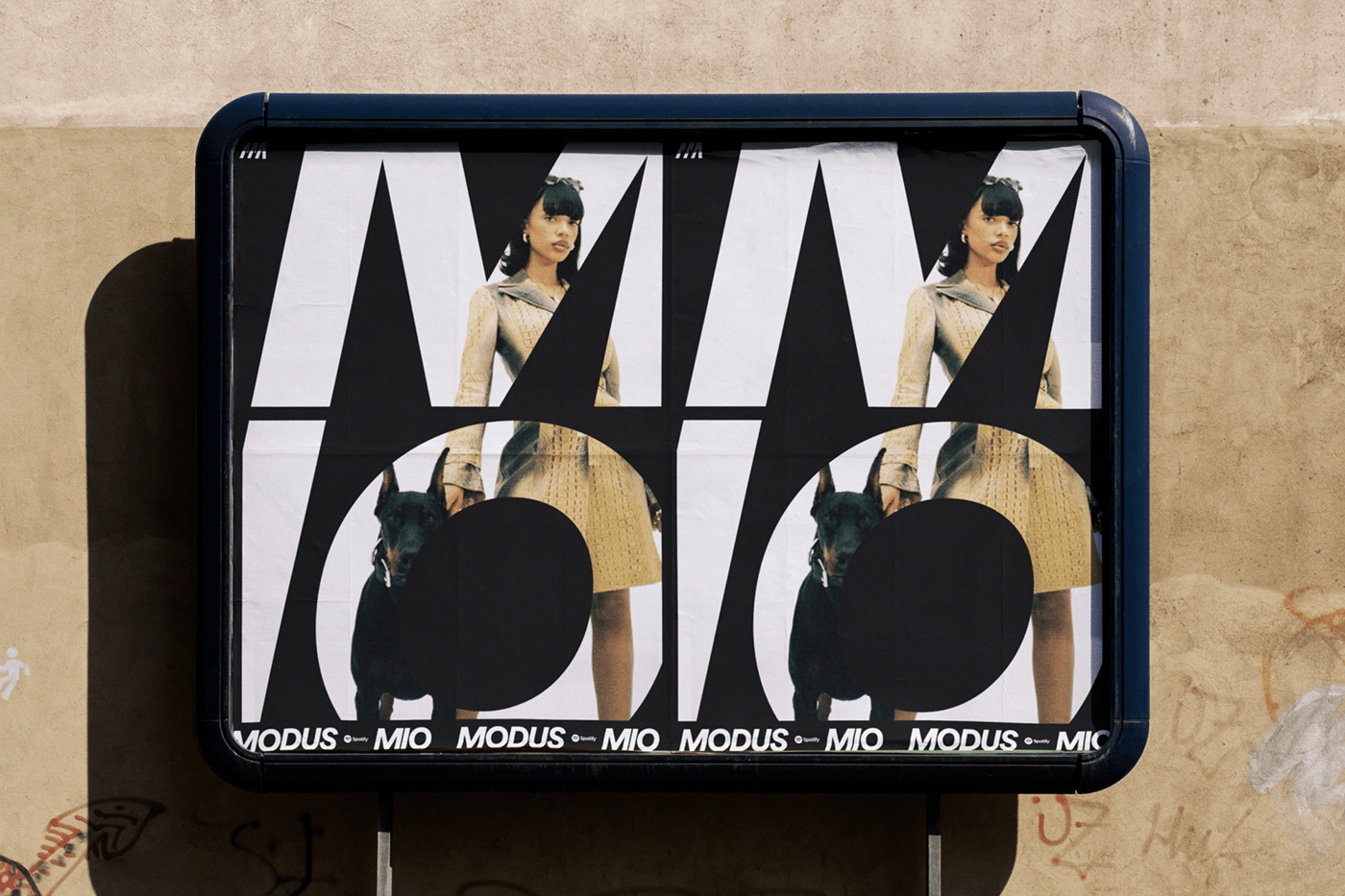
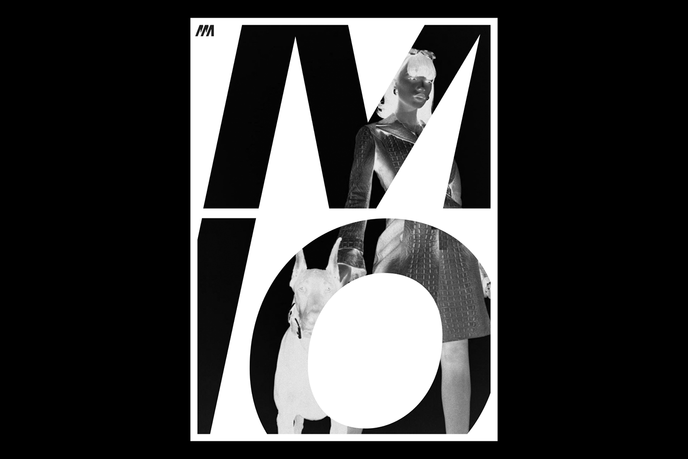
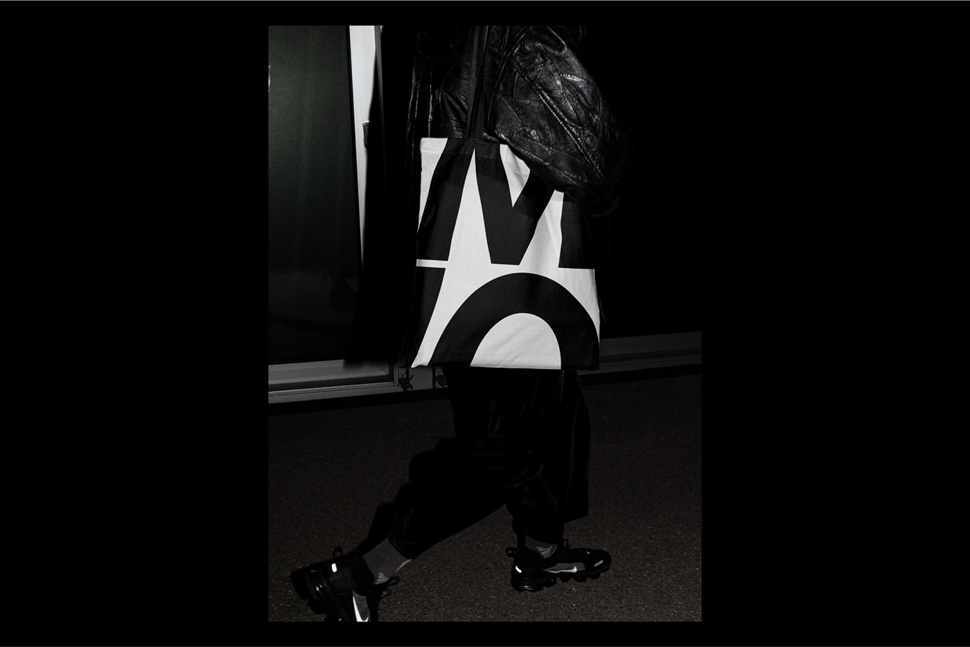
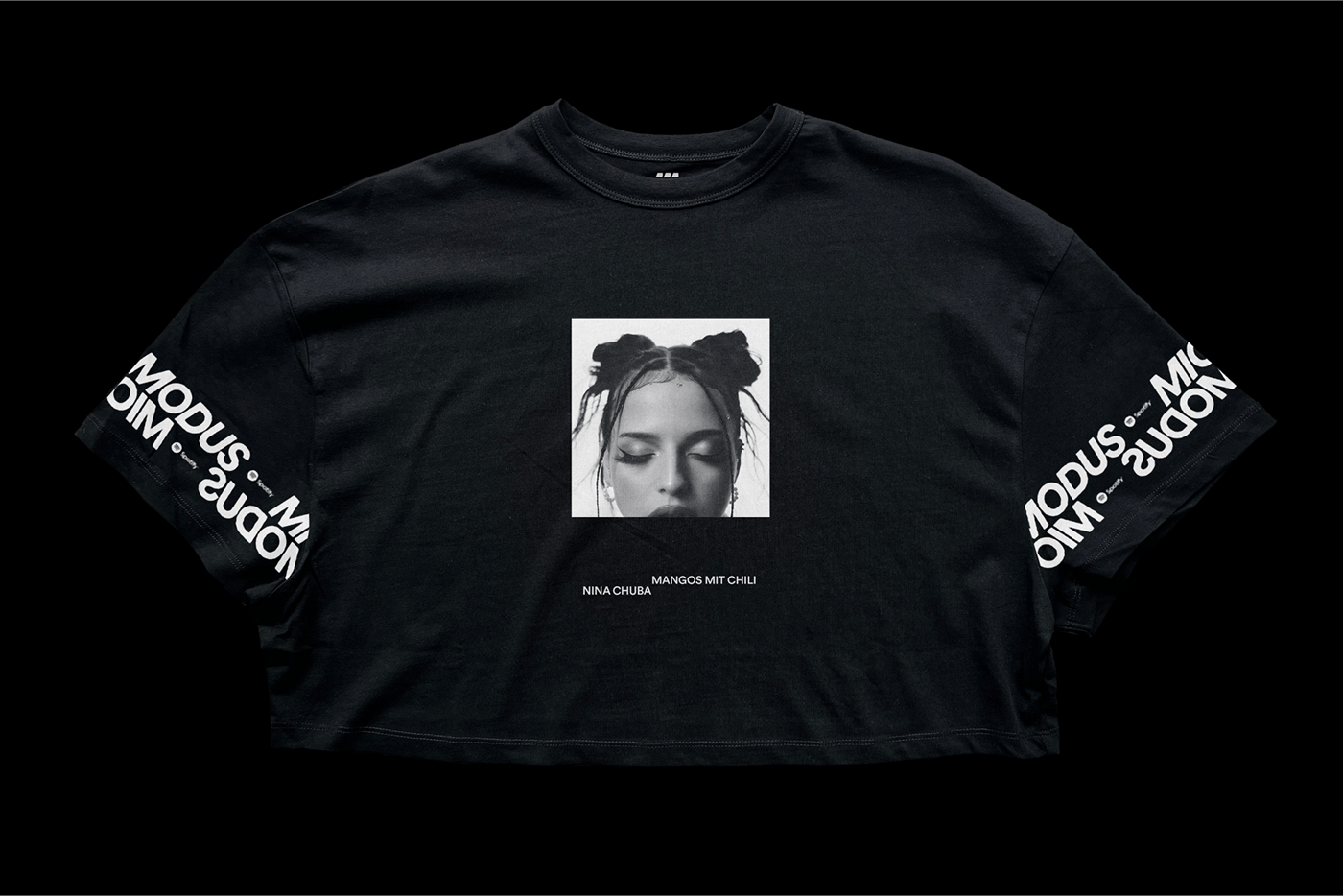
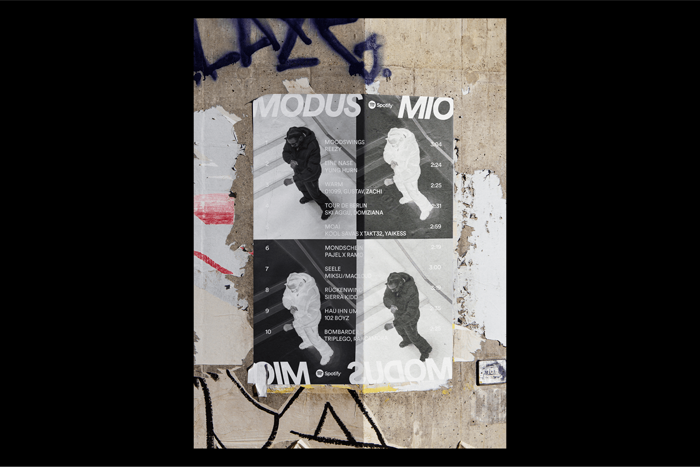
The brand identity relies on a specific set of typography lockups, set in Spotify’s Circular, that are always going against each other and lean from the left to the right. They are not going to be still and straight up. They will always lean and have a distinct presence.
This is combined with an inverted image treatment that helps to show the opposite side of every artist. The brand identity is solely relying on black and white colors to create and build on the same contrast of either this or that. It’s all about establishing a simple yet impactful visual world where the artists take the center stage.

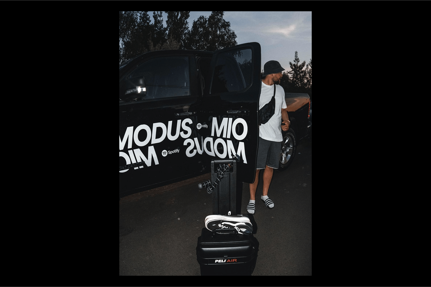
The playlist rebranding was launched at one of Europe's biggest hip-hop festivals, “Splash!” last summer.


Design & Art Direction: Studio Herrström
Client: Spotify
Art Director: Shahin Haghjou
Spotify Germany: Vanessa Nikolidakis, Michael Schneider, Davide Bortot (A Color Bright)
Editor: Gerwin Laux
Project Managers: Michelle Pham and Loren Lee
Photography Credit: Leo Schaefer, Shafeeq Nickels, Tom Kleinschmidt
Agencies: DOJO, UM (Media), A Color Bright, DEPARTD, MIKADO CULTURE.


