

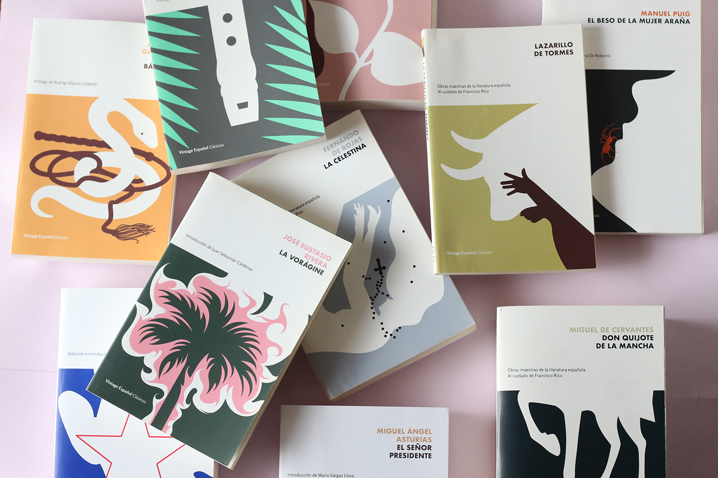
This Vintage Classics series was an open selection of really popular titles from many different latitudes of the hispanic world, from Guatemala to Spain and Argentina as well. Aimed for Spanish readers in the US, conceiving it as an homogeneous literary landscape was impossible, specially when we were supposed to make them resonate with readers from such as various backgrounds as the ones you can find in the country.
Each of these books is staple in literature classes, well-read critics, scholars and many authors homelanders would definitely scrutinize our work, so then we embarked on in-depth research, not only on the texts but also on the critical and public reception these had over the years.

'
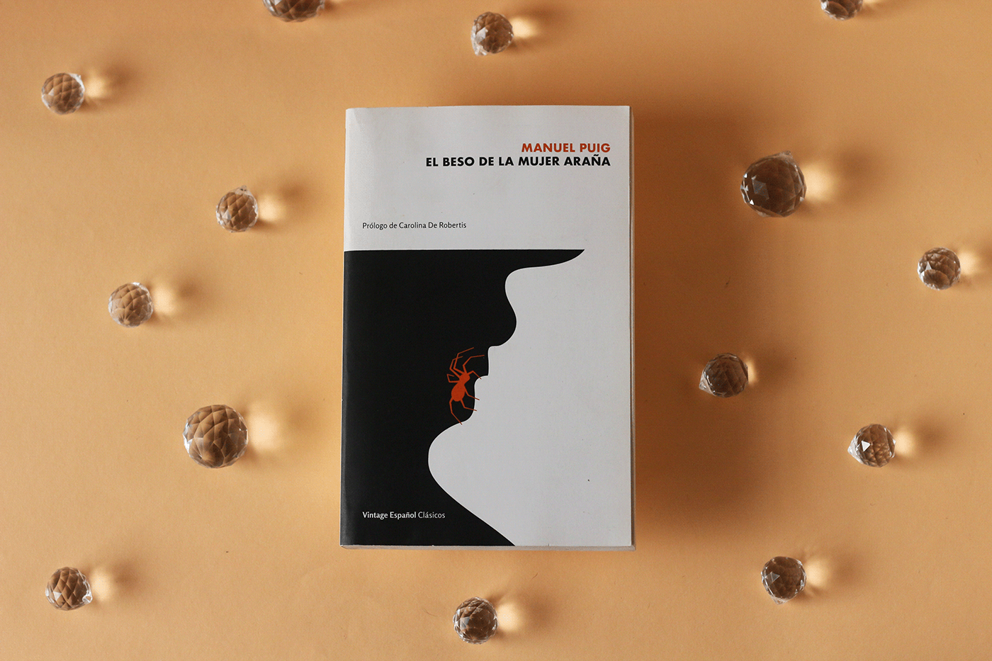
'El beso de la mujer araña', Manuel Puig (Foreword by Carolina De Robertis)
'Estados Unidos en la prosa de un inmigrante', José Martí (Foreword and selection by Nésto Díaz de Villegas)
'La vorágine', José Eustasio Rivera (Foreword by Juan Sebastián Cárdenas)
'Doña Bárbara', Rómulo Gallegos (Foreword by Rodrigo Blanco Calderón)
'El señor presidente', Miguel Ángel de Asturias (Foreword by Mario Vargas Llosa)
'La Celestina', Fernando de Rojas (Edited by Francisco Rico)
'Don Quijote de La Mancha', Miguel de Cervantes (Edited by Francisco Rico)
'Lazarillo de Tormes' (Edited by Francisco Rico)
'Historia verdadera de la conquista de Nueva España', Bernal Díaz del Castillo (Edited by Francisco Rico)
'Los pasos perdidos', Alejo Carpentier (Foreword by Leonardo Padura)


The research included collecting as many previous local and foreign editions covers as possible to set a huge board of characters, metaphors and imagery around each title.
Hispanic literature spans a wide spectrum, encompassing urban, rural, historical, and modern narratives. To get meaningful covers, we had to immerse ourselves in the heterogenous popular knowledge of this stories.
To get some balance between tradition and innovation seems like a very usual brief in modern cover publishing. But if we also wanted to bring new readers to them, we should avoid using too specific regional references on the cover. It must convey an open, modern approach to the story, just as if they were being issued for the very first time. Or ‘Infusing them new life’ on them as Zachary Petit wrote on his article for Print Magazine.

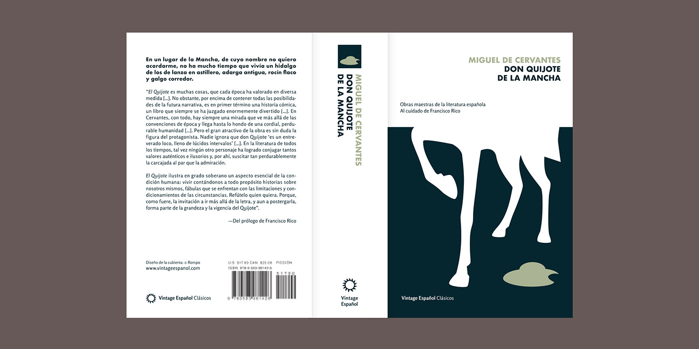


Our first shot was on 'Quixote' which I presented to the team in a variety of drafts from two different styles. The one featuring a classical hand drawing portrait of the main character and a second one where he didn't appeared at all. We could only see the legs of his errant steed and his helmet lying on the ground as a subtle symbolism of the man losing his mind.
We all loved it, happily. And at this time, the visual poles remained pretty clear. Type was going to do the traditional work, giving titles enough prominence and space to settle the coordinates and boundaries of the entire layout. And the illustration would do just the opposite. Seeking to get as different compositions as possible each time without needing more than a pair of Pantone inks. Seemed dynamic, so we would manage...
I was still really stunned by the discovering of Juan Cotta's work on the 'Libros del Mirasol' books some decades ago in Argentina. Just loved how his colourful, expressive language fit perfectly both classic and modern literature without losing the same graphic coherence. So I remember coming up with a bunch of his artworks the very first time Megan (Wilson the art director), Cristobal (Pera, the editor) and myself discussed the project. So, his vibrant, synthetical and freely influence was a really conscious one to me.
By the third book from the series we all knew that there's also an intentional will of giving each scene a dramatic sense by closing the 'camera' right to the point where the action is barely noticeable. You know, there's always something happening apparently beyond the limits of the frame. And that honestly remained almost the only brief I'd in mind each time Megan prompted with a new title from our collection. Mixing at least two objects/elements, and that.

Nevertheless only now a few years later, I can notice the big influence of Megan's work on her cover for Vintage Classics's 'Dracula' and Nabokov's 'Lolita', which'd always been one of my very favourite pieces of design in the world. That sense of drama, you can see nothing but the detail of a human neck. There’s not even a clue of what’s going on there. What's the lady doing or who’s she with. Yet you can certainly say. The effect is super disturbing, and memorable.
So this is our design for this Vintage Español series. A colourful illustration set and the perfect excuse to take the time to jump into these all time classics. A really fun routine during almost a year of my life I would say.
Year: 2019 - 2021
Publisher: Vintage Books USA
Design & Illustration: Max Rompo
Art director: Megan Wilson
Editor: Cristóbal Pera
Photos: Aylén Temer
Animation: Ale Pippa


