

Year: 2022
Stretch Unit
Identidade Visual / Visual Identity
PT.
Stretch Unit: Elevando a Liderança Moderna com Disciplina
Stretch Unit: Elevando a Liderança Moderna com Disciplina
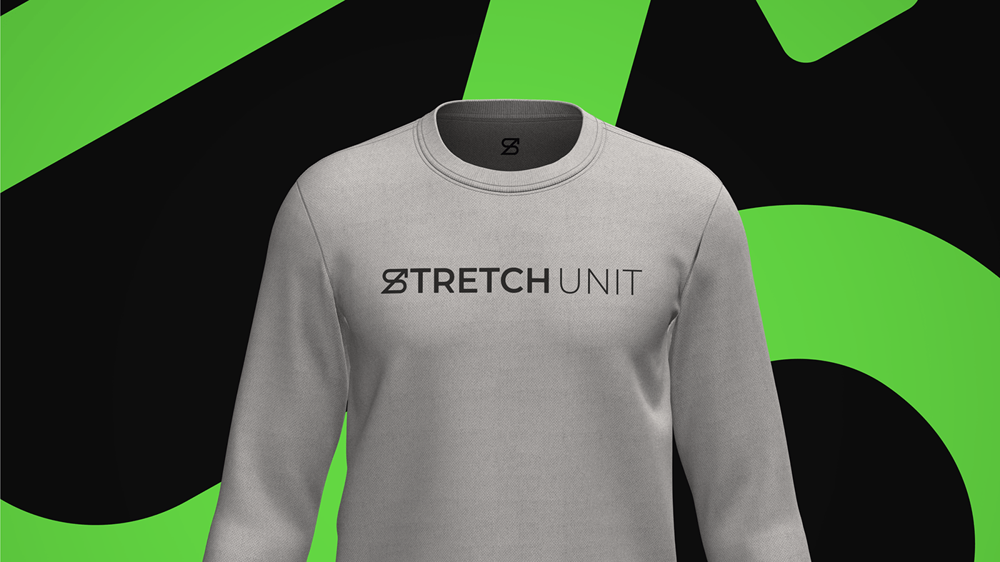
O Stretch Unit, um time de vendas excepcional da Pagar.me, que faz parte do grupo Stone, emerge como uma marca singular e impactante. Sua comunicação direta e envolvente é forjada em torno dos princípios fundamentais de modernidade, liderança determinada e disciplina. Esses alicerces permeiam o logotipo moderno e minimalista, onde a letra "S" se estica, dando origem a uma flecha ascendente que simboliza não apenas crescimento, mas também a busca constante por progresso.
EN.
Stretch Unit: Elevating Modern Leadership with Discipline
Stretch Unit: Elevating Modern Leadership with Discipline
The Stretch Unit, an exceptional sales team from Pagar.me, which is part of the Stone group, emerges as a unique and impactful brand. Its direct and engaging communication is forged around the fundamental principles of modernity, determined leadership, and discipline. These pillars permeate the modern and minimalist logo, where the letter "S" stretches, giving rise to an ascending arrow that symbolizes not only growth but also the constant pursuit of progress.


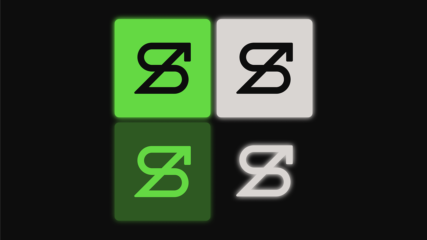


PT. A seta na extremidade superior do logotipo é uma homenagem ao arqueiro anteriormente utilizado, transmitindo visualmente não somente um vetor de crescimento, mas também a ideia de velocidade e direção clara. O Stretch Unit é mais do que um time de vendas; é uma representação visual da determinação de liderar com inovação em um mundo em constante evolução.
EN. The arrow at the upper end of the logo pays homage to the previously used archer, visually conveying not only a vector of growth but also the idea of speed and clear direction. The Stretch Unit is more than just a sales team; it's a visual representation of the determination to lead with innovation in a constantly evolving world.


Obrigado!
Thank you!
Developed: Studio Cage
Project: Strech Unit
Visual Identity
For projects contact:
Hello@studiocage.cc


