NA JANELA - VISUAL IDENTITY - BRAZIL, 2023
An artisan bakery that invites people to discover the true essence of the good bread.
Na Janela is an artisan bakery located in São Paulo, founded by three partners with diverse experiences, aiming to establish an excellent gastronomic business and make easier the people’s access to quality bread. With their take-away products, they aim to become part of the daily routine of their audience, offering in a simple way real food with natural ingredients selected. The essence of the brand is to encourage people to enjoy good times and the taste of good bread, even in busy life.

DISCOVERY
Initially, I conducted research and collected testimonials to gain a deeper understanding of the brand. This process helped me identify three core concepts that would make the brand distinctive.
URBAN: We understand the rhythm of the city. We make everyday life simpler with our efficiency and organization.
KIND: We are helpful, friendly, and we make our presence felt in people's day through small gestures.
METICULOUS: We offer excellent products, handcrafted with care and high quality standards.
GOALS & SOLUTION
With the brand's personality characteristics clarified, the next step was to think about strategies to effectively communicate them through visual identity.
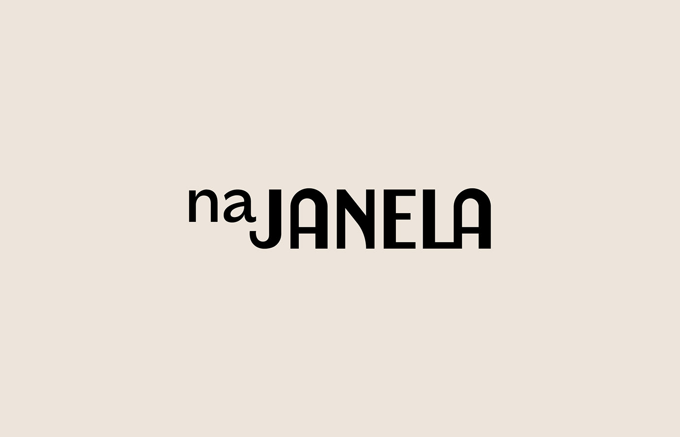
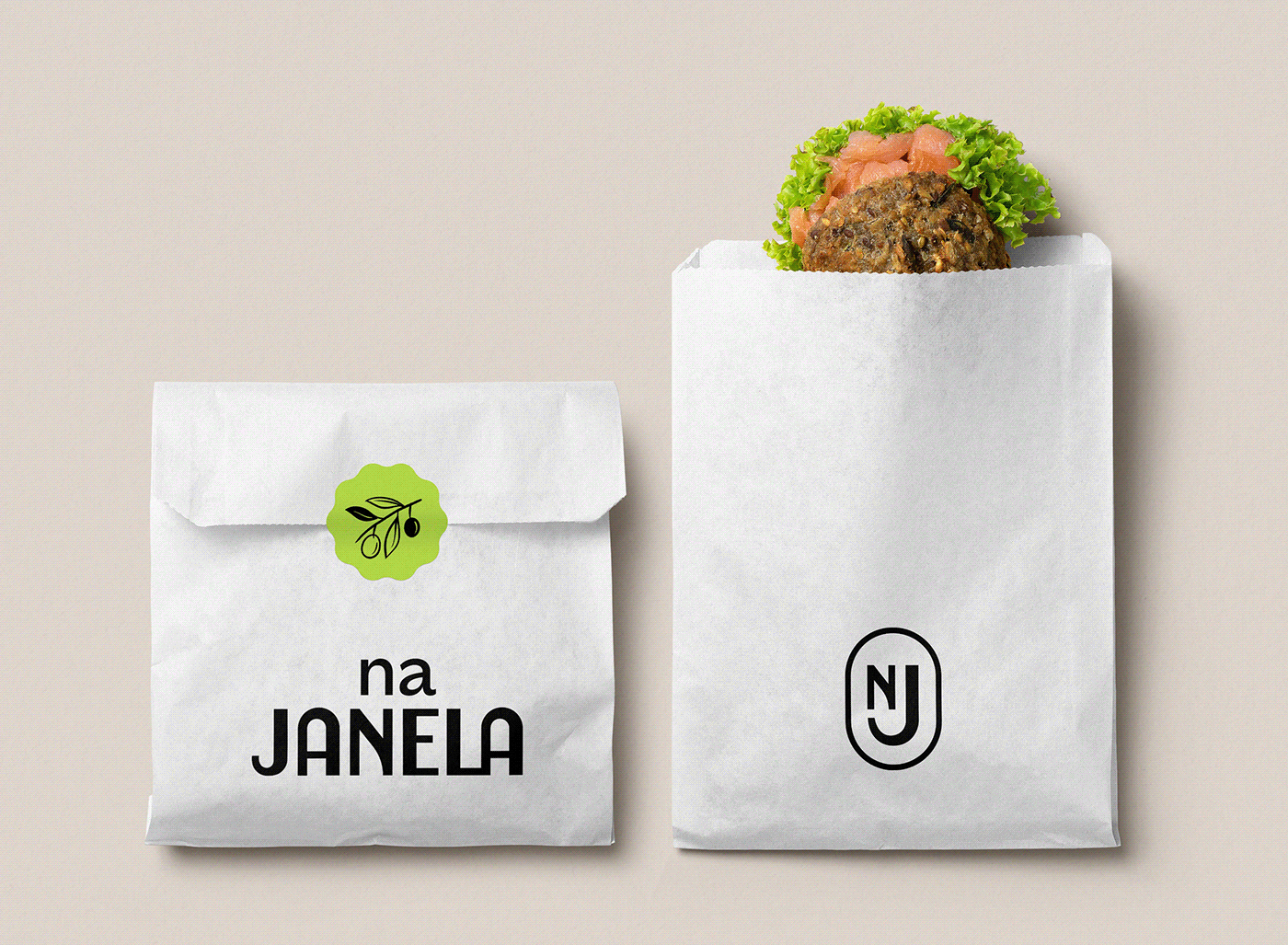
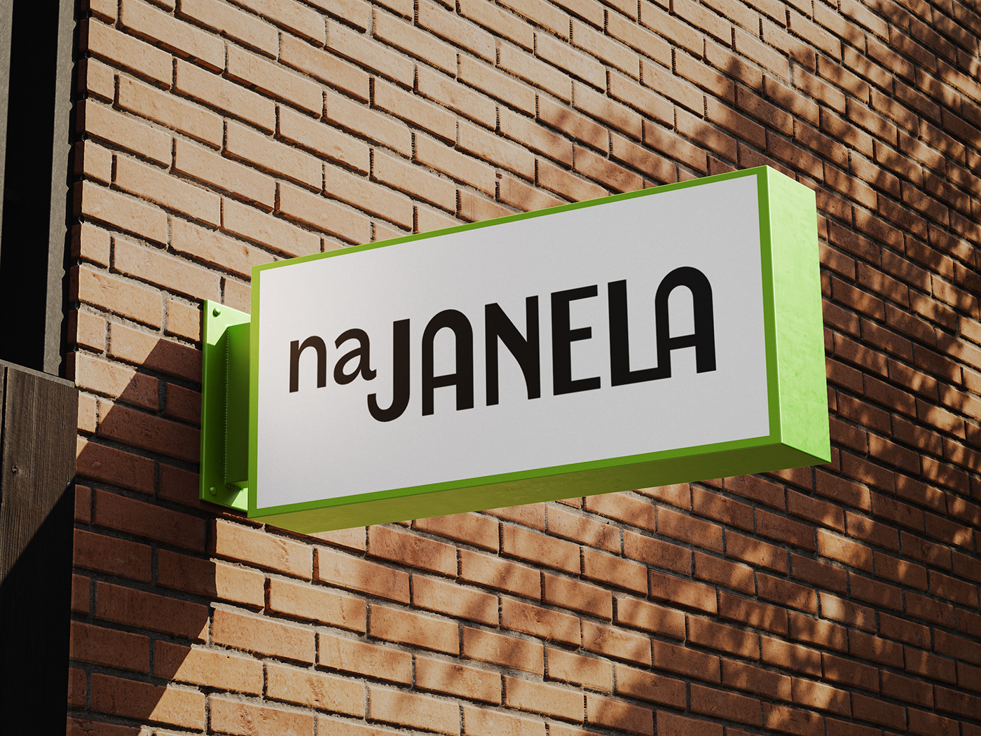
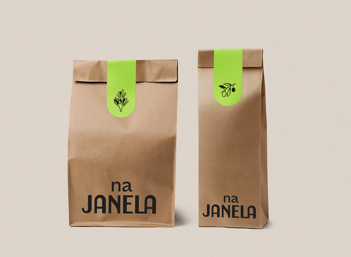
LOGOTYPE: It's important to think of a logo that puts together tradition with the agility of modern life. Develop a straightforward and sophisticated lettering, without losing the feeling of proximity is a way to unite these two worlds. Small adjustments to the letters can give them a handmade look.
TIPOGRAPHY: A bold style can help the brand stand out in the city, conveying authority and personality. The narrow width makes it easy to apply the text, giving it more elegance and objectivity. Considering the rhythm of the city and the movements of kneading the bread, I looked for a typography with a very dynamic negative space.
COLORS: Shades that refer to the texture of bread, such as cream, brown, terracotta, bring a more appetizing and cozy sensation. Experience and sophistication can be conveyed through the color black. A bright color could stand out in the palette, as it represents the dynamism and memorable presence of the brand in people's daily lives.
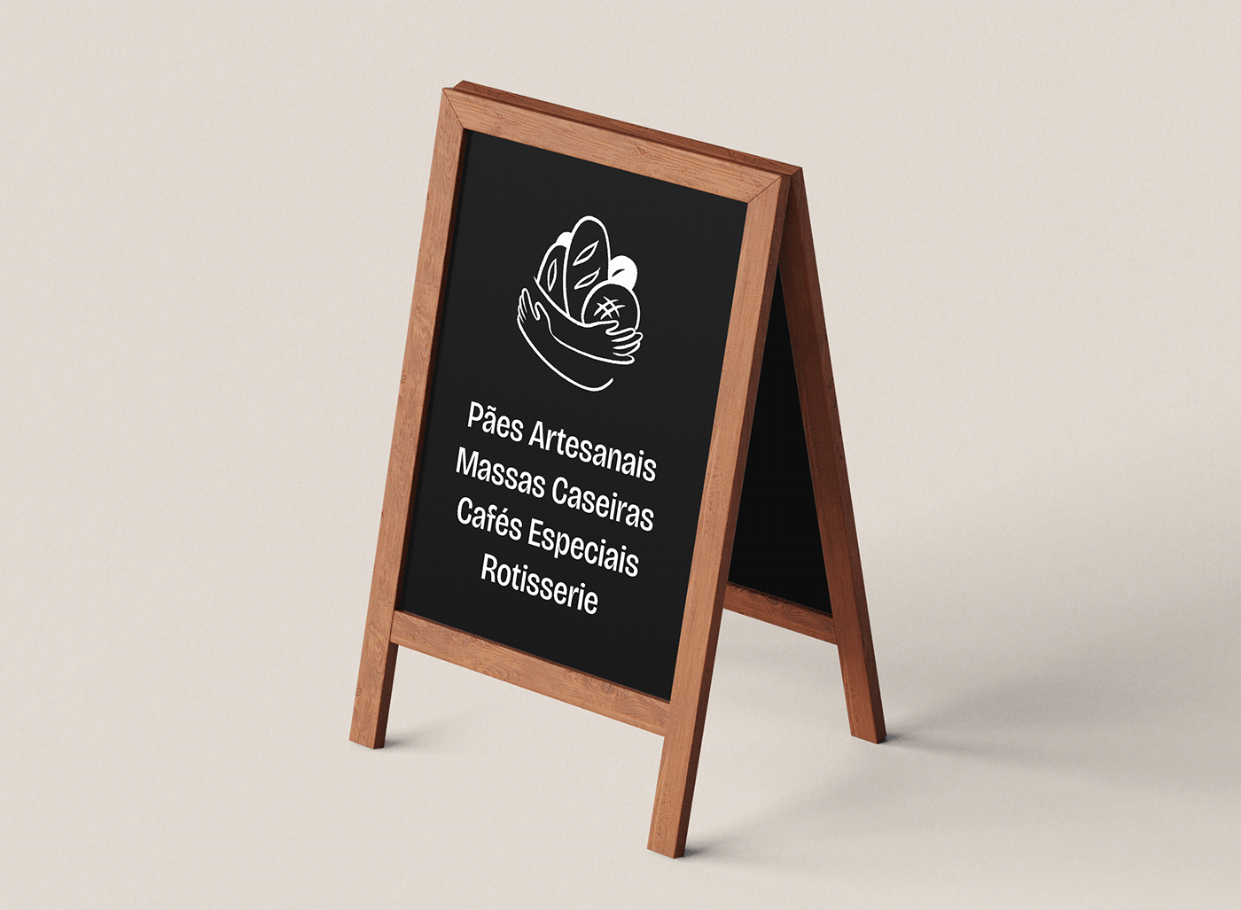
SUPPORT GRAPHICS: The visual universe would be enriched with light drawings of simple and rustic style, like sketches made unpretentiously on a day in the city park. Handmade friendly strokes that symbolize the small gestures.