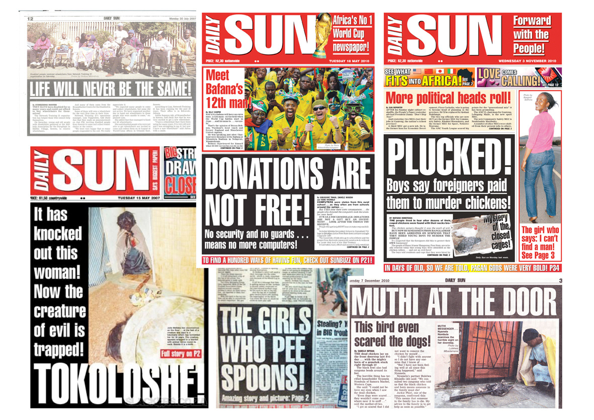
Our basic thematic style of this campaign is in-keeping with the tone and style of the Daily Sun. This entails making use of the ambiguous and sensationalist headline style in the Daily Sun – often perceived as a “big deal” headline, which is clarified to its truth in the subhead. e.g: Headline: We are at war! Subhead: Community declares war on ant infestation.
The headlines are perceived as being inflammatory, but are defused by a short and succinct explanation in the sub-headline.
The headlines are perceived as being inflammatory, but are defused by a short and succinct explanation in the sub-headline.
The fact that we have the word “whiteness” at our disposal as one of the main Surf KSP’s, creates the ideal opportunity within our medium of the Daily Sun to exploit the sensationalist nature of the word and communication meduim. People have learnt to assume that any reference to colour in this manner, automatically refers to skin colour, and we believe that overturning their expectations (when they realise that it refers to laundry) will create a smile, as well as talkability, which will aid in creating awareness around the product.
In our ads, the style of the headlines is intended to draw attention – with sensationalist use of the word “white” to create initial interest and questioning, with the sub-line explanation clarifying that it actually refers to white laundry. In terms of layout, the copy is placed centrally, surrounded by a large space of white. The purpose of this is to ensure that the ad stands out amidst the traditionally very crowded newspaper layout. This increase in white space also aids out message, as it gives the impression of a cleaner and whiter space.
In our ads, the style of the headlines is intended to draw attention – with sensationalist use of the word “white” to create initial interest and questioning, with the sub-line explanation clarifying that it actually refers to white laundry. In terms of layout, the copy is placed centrally, surrounded by a large space of white. The purpose of this is to ensure that the ad stands out amidst the traditionally very crowded newspaper layout. This increase in white space also aids out message, as it gives the impression of a cleaner and whiter space.

“You’ll look so much whiter and brighter if you go back to using Surf.”

“Are your whites looking dull? Bring back their whiteness with Surf.”


“Now that Surf is back, everyone in the street has whiter laundry ever before.”

“She just can’t get enough of her whiter washing, now that she’s gone back to using Surf.”

“Their super white washing shows that they’ve all gone back to using Surf.”

“If you go back to Surf you’ll have a whiter and brighter look.”

“I’ve had enough of dull whites - I’m going back to using Surf.”
After the series of “teaser” ads, we have a great reveal – a full-page insert printed on bright white paper (as opposed to traditional newsprint) inserted in the center of the Daily.

“Look at this page. Now look at the page next to it. It’s easy to see which page is brighter and whiter.
Surf is back and the dullness ends here!”
Surf is back and the dullness ends here!”

“Surf is all about whiteness and brightness.
That’s why we are ‘No. 1 for whiteness guaranteed’.
If you want guaranteed whiteness, you need to go back to using Surf - today.”
That’s why we are ‘No. 1 for whiteness guaranteed’.
If you want guaranteed whiteness, you need to go back to using Surf - today.”

“I’ve gone back to using Surf. Have you?”
As a repetition of the key message: The same humorous message will run for two additional days, serving as reinforcement of the same message, as well as wrapping the campaign up with a smile.

These are suggested additional media, designed to increase talkability around the campaign.


Surf-Whiteness is Back Campaign. JWT JHB. 2011.
Writer: Christine Voorendyk & Mariske van den Berg
Art Director: Mariske van den Berg
CD: Theo Clarke
Client Service: Annie Lazarevski, Dianne Fraser & Clair Fletcher
Writer: Christine Voorendyk & Mariske van den Berg
Art Director: Mariske van den Berg
CD: Theo Clarke
Client Service: Annie Lazarevski, Dianne Fraser & Clair Fletcher
