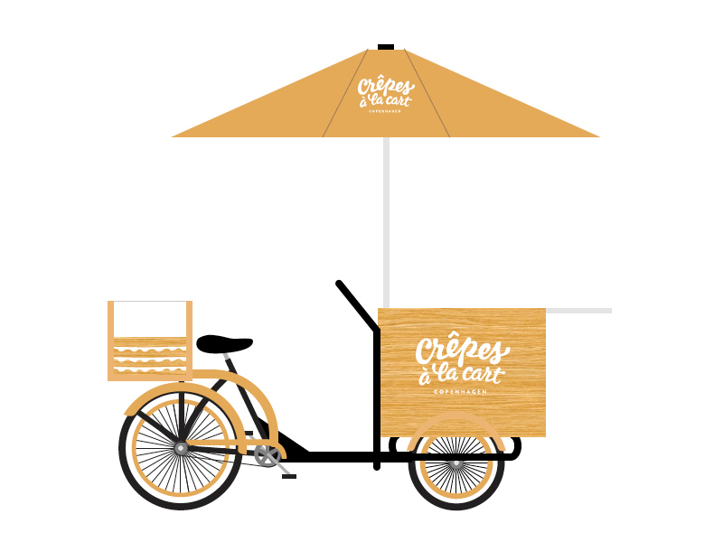
While walking the streets of Copenhagen you may see a bicycle carrying organic pancakes, Crêpes à la Cart; I was commisioned to design the brand’s identity.
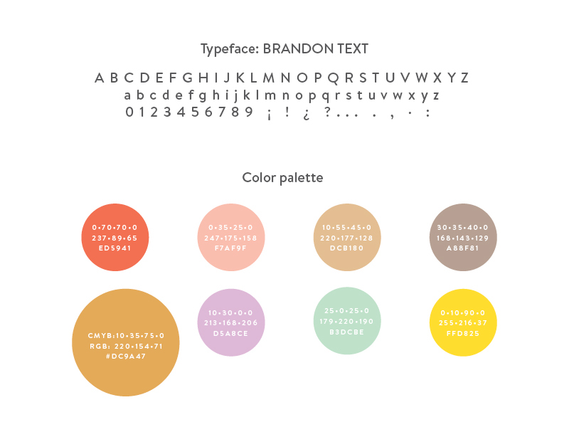
I started the logo design by writing the name's brand with a Pentel brush on rice paper, then redrew the shapes so that the final version reflects the fluidity of the crepe batter. After defining the lettering, I chose Brandon Text, by HVD Fonts, as a companion typeface, due to its modern look combined with a warm touch.
Additional elements like the wavy pattern, the color palette, the materials: natural pine and Kraft paper, plus the photography tone, complete the brand's personality.