The Brief:
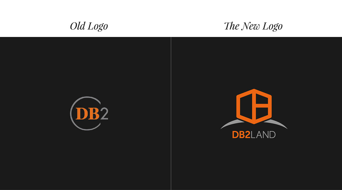
DB2Land, a boutique property development company, is known expertise for quality development. Its name consisted of two initials ("D" and "B") to represent the two founders of the company. The company was looking to refreshen their logo, and worked with Petit-o! to explore the possibilities. This post features one of the proposed versions.
Problems Identified:
• Lack of significance for “D” and “B” in the old logo.
• Does not imply what the company does.
• The design could not do justice to the company's current standing in the property industry.
• Does not imply what the company does.
• The design could not do justice to the company's current standing in the property industry.
Design Objectives:
• To improve the company's brand positioning and logo identity.
• To intelligently indicate a hint of their business context.
• To intelligently indicate a hint of their business context.
Design Rationale, Creative Elements:
• A building block – the backbone of property development – is formed by the two alphabets "D" and "B".
• Partnership, Cohesiveness, Stability are reflected in the symbol.
• Always above the horizon - an indication of the company's mission and values.
• Partnership, Cohesiveness, Stability are reflected in the symbol.
• Always above the horizon - an indication of the company's mission and values.

Development Phase
Thank you for viewing! View more like this on www.petito.sg

