

«Tasty help» is known for it's delicious sweet presents in creative packaging. The most recognizable of them is a plastic bottle, filled with something sweet (or spicy sometimes). And one day they asked me to make a new visual identity system for the brand, including sale points graphics, card stickers, business cards and some more. (Logo is mostly untouched)
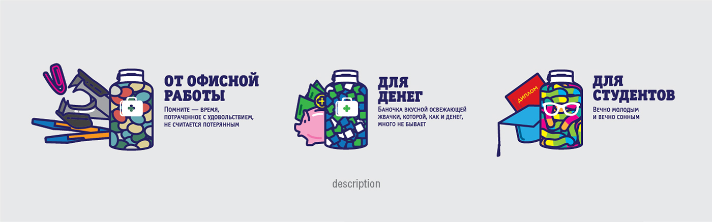
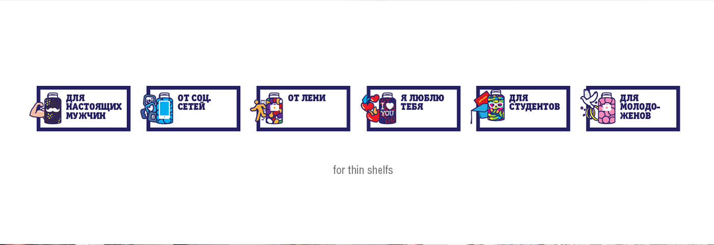
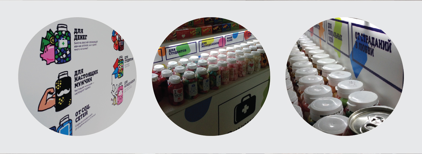
They had a problem to present their products to new people on their sale points, so I decided to make a menu-like list with colorful illustrations and put it right on those points. Every illustration have a little description next to it: the name (like «for students» or «for happiness»), use cases (ex. «to pull that all-nighter»), ingredients (as an illustration) and some themed graphics. So people can choose what they want using this «menu», and then ask a seller for more information more specifically.
When a simple colorful pattern of candy-like shapes was made to, all this graphic was adapted to various sale points they used and expanded to other mediums like business cards and vending machine stickers.
All in all, this was a really fun project to work on, and I hope it will be fun for you to look at too :)


Designed by: Anton Shlyonkin
Sale point construction and modelling: Liza Arsentyeva
Art direction: Anna Goncharova


