Sacramento Candle Company
Logo & Label Design
Logo & Label Design
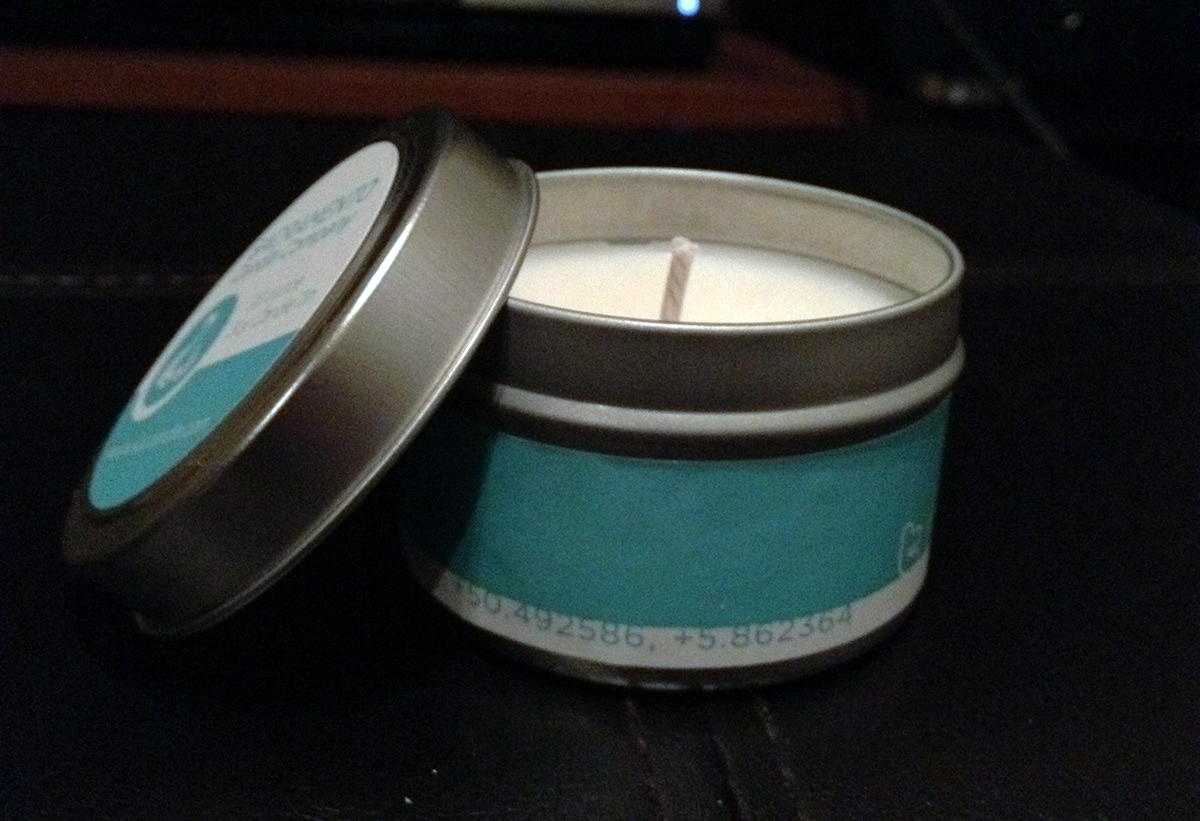
Sacramento Candle Company sought an identity to define their vision as a soy-based candle enterprise. I chose to go in the direction of a modern concept, creating a logo that paralleled a handmade product, combining positive and negative space to "form" the design. The labels play on the roundness of the tin along with a grid broken into thirds. Coordinates were placed on each label to engage the end user into discovering a special place the design was based from. A "Signature" series will be available year-round, while a "Holiday" series will be available during the winter season, and have a foil-based applique.
Overall, a very fun project!
Overall, a very fun project!