Selecore
Logo design process + Business Card Design
Located in Finland, primarily focusing on iporting new innovative products and secondary focus is in exporting items produced in Finland. Client wanted serious, modern and strong logo. He also mentioned that he loves when the logo has a hidden feature or message.
Type


This version is made to look elegant and modern, with a feel of speed and movement in it. You can see subtle arrows made of positive and negative space pointing left and right.
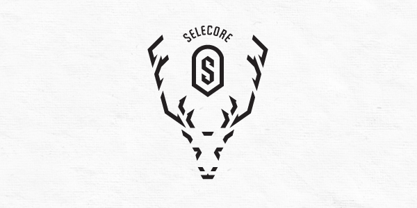
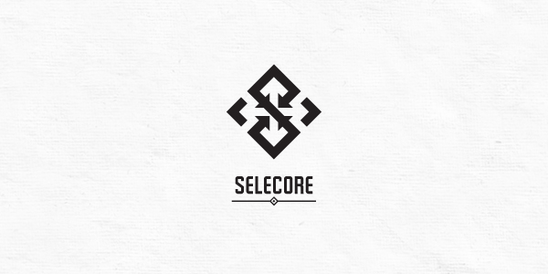
If you look at (any) letter "S", it has two gulfs, (letter is land and white space is the sea). When you look at the mark that way, arrows are pointing inside gulfs/harbours (import). On the top and bottom of the mark you can see half-arrows pointing out (export).
If you look at (any) letter "S", it has two gulfs, (letter is land and white space is the sea). When you look at the mark that way, arrows are pointing inside gulfs/harbours (import). On the top and bottom of the mark you can see half-arrows pointing out (export).

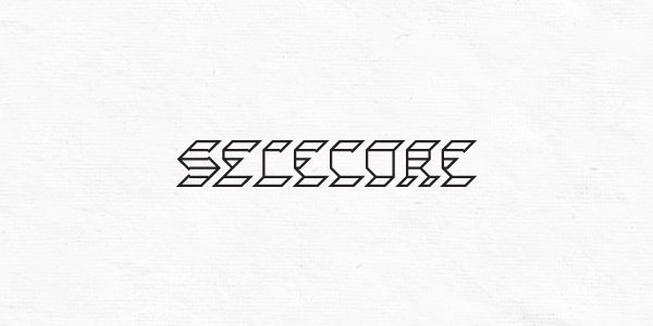
This is custom made typeface inspired by the "S" letter. Half-arrows can be seen on some letters. When you look at the whole word it looks like tire track, which simbolizes movement of goods.
Reindeer
There are around 200.000 reindeer in Finland (Lapland region). They are part of culture and lifestyle. Many people are reindeer owners and use them for food, transport and even for racing.
Reindeer is the symbol of soul guardian, honor of life.They are also one of the first beasts of provision relied for food, supplies, warm clothing and tools,which is nice connection to importing and distributing goods.
Besides from that, Rudolph (the red nosed reindeer) is the biggest exporter in the world, even though he works only one night a year :D

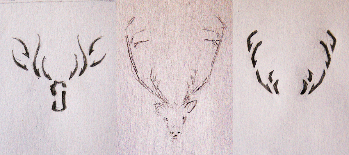


The mark shows alpha male reinder, strong and confident. The horns are made of arrows.On each horn 3 point to head (import)and 2 small point from head out plus 1 arrow in negative space on top of each horn (export).
Arrows
Since Selecor's primary focus is import, I wanted arrows pointing inside to be more obvious than those pointing outside. After some more sketching I came up with letter "S" made of import arrows, while export arrows and cross being in negative space.


Client
Petri Hind, Purchasing Manager
Petri Hind, Purchasing Manager
" Right now I am seriously impressed, your design is simply fantastic! The moment of opening the mail was quite confusing, since I didn´t know what to expect, but you made me definitely speechless for a while there. So the first reaction / impression: Awesome! "
" I think this logo will be very easy to use, memorize and it will leave a good impression for sure :) Honestly, the more I have seen it, the more I find it ingenious and more sides of it seem to come up!"


Client
Petri Hind, Purchasing Manager
" The first thought I had yesterday opening the images was "Man, this guy can work wonders"! I seriously love the Logo, and the card is a perfect combination of the elements I was hoping for. "


- Featured on -
- Awards -
LogoLounge 8 Award, 2013
Brands of the World 2012, Bronze Award
LogoMix Top 10 Logos of the Month, March 2012.
- Publication -
LogoLounge 8, Rockport Publishers, 2014
* * *
Thank you for watching, commenting and appreciating!