Wedding Identity
Bold tastes from two different continents made this wedding in 2011 a design element that encased two different languages, two different perspectives and aesthetics that tied together to become the final knot.
Working with these clients was a valuable experience in that I learned the significance of being on a deadline so that invitations could be sent out in a timely manner, allowing guests to have ample time to reply and plan accordingly because the invite list included those from both the United States and Spain. This international guest list presented the need for a bilingual invitation that wasn't overly repetitive and remained simple and bold despite the double amount of copy required.
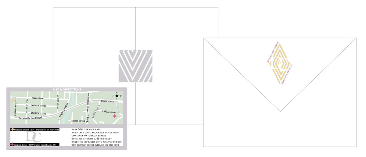
The monogram in the middle was a requirement of the client, they wanted a letterform arrangement to be part of their wedding so example research became a factor, as well as type research in order to correctly identify the couple. Manipulating design elements from the invitation to create a system that could be used with a vectorized map, invitation closure (which doubled as a closure for the 'thank you' gifts), and address label.


