NIM Architects were established in 2014.
Three different individuals who share a common vision: to create content through constant research and productive restlessness. The office undertakes large and small scale assignments. They aim at inspirational solutions in the fields of architecture, interior and product design.
__
When, back in the summer of 2016, we were asked to rebrand NIM architects in order to strengthen its image and increase its relevance, we decided to create a visual identity that would be refreshing and striking while emphasizing the bonds between the team members.
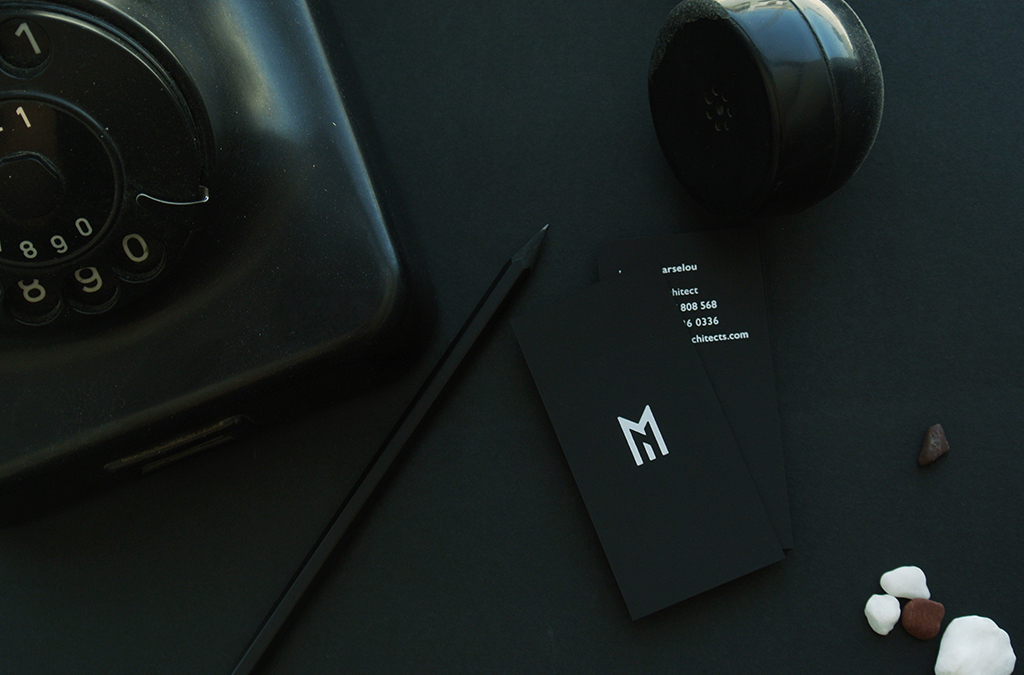
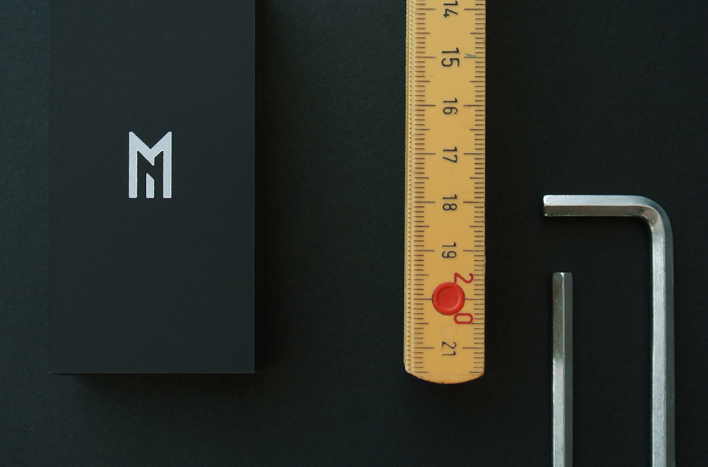
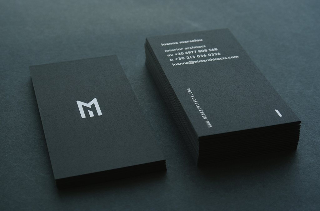
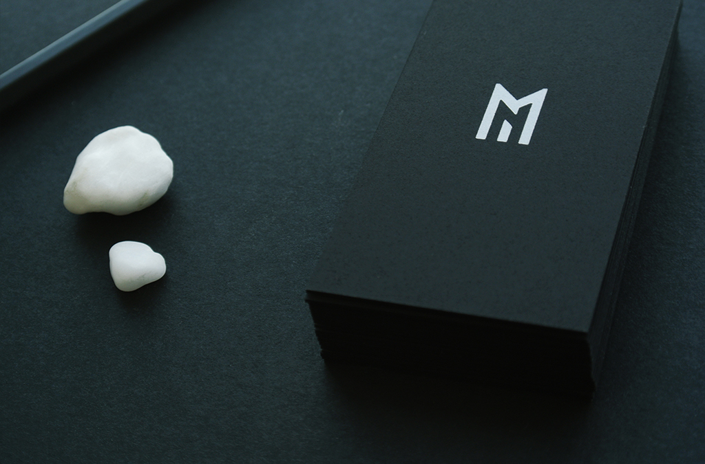
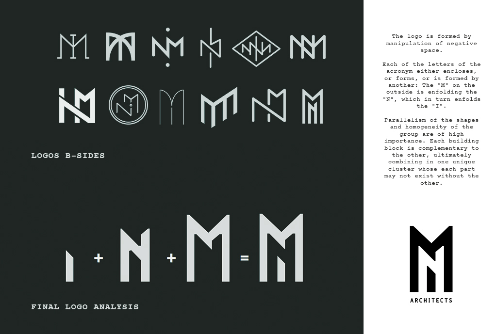
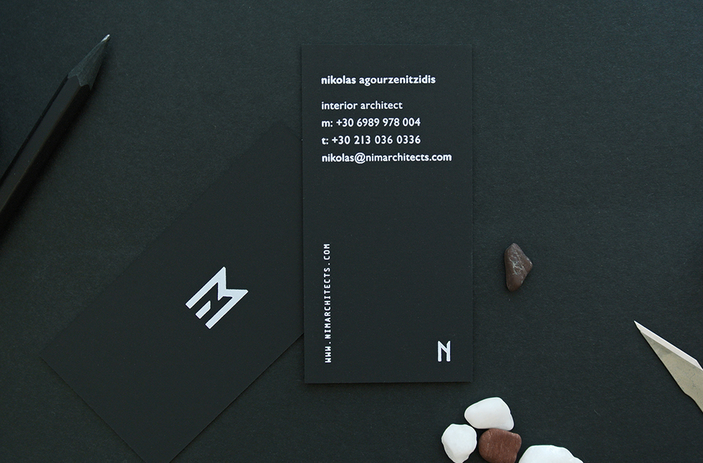
Having those things in mind, a new logo was designed, comprising three letters, one for each founding member of the NIM team. The logo works both as a cluster forming the NIM acronym, and as separate segments marking each of the three members' business card with a logo of his/her own.
__
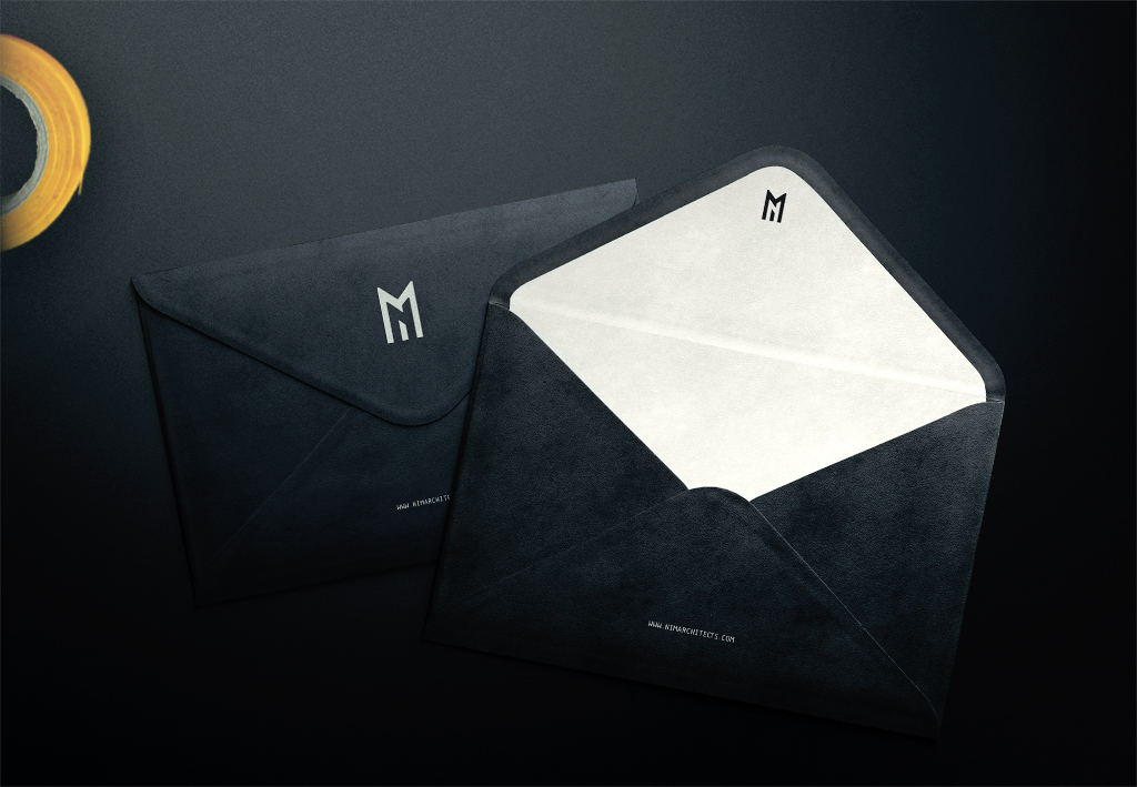
Black and white where chosen as the brand's main colours with a splash of yellow here and there. A clean sans serif font (Gill Sans) is heavily used, complimented by a monospace secondary font.


Client: NIM Architects
Production: TROUT
Creative direction : TROUT / George Kalofolias
Web Design: TROUT / George Mpaourdas / George Kalofolias
Creative direction : TROUT / George Kalofolias
Web Design: TROUT / George Mpaourdas / George Kalofolias
Thank you!

www.trout.gr