NATIONAL HAUORA COALITION - BRAND IDENTITY
National Hauora Coalition - NHC is an NGO and Primary Healthcare Organisation (PHO) that operates locally and in other rohe. They work with Iwi, district health boards, other governmental and non-governmental organisations, including health and social service providers and schools, and a range of professionals to support whānau.
The challenge was to create brand identity solution that reflects the coalition aspect along with the nature of service, with a flair of Maori culture. HAUORA in Maori means Health. The concept is based on ‘te whare tapa wha’ - the four cornerstones (or sides) of Maori health and the coalition with government.
With its strong foundations and four equal sides, the symbol illustrates the four dimensions of Maori well-being.
1. Taha Tinana (physical health)
2. Taha Wairua (spiritual health)
3. Taha Whanau (family health)
4. Taha Hinengaro (mental health).
Design Director and Designer: Rehan Saiyed, Storm Worldwide, New Zealand
Awards: The project has been awarded with Honorable Mention at 43rd Creativity International Awards, USA, under Brand Campaign category to Rehan Saiyed, Storm Worldwide
Web Development: Farhaan Mirza, Asfaahan Mirza - Mirza Bros, New Zealand


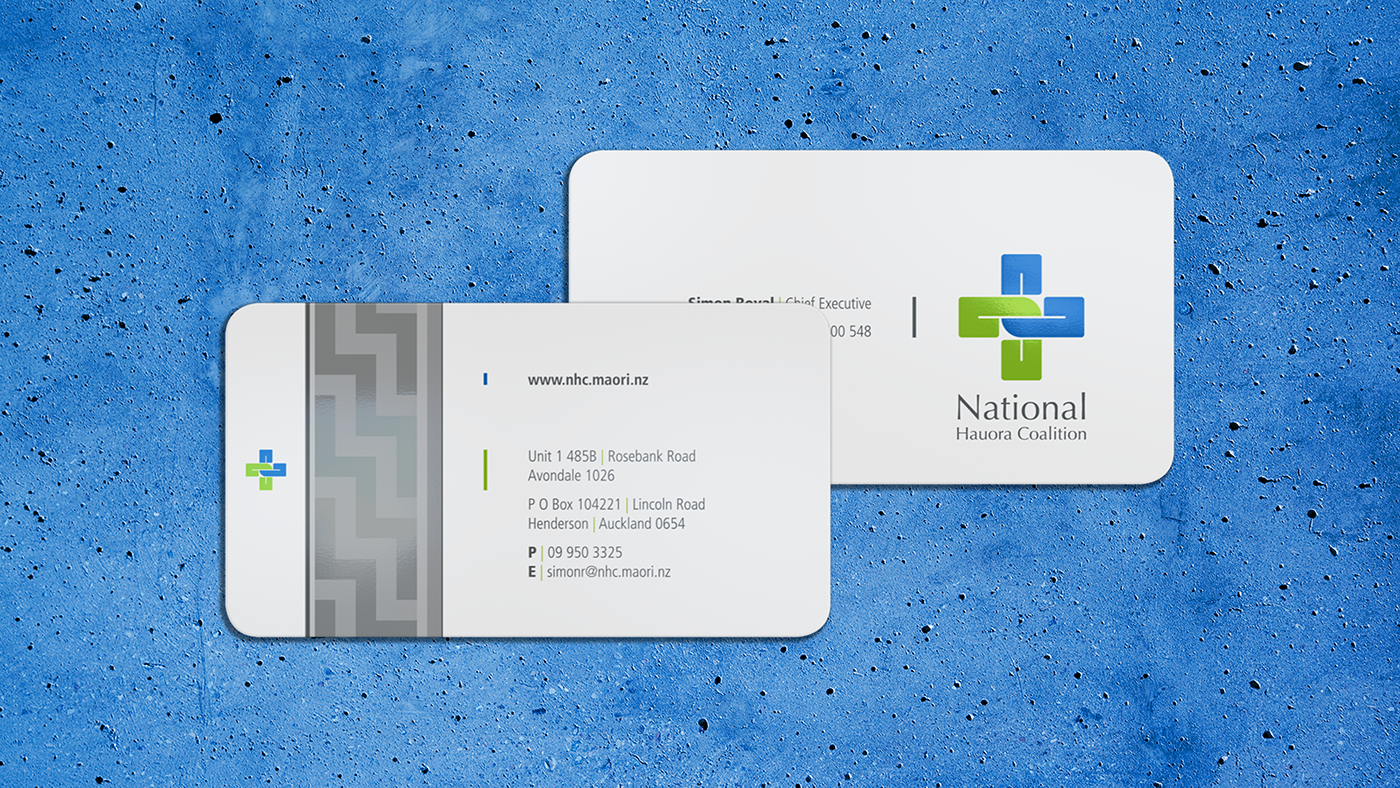
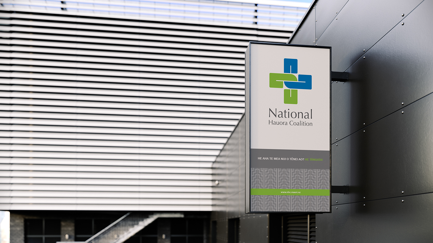
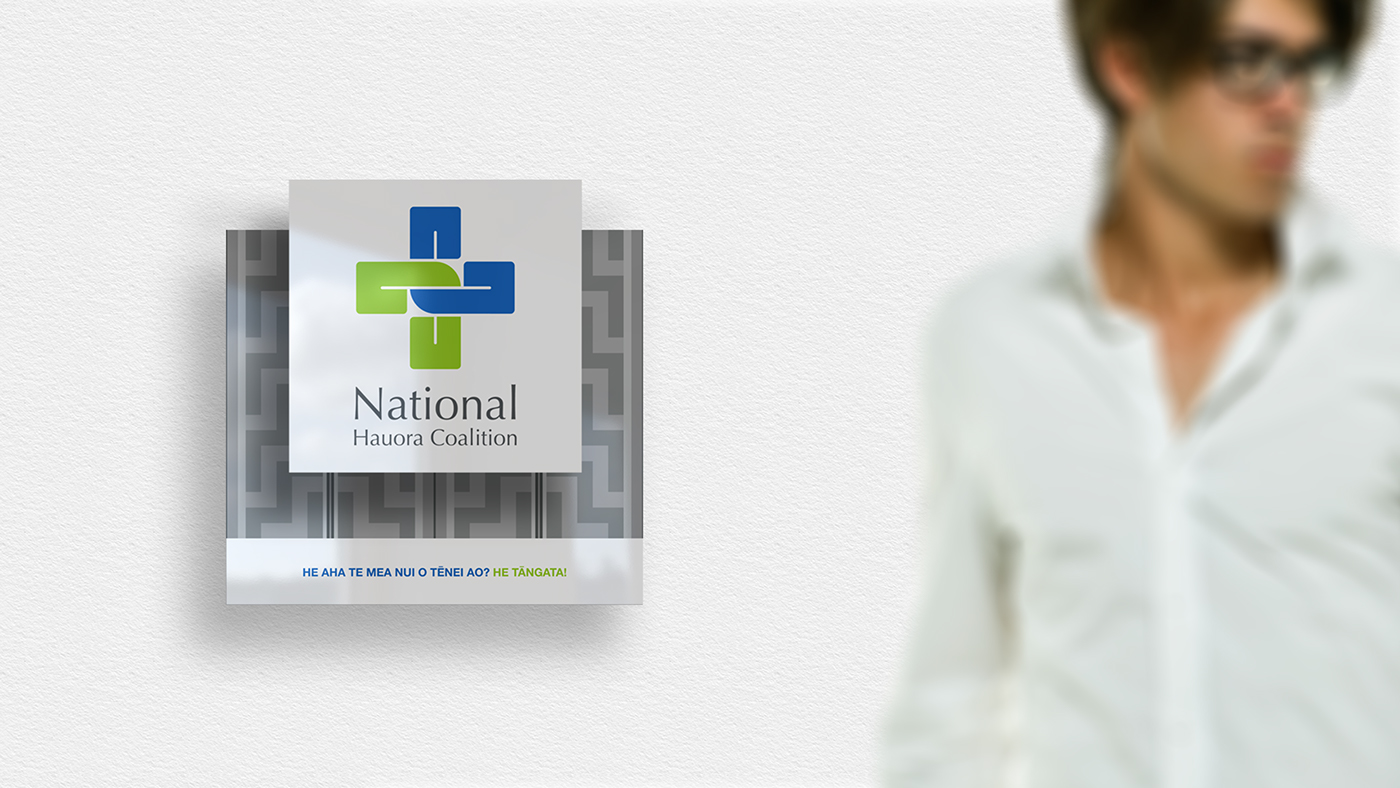
MAORI PATTERN
Vector Maori pattern was developed, to give flavor of Maori culture to the entire communication. The pattern represents mountains symbolically in Maori art and called Poutama Ahurewa.
Vector Maori pattern was developed, to give flavor of Maori culture to the entire communication. The pattern represents mountains symbolically in Maori art and called Poutama Ahurewa.