

Wonder Woman MOE Design
Wonder Woman main-on-end. Designed for Greenhaus GFX.
Continue on for additional insight into the concept and design process.


Behind-the-Design
Throughout 2016 and 2017, I had the privilege of designing and storyboarding the main-on-ends for WONDER WOMAN, a rare and creatively fulfilling experience. The following is a look at the process behind the design, its concept, and the influences that helped it come to be.
Over the years I’ve had a great rapport with Greenhaus GFX, collaborating with them on successful main title pitches for WORLD OF WARCRAFT and THE LAST SHIP. In the last quarter of 2016, I worked with Greenhaus GFX as creative director on the main title for XXX: THE RETURN OF XANDER CAGE. During this time, Greenhaus and I discovered a mutual interest to work on WONDER WOMAN. So, between work on other projects I started thinking about how best to engage that production. WONDER WOMAN was not looking for a title sequence just yet but I knew that if I could whip something up, Greenhaus GFX would be able to get it in front of them.


SPEC BOARD FOR A WONDER WOMAN TITLE SEQUENCE. DESIGNED BY JEREMY W. AT GREENHAUS GFX IN 2016.
I began with looking at the identities of the DC and MARVEL cinematic universes. The superheroes of the MARVEL cinematic universe are usually human beings augmented by some external force to become more than human. Iron Man has a mechanical suit, Captain America is a super-soldier, and so on. The DC cinematic universe has a running theme of superheroes as Gods, usually at odds with mankind.
The power of DC’s characters tend to be elemental, much like Gods of mythology. For WONDER WOMAN, images of sand as a metaphor for time came to mind. I also saw the influence of post World War I Art Deco in the detailing of the ‘W’ emblem and the Amazonian’s battle armor.

EXAMPLE OF ART DECO INFLUENCE. SOURCES OF WONDER WOMAN KEY ART UNKNOWN.
I distilled the spec board and the ideas behind it into a brief proposal. The focus was not about the particular design, but to establish a creative point of view with the film's production, and most importantly, open a dialogue with director Patty Jenkins.


ORIGINAL PROPOSAL. WRITTEN AND DESIGNED BY JEREMY W. AT GREENHAUS GFX IN 2016.
In 2017 Greenhaus GFX began officially pitching on the main-on-ends for WONDER WOMAN. I was invited back to the project as a freelance designer to continue working on and developing MOE concepts for WONDER WOMAN.
The film is told though Wonder Woman’s memory, following her journey from the shores of Themyscira to the world of mankind and into the Great War, where we learn what drives her to fight and protect humanity. Patty Jenkins shared her visual influences for the sequence, which included the lurid colorways of Gregory Crewdson’s photography and cinematography from Casablanca.

PHOTOGRAPH BY GREGORY CREWDSON. FILM STILLS FROM CASABLANCA. SOURCES UNKNOWN.
The work of Gregory Crewdson and the cinematography of Casablanca are atmospheric. They are metaphorical in their use of composition to convey emotion. I proceeded with taking the elemental aspect of my original spec board as an underlying visual motif, and began building upon it from Patty's influences. On the surface level, I looked to the photography of Gregory Crewdson for color. On a deeper level, Casablanca cinematographer Arthur Edeson’s usage of a softening gauze filter to convey sadness and nostalgia acted as an inspiration to use smoke as metaphor for distant and wistful memory.


"BEACON" DESIGNED BY JEREMY W. FOR GREENHAUS GFX IN 2017.
By paring down many of the elements into silhouettes or cutouts, the essence of the film’s emotional journey is seen through the lens of graphic design and not a literal retelling. Both style and economy are achieved without an over reliance on 3D modeling and rendering.
The smoke of chemical warfare used throughout the film symbolized death. In the design of the ‘Beacon’ boards, smoke became a bittersweet metaphor for Wonder Woman’s memory. The addition of silhouettes help pantomime how memories fade and change over time.
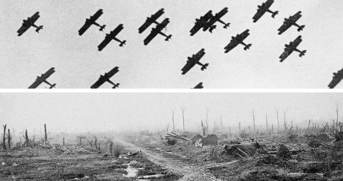
WORLD WAR 1 PHOTOGRAPHY. SOURCES UNKNOWN.
Ravaged landscapes, soldiers, and war machines are stripped of detail and woven into a dense fog. Wonder Woman becomes a ‘Beacon’ of hope as a bright light penetrating the fog, like a lighthouse bringing humanity in from a storm.
Once the decision was made to move forward with the ‘Beacon’ boards, I began with broadening the narrative beyond the war scenes to encompass more of Diana’s journey. The expanded boards begin with a fiery explosion from Wonder Woman's signature whip, revealing her Amazonian shield. Images of Themyscira and the “God Killer” radiate through the fog. The color palette shifts as Diana enters a new world fully enveloped by war. The lightning and arrows represent the power of the Gods and their ability to interfere with the course of humanity. The WONDER WOMAN emblem emerges out of the darkness, burning away the fog with fire.

FINAL MOE STORYBOARD FOR WONDER WOMAN DESIGNED BY JEREMY W. FOR GREENHAUS GFX IN 2017.
Inspiration also came from music. Knowing that Rupert Gregson-Williams was scoring WONDER WOMAN, I found myself listening to his work from THE CROWN. The cadence of Rupert’s score guided the design process. It helped set the tone and, in the abstract, gave me a sense of how to block out and pace the MOE as an entire sequence built around moments of amplitude and restraint.
The boards were created and painted in Photoshop using additional 3D elements from Cinema 4D and manipulated photography and key art supplied by the film’s production. Models for the shield, the God Killer, Steve's watch, airplanes, arrows, and the 'W' emblem were provided by Greenhaus GFX.
As with all large scale creative endeavors, changes were made throughout production to add levity to an otherwise bittersweet and sombre sequence. Diana and Steve's romance gave way to additional scenes in Themyscira and a montage of footage was incorporated as lead in to the title reveal.
For more information and insight into the production of the main-on-ends for WONDER WOMAN, check out ART OF THE TITLE for an interview with director Patty Jenkins and Greenhaus GFX.


