

Giving a fresh breath to a powerful tennis brand by clarifying the approach on branding elements
Before the lift : A brand ecosystem with unclear expression
BNP Paribas ecosystem was full of exceptions. Every single initiative is rich and creative. At some point, the BNP Paribas Group needed to get closer to it's tennis brand We Are Tennis.
We used the website project to get a refresh on brand approach including We Are Tennis logotype, codes and global identity.
We used the website project to get a refresh on brand approach including We Are Tennis logotype, codes and global identity.
We started an amazing journey full of tennis, emotion and challenges.

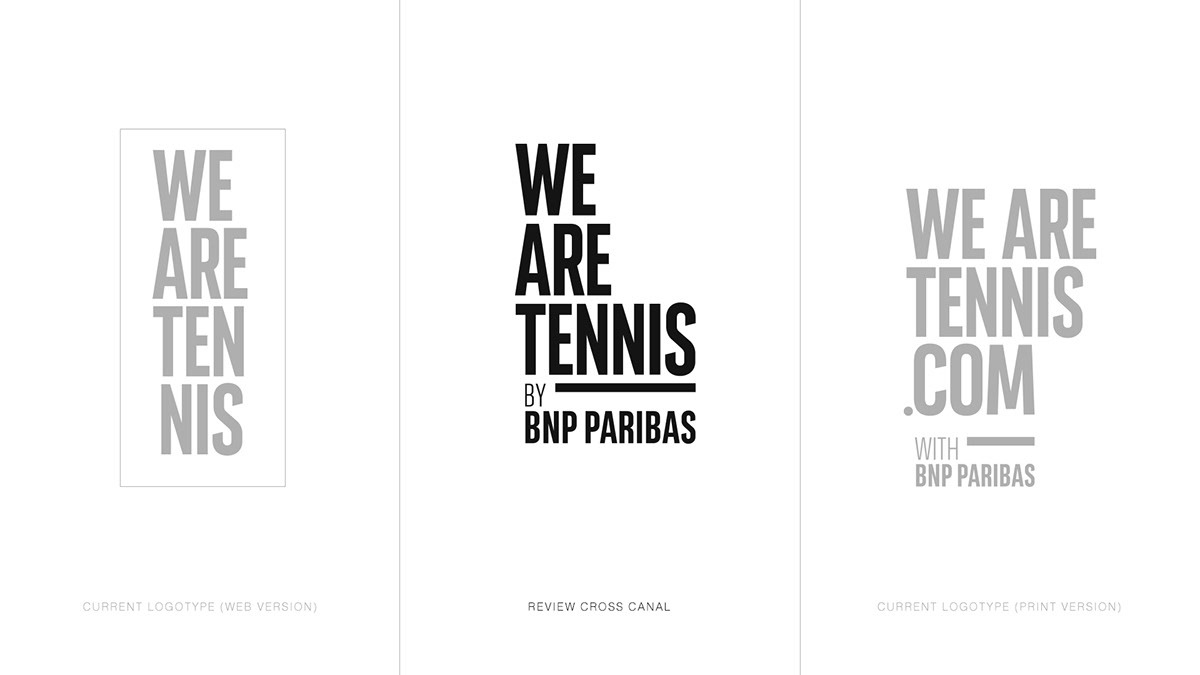
Fact : One name, one brand, so many ways to use branding elements
When we started our bench on We Are Tennis identity, we found so many differents logotypes that we became crazy, surprised and amazed.
"How to get back to a single expression ?" Was my new obsession.


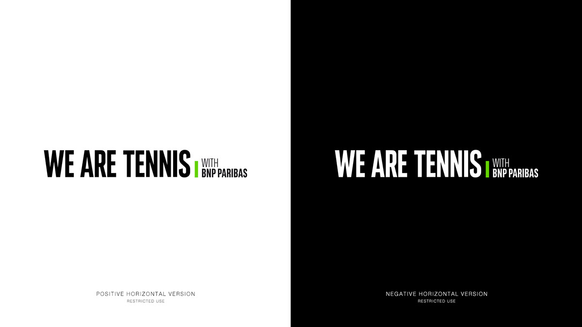
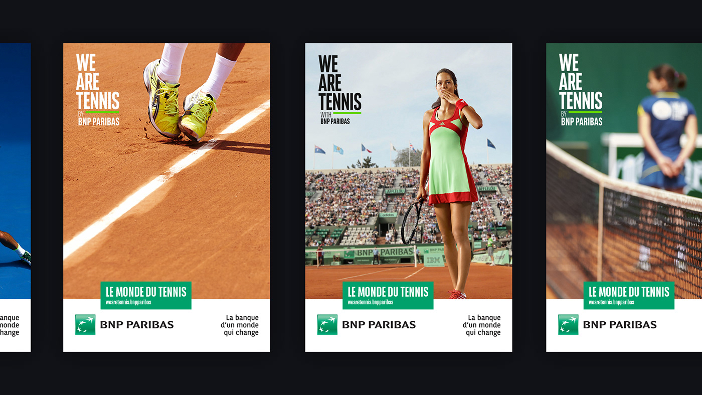
Identity review : it's a lift, not a revolution.
The brand is pretty well known world wide. My main focus was to clarify the logotype expression's.
I choose a mere and obvious approach :
The brand is pretty well known world wide. My main focus was to clarify the logotype expression's.
I choose a mere and obvious approach :
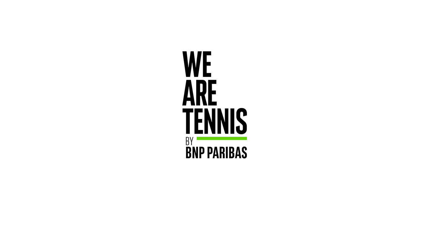
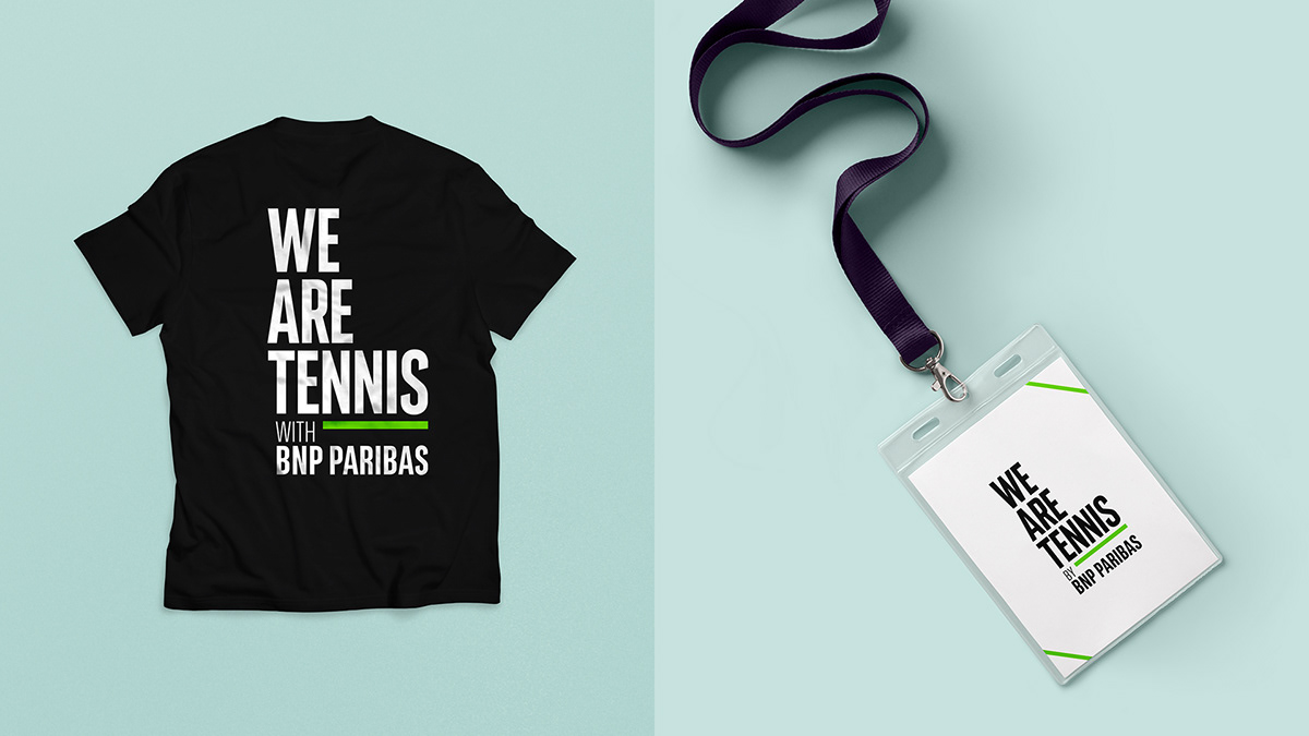
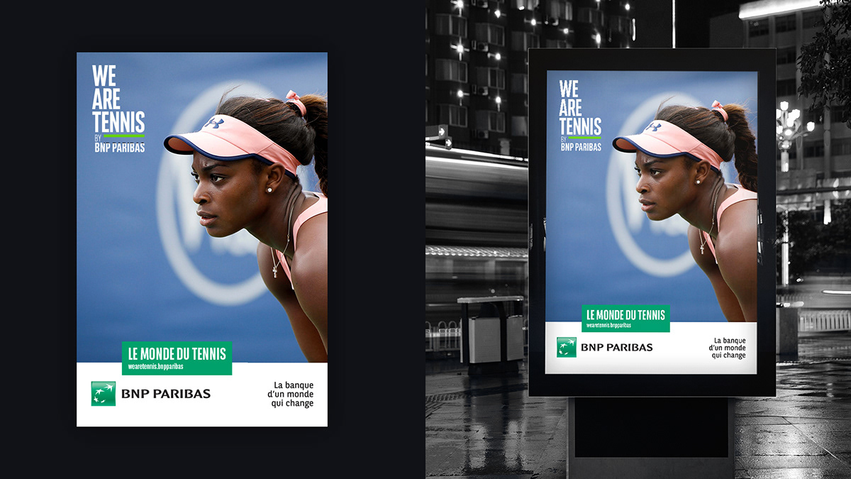
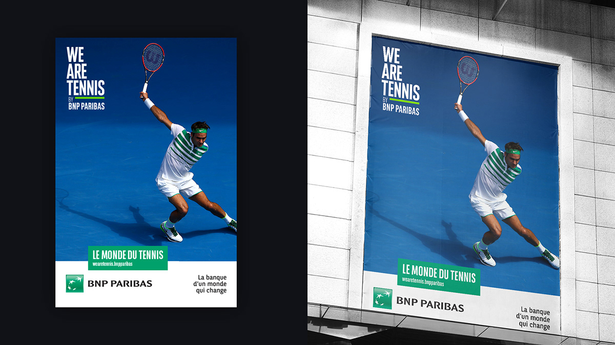
1. Keep the very unusual verticality of logotype cause it was a brand's signature
2. Include a strong and readable expression of relation with BNP Paribas
2. Include a strong and readable expression of relation with BNP Paribas
3. Link the two brands using tennis court signage
4. Define a new iconic color for the brand, a distinctive green keep the fluo DNA of current identity


ART DIRECTION & BRAND DESIGN
AGENCY : LONSDALE, PARIS
CLIENT : WE ARE TENNIS BY BNP PARIBAS
2017
AGENCY : LONSDALE, PARIS
CLIENT : WE ARE TENNIS BY BNP PARIBAS
2017


