


Building a bridge between tennis, fans and a brand
Wearetennis.bnpparibas redesign was an amazing challenge.
I had chance to challenge the user experience, art direction, content strategy and several other identity items.We worked closely with We Are Tennis team to give life to a very ambitious fan program based on gamification and authentic ambassador participation.
Following case study is a backstage view of the online work.
Conception & workshops
We did have lot of informations about our mains users. I organized datas, I gave name to these personas and worked even harder on user flow based on the story they help us to build. More than user journeys, we work on customers journey including relationship people could actually have during tennis practice.
The wireframing sessions were a very enthusiastic part of the project. It was the very best way to have a full vision of website potential. Nothing was more usefull than "loosing time" in wireframe process.This preparation work give a us a clear understanding of user flows. According to client schedule, we decided to keep features in mind for v.1, v.2 and v.3.


Research
Here is few identity and graphic research for Avantage, the tennis engagement program of BNP Paribas.


Gamification
Avantage included a gamification program based on fan engagement.
The more the user play, the more chance he will get to have free tickets for big competition or other goodies.


Ui guidelines
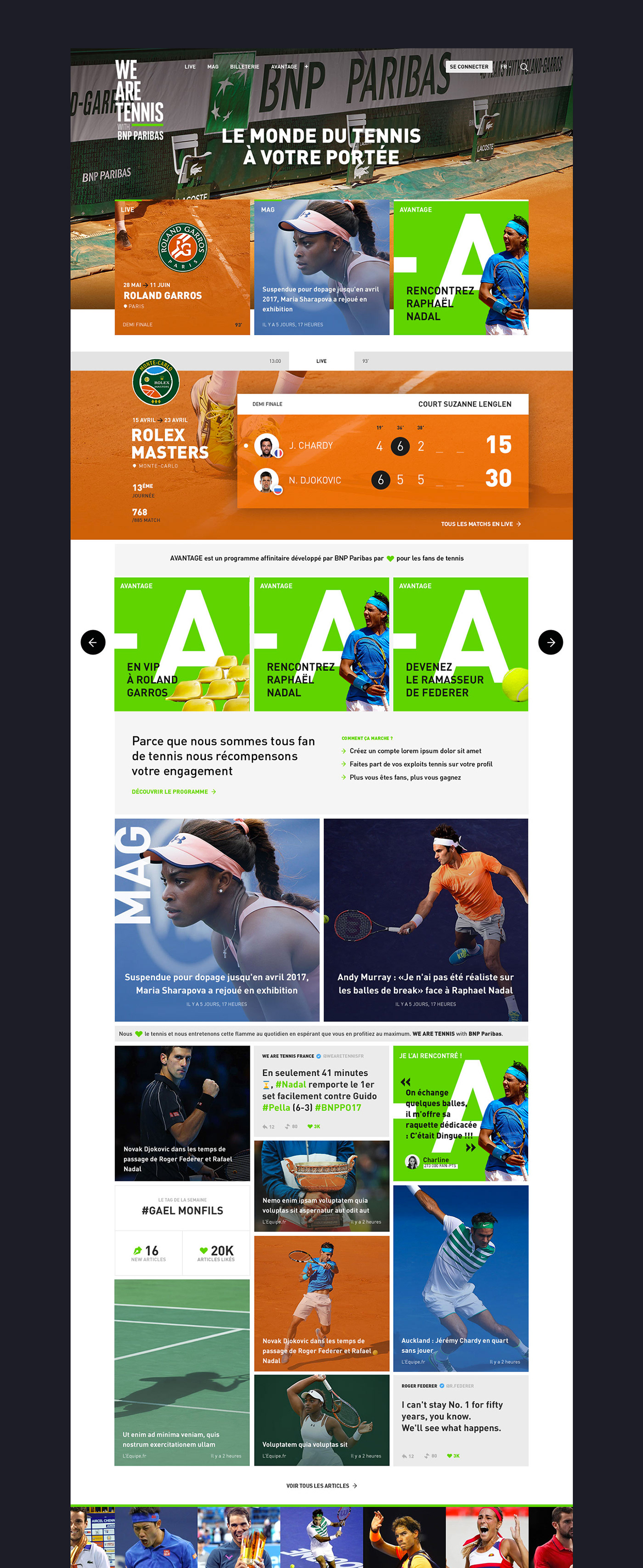
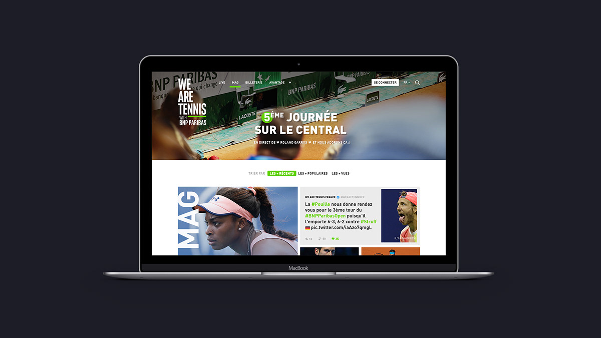
Tennis is a very intense and wonderful playground for photographers. We knew tennis fans were attracted to good quality picture too.
I decided to give as much space as possible to tennis picture. I selected an iconography following an immersive statement "Closer to tennis than ever before".
User interface colors was reduce to minimum : few grey, black, white and the identity green I defined while working on brand elements. My main concerns were to give space to increase general quality of content and to include the new Avantage program as a distinctive object. Using ❤ symbol became a strong language signature in every single page.
User interface colors was reduce to minimum : few grey, black, white and the identity green I defined while working on brand elements. My main concerns were to give space to increase general quality of content and to include the new Avantage program as a distinctive object. Using ❤ symbol became a strong language signature in every single page.

tennis season
Tennis is one of the most complete sport : world competition barely stop a month every year. It means that your fan's agenda is never empty. Keeping this fact in mind, I had the feeling that our interface should be able to change and evolve regarding to the time of the year. I decided to design blocs in regard of tennis court used during the competition : a very simple rule to thematizing an entire website.


Buy your tennis ticket
We designed buying ticket flow as a mobile first experiment


ART DIRECTION , CONCEPTION & UI DESIGN
AGENCY : LONSDALE, PARIS
CLIENT : WE ARE TENNIS BY BNP PARIBAS
2017
AGENCY : LONSDALE, PARIS
CLIENT : WE ARE TENNIS BY BNP PARIBAS
2017
You should probably check :


