O V A B R A N D
While we aspire to revolutionize menstrual care in Vietnam through our innovative products, we also believe in the power of our enterprise to improve people's lives in other ways. We consider it our business to spread awareness about sexual and reproductive health, and therefore pledge to dedicate a portion of our profits towards efforts to inform and educate as many Vietnamese women as we can.
D E S I G N I N S P I R A T I O N
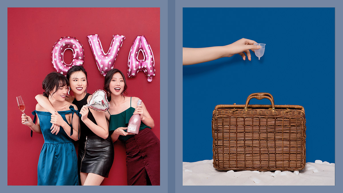
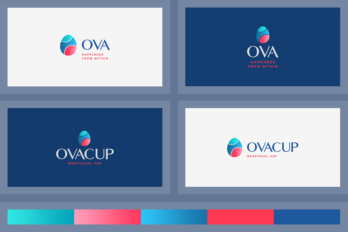
Based on product characteristics and nature of female, logo symbol was designed on the shape of egg with three light pantone: Turquoise, blue and pinky go along with elegant font types.
F R E E O F H A R M F U L C H E M I C A L
OVACUP is made 100% medical-grade silicone that fit snugly in your body while keeping harmful chemical out of it.

C L E A N - C O M F O R T A B L E - C O O L
We believe that all women should have a happy and healthy period experience. That is why we do everything we can to ensure our products are certified, registered and manufactured with women’s health and comfort in mind.
T E A R D R O P T I P
OVACUP innovative tear drop tip-shaped solid tip makes for fuss-free removal and effortless cleaning.

D Y E - F R E E - S I L I C O N E
OVACUP contains no colors or dye to keep you safe from inside, yet feeling bright and colorful from the outside.