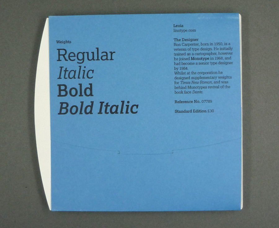
First project I completed for the Craft and Technology strand at UCA Farnham's Graphic Communication degree course. The brief was to create a desirable promotion for a typeface, in my case Lexia.
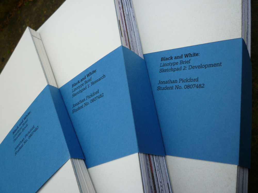
I produced a series of three books charting the progress of the project. Two of the books were the raw, unrefined version of my process; one for research, one for development. The third book edited down the content of the other two, giving a streamlined narrative of the project.
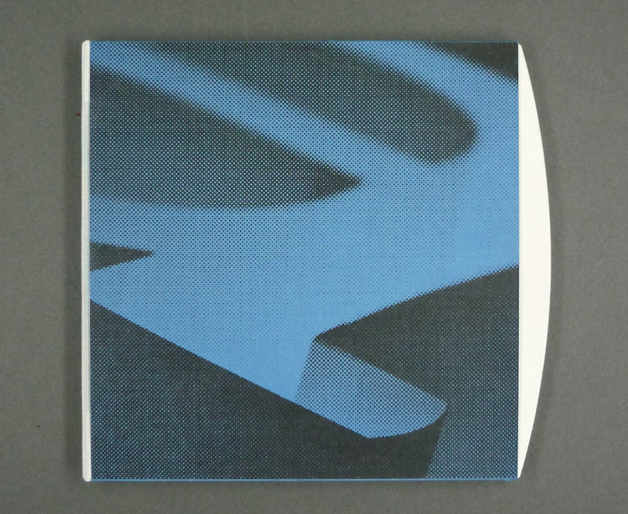
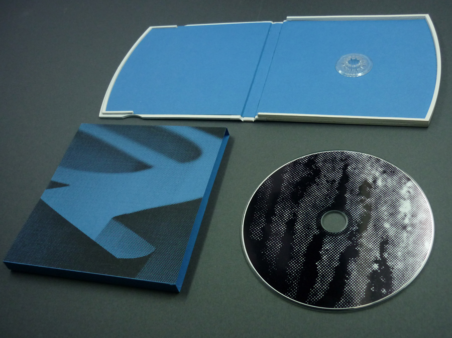
The subtle curve on the right hand side of the case is made from Lexia's serif, which I identified as the font's most unique feature. When the belly band is removed and case opened out, you are actually looking at the hyphen from Lexia's bold weight; a bit of a geeky touch, but one I took great pleasure in.