A brief introduction for the projects you're about to see.
For most of these projects, I have had the privilege of designing identities from scratch - including the name, concept and visual representation. I have also used imagery to convey the moods better and illustrate what the brands represent.
To me, brand design need not be limited to a logo or a name. There is a great deal that can be done with visual storytelling. You will notice that all the projects have very different 'voices' that create an immersive brand projection. Hopefully this also showcases the diversity of the work that I've done so far.
I hope you enjoy this showcase, and I would definitely love to hear your thoughts in the comments.

There are an estimated 1 Billion Trillion stars in the observable universe, and the number of planets is incomprehensibly large. But in this practically endless cosmos, there is only ONE Earth.
It is our only home, and so our only hope, and our only mission to save it.
ONEarth is a brand that hopes to shape a worldwide culture of zero-waste product design.


On the surface ONEarth designs and promotes products that are made from 100% sustainable materials sourced ethically without sacrificing the function or cost. But at it's core, it is a culture of conscious consumption and sustainable design.


Their products are available worldwide and range from bamboo accessories to pure copper drinkware.


// I am not like you.
// I am from the streets.
// an OLD faraway town
// I have fire in me
// I am a GUN for all you know.
// bold
// fearless
// violent even
// i'm peachblood b***h

// They just want you to buy more
// I want to show you how to love
// Lasting love
// I say f***k them and join me instead
// Come on let's play

// I'm never shy
// I am my favorite color
// Lol if you don't like me
// Lol if you do
// Mirror mirror on the wall
// F***K YOU

// F***K captions under every pic


//I have worked my hands
//The cracks and scars
//are mine
//Made with lust
//Lust for my craft
//and for you <3


//F***k all this doubt and dogma
//and f***k that capitalist with hidden agendas
//Come play with me instead
//I'm just a shoemaker
//And I'll make you
//The last pair you'll buy

In developing economies like India, getting a loan can be a major hassle. Multiply that with the population density and language barriers of tier 2 and tier 3 cities, and you have a nightmare.
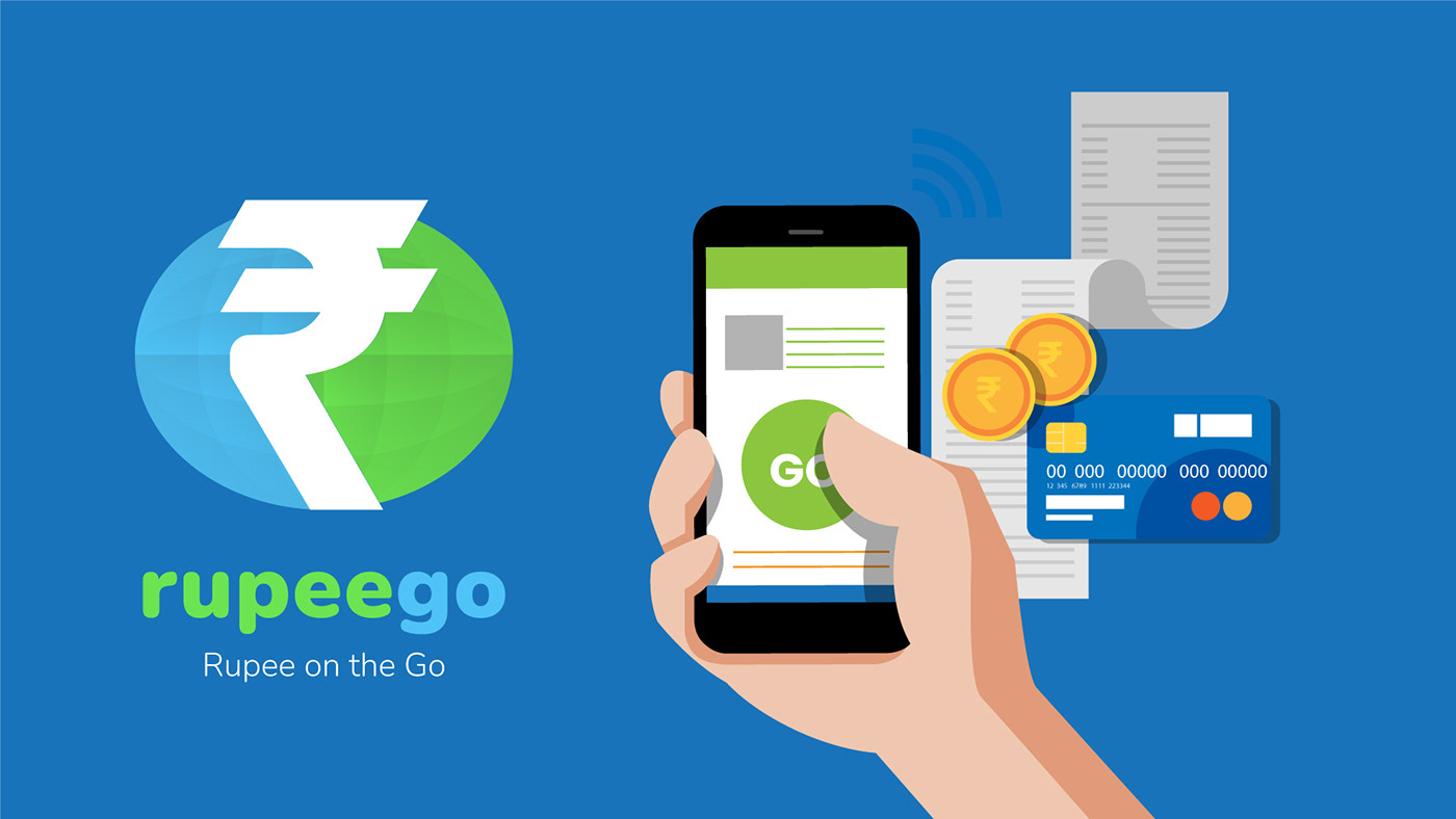
This is where 'rupeego' comes to save the day. With a mission to use the latest technological advancements to empower the lending economy for the Indian market.

A simple and friendly design with a great emphasis on visuals, to create an easy to understand and joyful experience while also creating a blazingly fast service around it.

Creating marketing campaigns using trending vernacular topics in Hinglish (Hindi+English) language to create something that makes the lending process seem all the more light-hearted and accessible in contrast to the more severe and daunting approach by other players.

Simple and to the point messaging that creates a strong visual impact to really address the pain-points with lending in the most direct way imaginable.

Creating a visual identity that is based on simple vector illustrations (which have extremely fast loading times as compared to photos) that can be easily used on website and mobile apps which is 80% of their service.

'Teekha' is a hindi word which refers to the heat you feel when eating chilies. In the Indian context, it also means spicy.
Teekha is the idea of two Indians living in California and regularly missing the 'Teekha' in the Indian food they get locally as compared to what they eat when in India - which is their favorite and most important aspect of 'Desi' or Indian cuisine.


The branding is just as 'Teekha' with the hot colors and bold, text based visuals often paired with fire elements to make their customers understand what to expect (or send a warning to the weak-hearted ones!)


