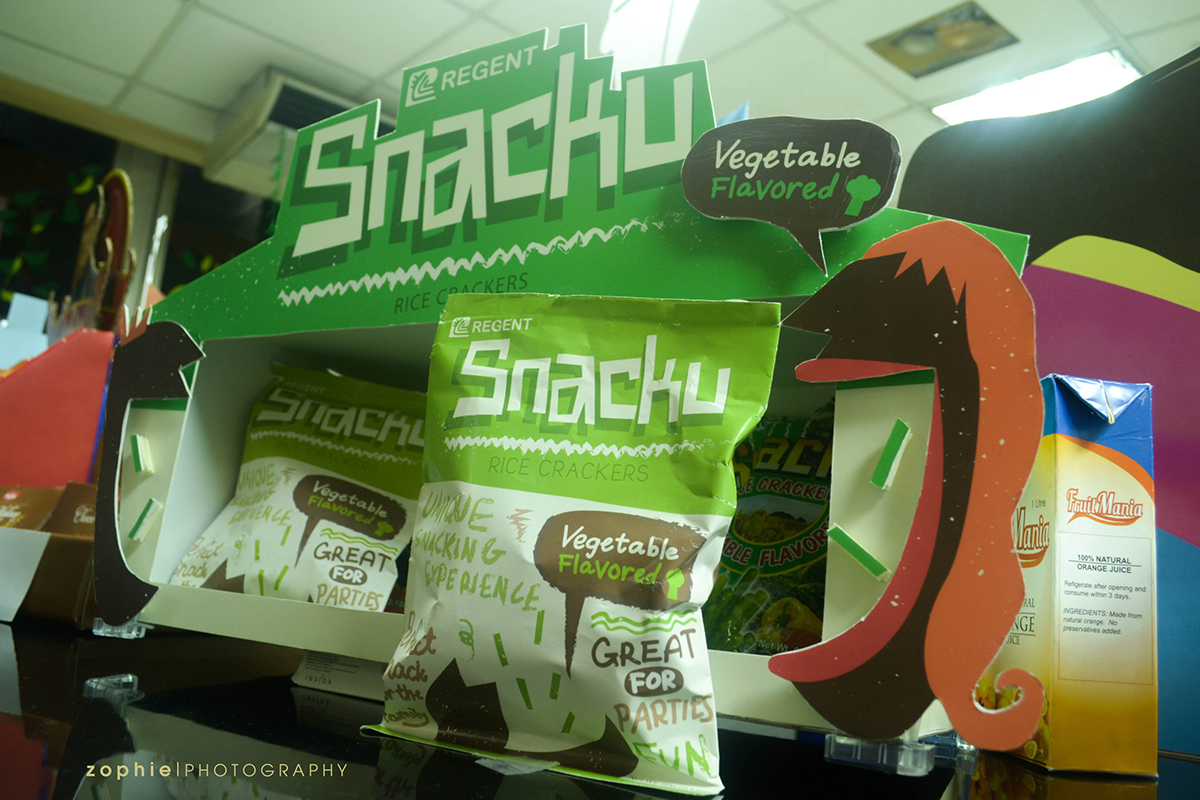
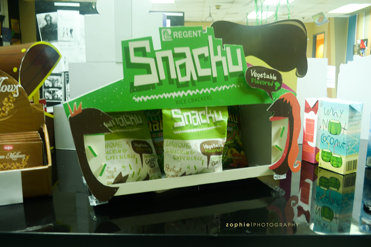
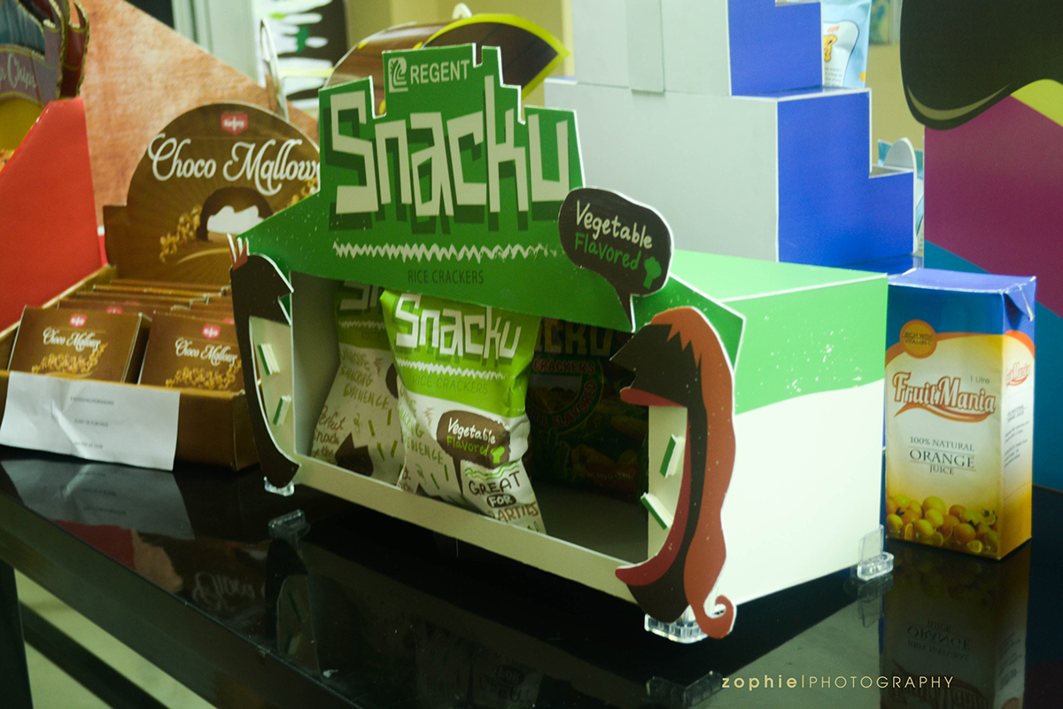
For this project, we were tasked to rebrand a local Philippine brand to make it more appealing to an international market. After which, we were then tasked to design and assemble a working, durable counter display.
We decided on Snacku rice crackers as our product and we were aiming for it to have a health snack appearance- one that could be displayed in high-end health stores, such as Healthy Options. For the colors, we decided to stick to earth tones, with green as our main color as it represents the Snacku brand as a whole.
Here's how our work was divided:
Kaela: Rebrand/Design of the Snacku Package and Counter Display, Assembling of the Counter Display
Roszene: Measurements, In-Charge of the Cutting/Assembling of the Snacku Package and Counter Display
Photos by: Roszene
This is the final result of our Counter Display. It was one of the works chosen for our college's Foundation Week exhibit.

Thanks for viewing!


