

Harrowgate
Logo Design Creative Process
Logo Design Creative Process
Hey creative friends, let's enter in a new journey of showing you my creative process creating a logo for this company. I know I'm not the best writing in English, but my aim here is to try sharing all my thoughts on the process as natural as I can, so here go some background info of my client:
Harrowgate is a start-up focused on human resource management and associated technologies for high-performance teams.
Harrowgate is a start-up focused on human resource management and associated technologies for high-performance teams.
Their target market exists primarily within the special forces community and other government agencies.
Harrowgate are designing the management systems and software that support the development of exceptional individuals, forming cohesive high-performance teams and supporting their associated leaders with making impactful decisions.

Considering the goal and the company background, here are my initial concept explorations for the Harrowgate logo (above you can see a whole board of sketches and below each group organized by "theme" or direction):


A - The eagle of course is a desired symbol in this case, I tried here to convey the eagle head profile plus the gate's bars.
B - Still aiming an eagle plus the gate's bar, this time I was looking for a more full-body eagly with the overall shape of a shield.
C - Client ask me to explore also another animals, so the lion came to mind or course, some of the options already have the H and the shield shape included.
D - The ideia of a compass paired with the bird of prey also seems a good option to me, specially when overlaped as a sun or just rays coming from it's center.
E - I feel like there would be interesting to have a more aggressive representation of the eagle/bird, as if it's on attack mode or grabbing the prey; also not missing the gate embeded on the wings.
F - The classic representation of rampant horses back to back also is desired, so I tried my best here to make it in a more modern style, still complex thought.
G - Here I think the special feature is to include the opening of the gate as a subtle H and make easier to recognize the eagle profile.
H - I've tested the crown as well on top of the horses as a symbol of power also aiming the gate style for it's spikes, maybe too complex to be honest.
I - I know this one isn't really a successfull take, but worth the explanation that I tried to put together a frontal eagle face that also looks like the full-body eagle flying. My mistake here possibly is to try including too much ideas at the same time, but for some reason I like this abstraction.
J - This is kind of a remix o the last direction, trying to make is cleaner and exploring different overall shapes.
We decide to go with those three options above :)

At this concept I tried to put together a frontal eagle face that also looks like the full-body eagle flying. My mistake here possibly is to try including too much ideas at the same time, but for some reason I like this abstraction portraiting the eagle in attack position and also kind of reminding it's face leaning toward.
I think this still need some simplification, maybe less bars and feathers to name few possible refinements. I really like the achieved circular overall shape being so dynamic!
I think this still need some simplification, maybe less bars and feathers to name few possible refinements. I really like the achieved circular overall shape being so dynamic!

Interesting that this direction ended up serving as a start point to two different concepts (kind of similar, I know), in this case a overal shield make it more sober and convey more respect to heraldic tradition, and I think this is good. Also make the H bolder and ironically it looks modern due the use of a "sans serif" type on the capital letter.
Overall idea keeps the same goal as the previous one: to put together a frontal eagle face that also looks like the full-body eagle flying and the portraiting of the eagle in attack position and also kind of reminding it's face leaning toward.
I think this still need some minor refinements, maybe to balance best each bars and feathers to have a similar weight and maybe reduce a couple of feathers as well. The overal shape of the shield also could be differente, maybe elliptical or something...
I think this still need some minor refinements, maybe to balance best each bars and feathers to have a similar weight and maybe reduce a couple of feathers as well. The overal shape of the shield also could be differente, maybe elliptical or something...

I think this version was special due it's unique combination of ideas, here I could portrait the eagle in a 'not so evil' attack position, yet a profile position that shows his very recognizable beak shape, plus it's talons and wings suggesting the gate. Still managed to put the H details on it, what is a spot on!
I still feel that there's too many lines over this symbol, this is surely something to give a special attention further. Of course the balance is also an issue, and specially the talons are given me a headache to solve visually, you'll see how I've solved this in the next post of this project in details :)
I still feel that there's too many lines over this symbol, this is surely something to give a special attention further. Of course the balance is also an issue, and specially the talons are given me a headache to solve visually, you'll see how I've solved this in the next post of this project in details :)


Above you can see the refined version of the selected sketches, as I said before the talons of the third one was a concern, so I've made some visual solutions exploring all ways I could imagine to represent it:
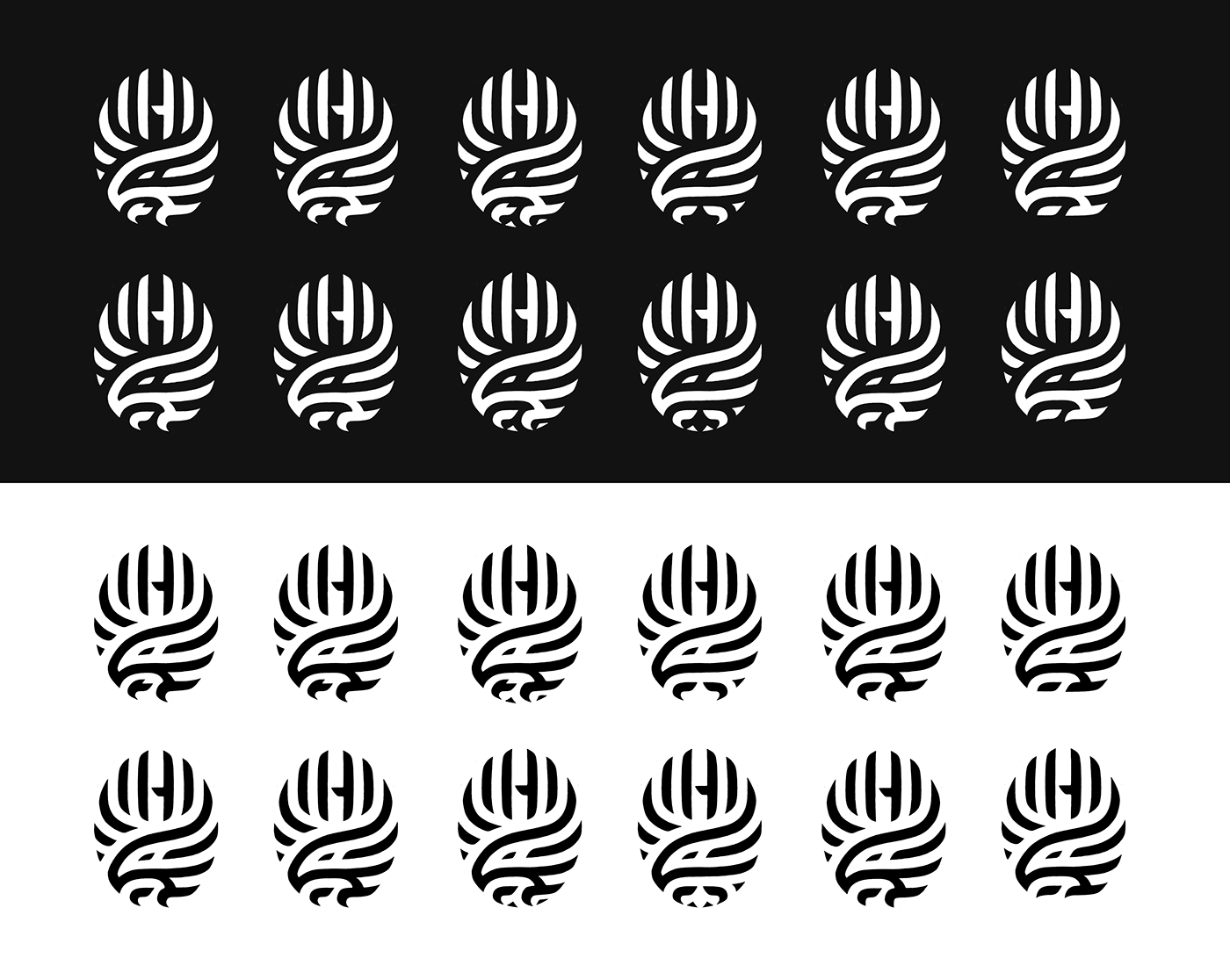

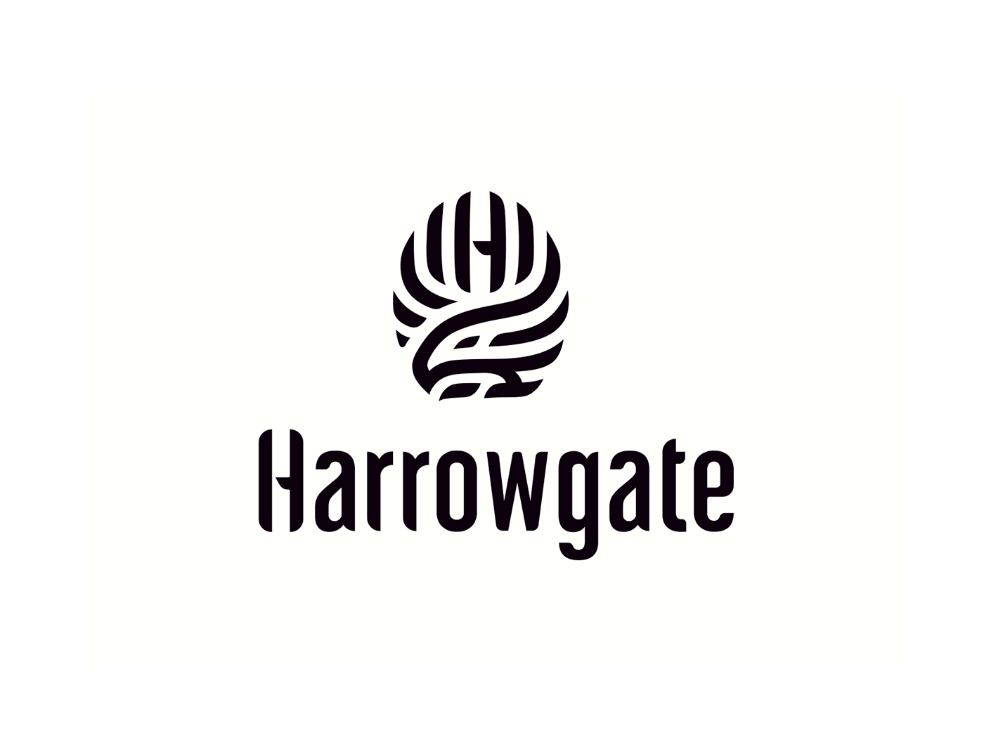
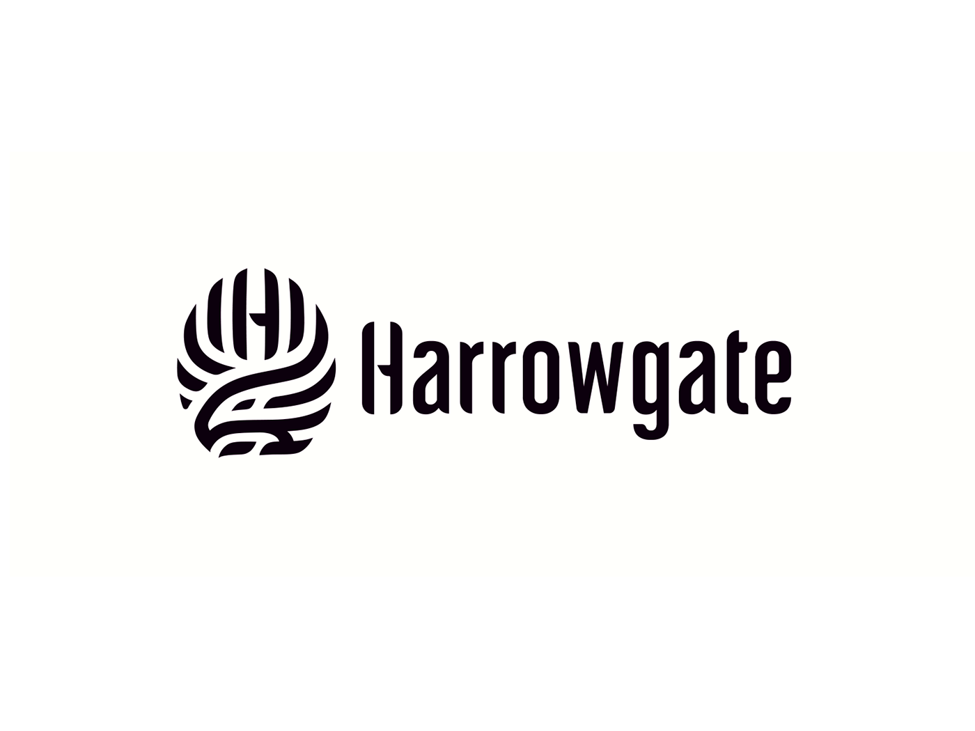
Really hard to choose a winner at this point, after some discussion with the client and considering our goal, we decided on this solution below, which is also the final version of the symbol


Unfortunately I couldn't record much about the typography creation, so I just have this final version to show. This is a custom type made to match with the symbol style, and of course the H present in the symbol. I've used a very simple type as base to develop this one, I hope you like it!

And that's all! I cannot share yet the guidelines since is still in the final refinements stage, but I think this part of the creative process is really more interesting to share than the brandbook (that's kind of boring to be honest, and nothing really different than many other works you can see here ar Behance)
I hope you enjoyed this ride as I do sharing it with you :)
Also I'm available for new projects, so feel free for ask me!
I hope you enjoyed this ride as I do sharing it with you :)
Also I'm available for new projects, so feel free for ask me!
Need a logo, illustration or other crazy stuff? Email me now :)
Follow & Connect!
/bitencourt or /allopoietic over any networks!


