
I've been working on an unique R solution as a symbol for a Logotype and want to share you more about how is my creative process, I hope you like it!

We all love the simplicity and clean look of the final Symbol of a Logo, but very often this final product take a lot of effort and a very dirty and complex process (at least to me), so here we go!

Here we can see all the main ideas side by side:
(my favorite part, the appreciation)

This is very helpfull to get a better idea of each one standout and you can also understand best why it pops up more thent he others.

This is a matter of taste as well, of course. But this stage plays an important role when you're searching for the best solution to reach your goal!

Some are clearly in the wrong direction, some seems a bit trivial and mundane, some not really readable... and some of them really grabbed my attention.
Those will be hopefully the ones I'll give more refinements and the final vector format!


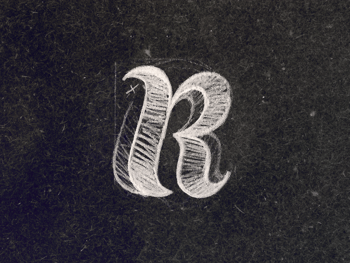
Above you can check all details of the evolution on each Symbol idea, some of them ended up a bit similar, but it's all about the process!
We keep evolving from step by step and iterations, I've added some suggestions on adjustments of the shape and also some possibilities on styling.

This is the full board where all these ideas came from, I like to keep them altogether so I can manage to organize my files easily in a physical folder.
I hope you'd appreciated this quick tour on my Sketching process!
Also I'm available for new projects, so feel free for ask me!
Need a logo, illustration or other crazy stuff? Email me now :)
Follow & Connect!
/bitencourt or /allopoietic over any networks!


