

Welcome to HDA Real Estate, a prominent Egyptian company specializing in the acquisition, development, and sale of premium commercial and residential properties. Our commitment to excellence is reflected in our brand's core values of transparency and professionalism.
About HDA:
At HDA, we distinguish ourselves by maintaining an exceptional level of transparency and professionalism in all our dealings. Our core focus revolves around providing comprehensive real estate solutions, addressing our clients' unique needs, and offering practical guidance in their property selection process.
At HDA, we distinguish ourselves by maintaining an exceptional level of transparency and professionalism in all our dealings. Our core focus revolves around providing comprehensive real estate solutions, addressing our clients' unique needs, and offering practical guidance in their property selection process.
With a dedicated emphasis on meticulous site selection, we pride ourselves on identifying optimal commercial and residential locations in emerging cities. This ensures that our clients receive prime real estate options, aligning with their investment goals and lifestyle preferences.

Project Objectives:
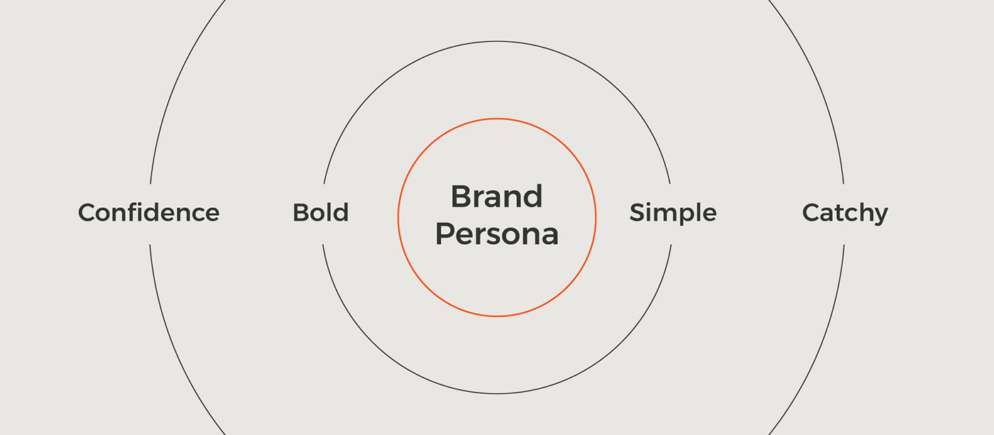
1. Evaluate the fundamental traits that define the brand, create a distinct personality, and translate these characteristics into aesthetic elements.
1. Evaluate the fundamental traits that define the brand, create a distinct personality, and translate these characteristics into aesthetic elements.
2. Develop a unified visual language that allows for easier identification, recognition, and public connection through emotive memory, emphasizing differentiation from competitors.
3. Update the brand's old design/visual identity, which was traditional, to be simpler, more memorable, and visually appealing to the audience.
Creative Solutions:
1. Visually portray an informational source based on the brand's unique information.
1. Visually portray an informational source based on the brand's unique information.
2. Translate the brand's personality traits into visual shapes to create a connection between the brand and its clients.
3. Emphasize the idea of the agency name itself and use it as the core concept for building the symbol and other brand assets.
Inspirational Imagery:
Photographs played an exceptionally vital role in crafting a fitting concept for the brand and highlighting its personality traits. The primary focus was on images related to real estate, buildings, and their components, with a personal touch reflecting the brand's values of confidence, simplicity, and more.
Photographs played an exceptionally vital role in crafting a fitting concept for the brand and highlighting its personality traits. The primary focus was on images related to real estate, buildings, and their components, with a personal touch reflecting the brand's values of confidence, simplicity, and more.

Logo Concept:
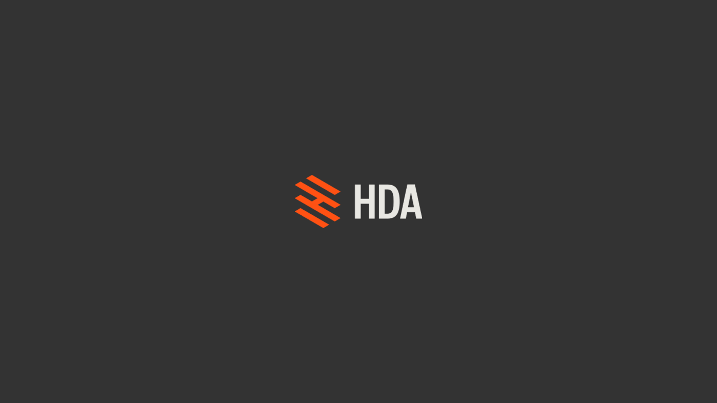
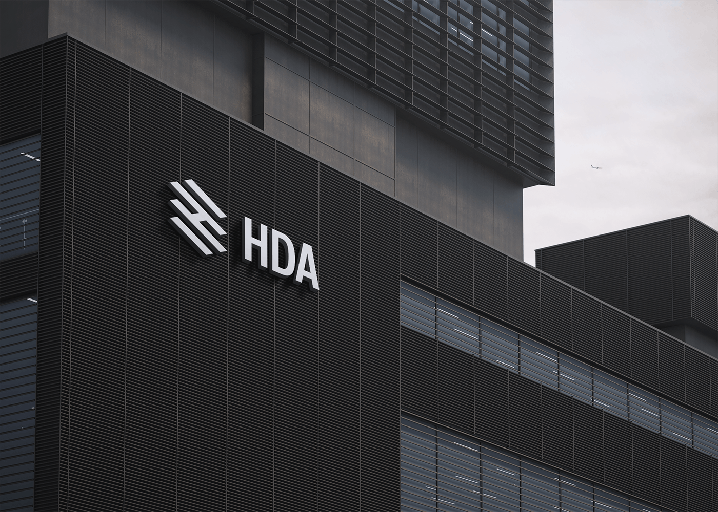
The conceptual process behind creating the logo initiated from the brand name itself. The first letter of the abbreviation, representing the company name "Haytham," was creatively incorporated. The letter 'H' is intricately shaped to resemble a small building composed of multiple layers. Additionally, it conveys the symbolism of a ladder and brick walls, all collectively representing real estate elements.
The conceptual process behind creating the logo initiated from the brand name itself. The first letter of the abbreviation, representing the company name "Haytham," was creatively incorporated. The letter 'H' is intricately shaped to resemble a small building composed of multiple layers. Additionally, it conveys the symbolism of a ladder and brick walls, all collectively representing real estate elements.

Logo Anatomy:
Our goal was very clear: to create the logo in the simplest way possible. We used a very simple grid and several rectangles to represent the logo.
Our goal was very clear: to create the logo in the simplest way possible. We used a very simple grid and several rectangles to represent the logo.


Logo Variations:
The logo was designed in multiple variations to ensure maximum versatility across various applications and spaces.
The logo was designed in multiple variations to ensure maximum versatility across various applications and spaces.
Typography:
A simple geometric font was used to align with the brand's personality and the logo's form. It is also a bilingual font designed for use in both Arabic and English applications.
A simple geometric font was used to align with the brand's personality and the logo's form. It is also a bilingual font designed for use in both Arabic and English applications.

Colors:
To convey maximum transparency, white and black colors were used to create the visual identity, along with a specific shade of orange to give distinction to the brand and attract viewers. Additionally, secondary colors were employed to contribute to the overall visual identity.
To convey maximum transparency, white and black colors were used to create the visual identity, along with a specific shade of orange to give distinction to the brand and attract viewers. Additionally, secondary colors were employed to contribute to the overall visual identity.


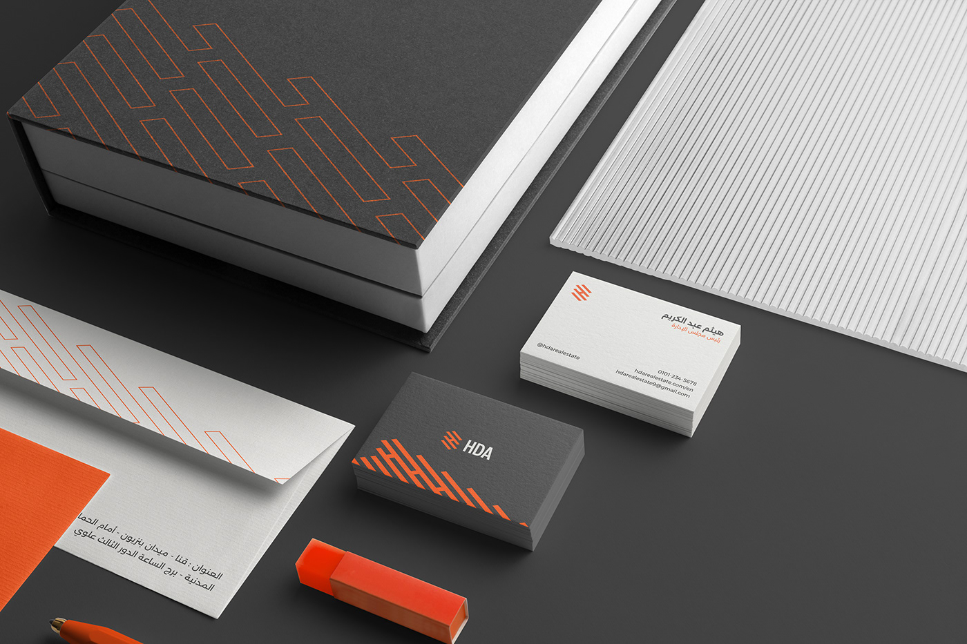
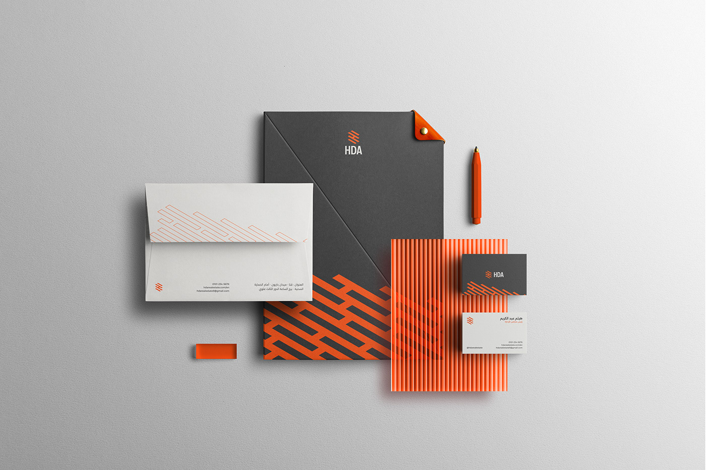
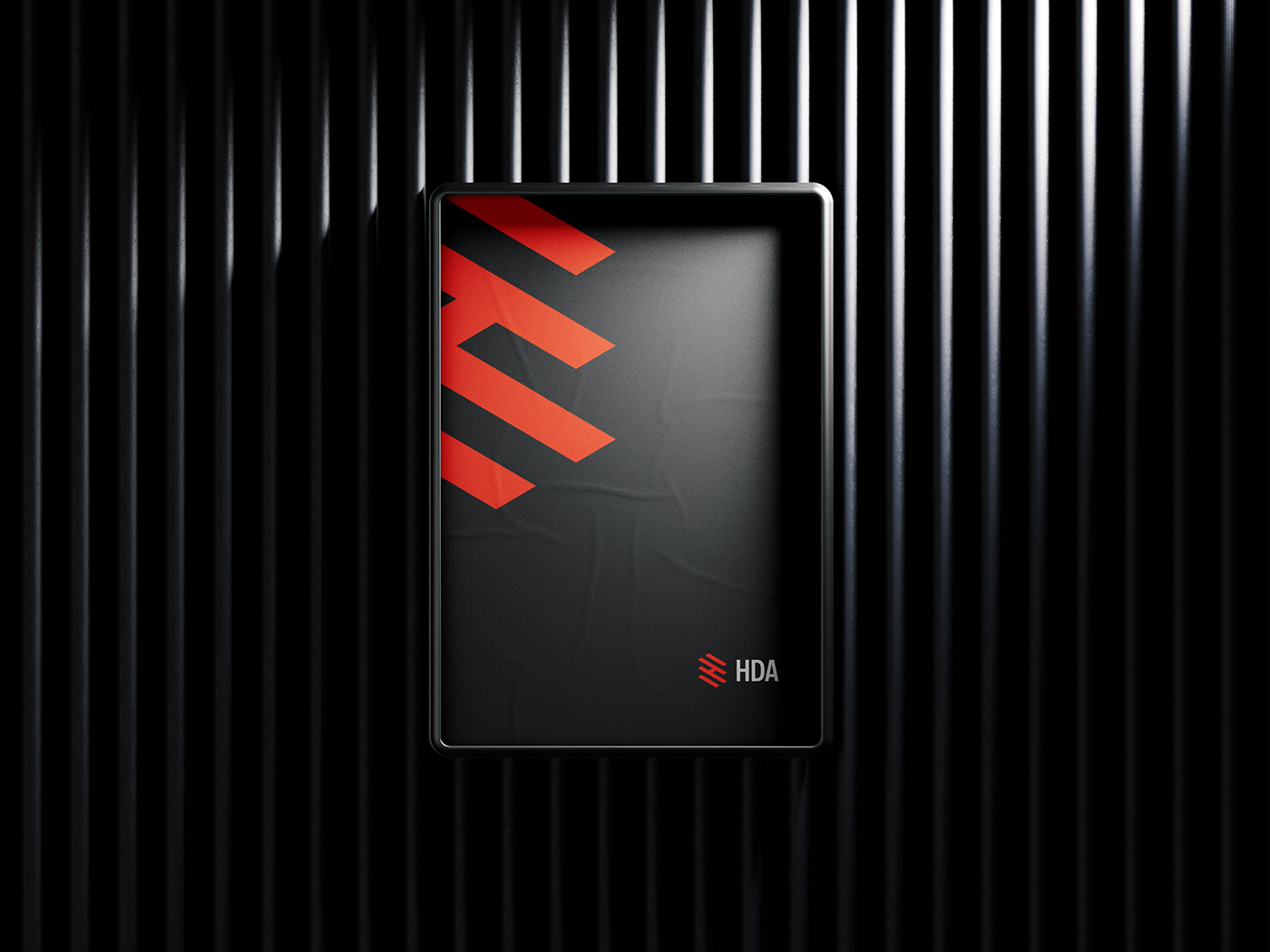
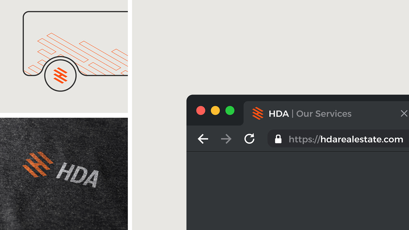
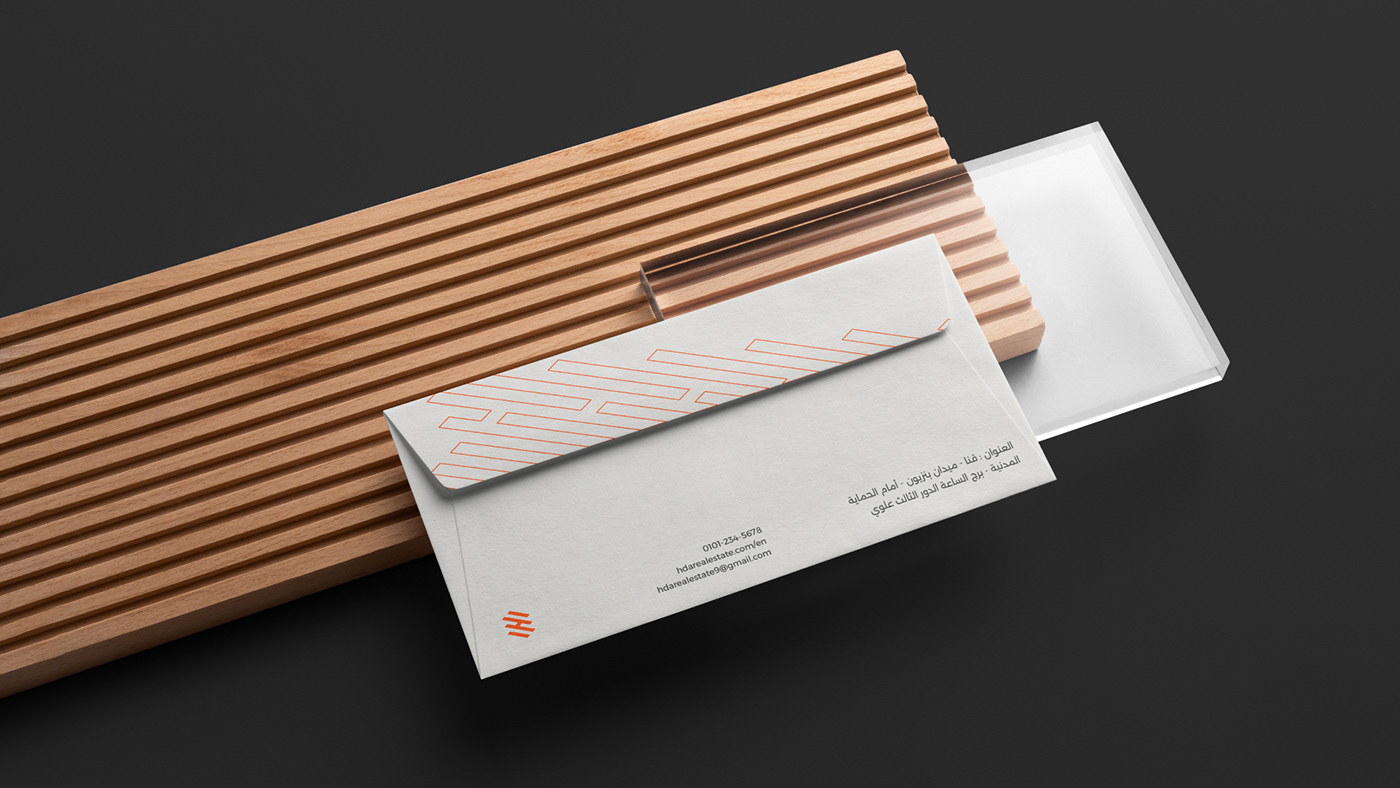
Brand Applications:
This is the rollout of the brand's new identity on all the brand assets, ranging from corporate materials like letterhead, business cards etc, to the banners, posters and all other marketing materials and other client’s touchpoints, A significant step towards allowing their clients to get to know the brand as an organization is making the brand communicate with its customers through a consistent brand voice and cohesive appearance.


"Your feedback matters! Share your thoughts and help shape the future of our projects."


