

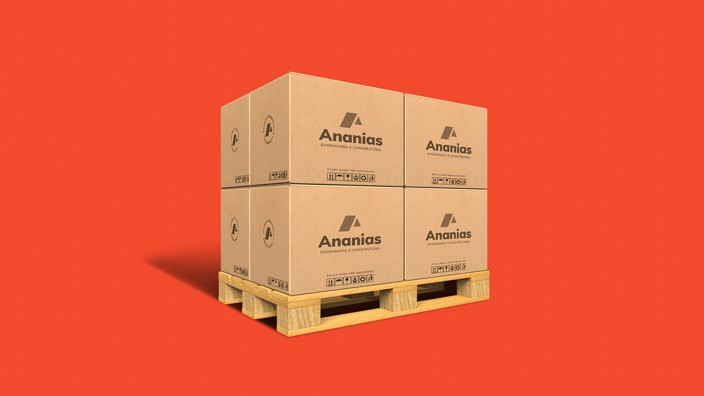
A Ananias, Engenharia e Construtora, já é uma empresa destaque no mercado de Projetos, Construção e Venda de Pré-moldados, e traz como maior missão, a seriedade, qualidade, agilidade nos serviços prestados e a realização de sonhos.
Com todo o crescimento da empresa, se fez necessário uma marca à altura, com um Redesign do Logotipo e a criação de uma Identidade Visual Profissional, gerando assim um maior impacto e relacionamento com o público-alvo e clientes.
Ananias Engineering is already a prominent company in the Pre-Molded Projects, Construction and Sale market, and brings as its greatest mission, seriousness, quality, agility in the services provided and the fulfillment of its customers' dreams.
With all the growth of the company, it was necessary to have a brand worthy, with a redesign of the logo and the creation of a professional visual identity, generating a greater impact and relationship with the target audience and customers.


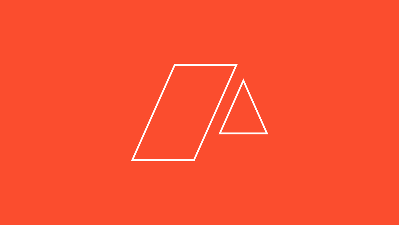
Símbolo / Symbol
O Logotipo atual traz o símbolo de um telhado, porém unido à tipografia, e um não funciona sem o outro, tirando assim toda a responsividade e escalabilidade do logo. O novo símbolo foi feito seguindo um conceito minimalista e simétrico,mantendo uma semelhança com o logotipo atual, porém mais moderno e 100% original, e não depende mais da tipografia para existir.
O novo símbolo pode ser aplicado em um outdoor de 10 metros ou em um ícone de Instagram, e mesmo assim, permanece visível e impactante. Um símbolo forte e moderno para uma empresa com as mesmas características.
O símbolo é a união de um telhado ou casa em perspectiva + Letra A minimalista e traz traços e simetria que gera semelhanças com peças pré-moldadas, como partes que se encaixam, uma vez que a empresa também atua com venda de pré-moldados.
The current logo bears the symbol of a roof, but united to the typography, and one does not work without the other, thus removing all the responsiveness and scalability of the logo.
The new symbol was made following a minimalist and symmetrical concept, maintaining a resemblance to the current logo, but more modern and 100% original, and no longer depends on typography to exist.
The new symbol can be applied to a 10-meter billboard or to an Instagram icon, yet it remains visible and striking.
A strong and modern symbol for a company with the same characteristics.The symbol is the union of a roof or house in perspective + minimalist Letter A and brings traces and symmetry that generates similarities with precast pieces, as fitting parts, since the company also operates with sale of precast pieces.


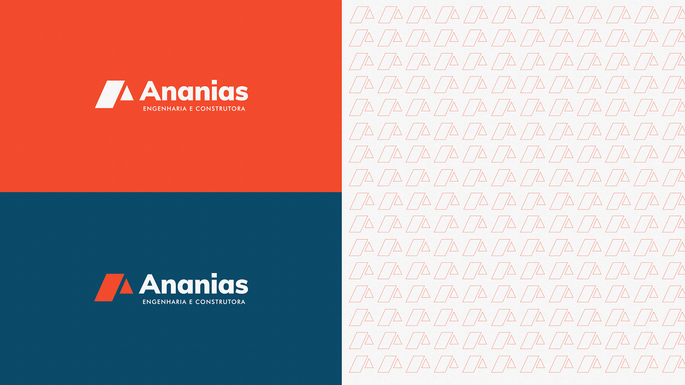
Tipografia | Typography
Com um símbolo totalmente simétrico, utilizando formas geométricas, a tipografia também segue o mesmo caminho, buscando total harmonia entre eles. A família tipográfica escolhida para toda a Identidade Visual foi a família “Muli”, uma fonte sem serifa, que traz um toque moderno, jovem e ao mesmo tempo corporativo para a marca, além de ser uma fonte incrível tanto para titulos, como para textos de parágrafo.
With a totally symmetrical symbol, using geometric shapes, the typography also follows the same path, seeking total harmony between them. The typographic family chosen for the entire Visual Identity was the “Muli” family, a sans serif font, which brings a modern, young and at the same time corporate touch to the brand, in addition to being an incredible font for both titles and texts paragraph.


Obrigado | Thank you
Orçamentos por email | Email quote
contato@pliniovitordesigner.com


