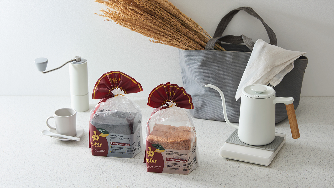
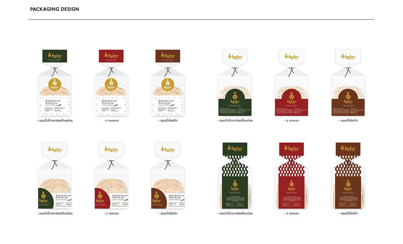
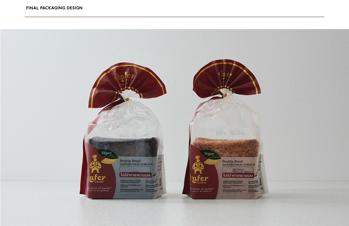
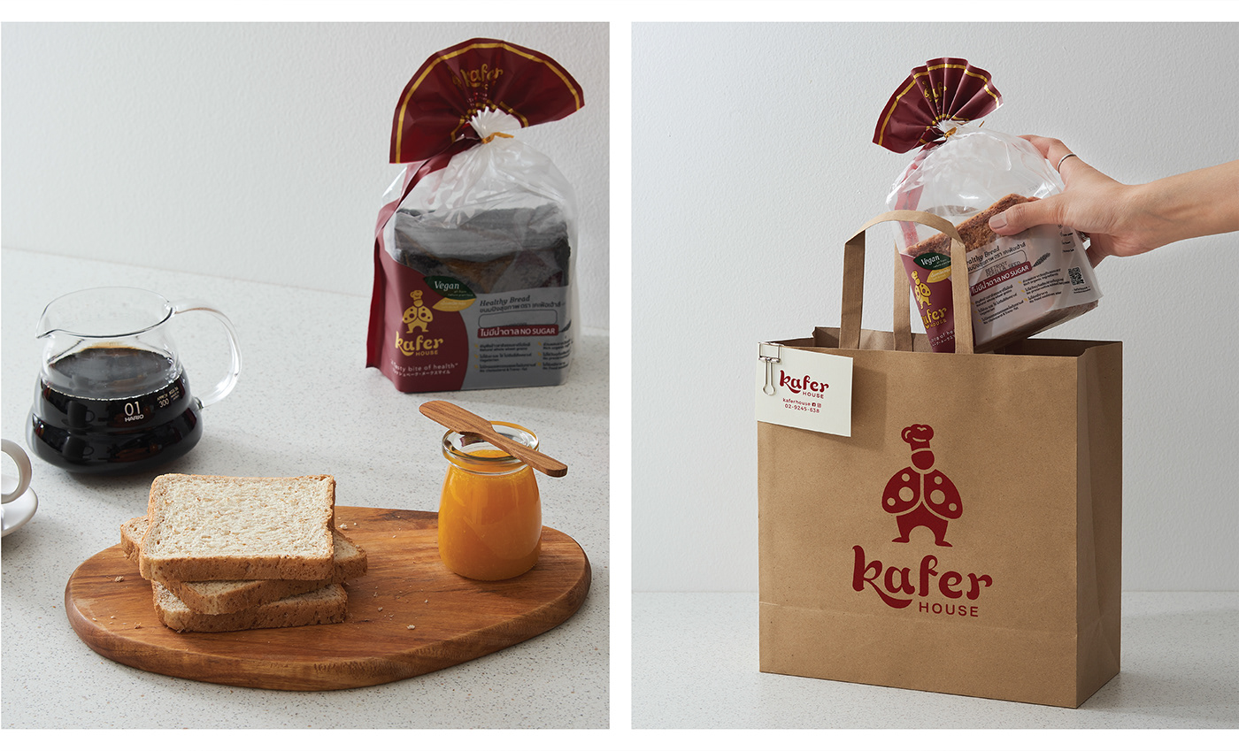
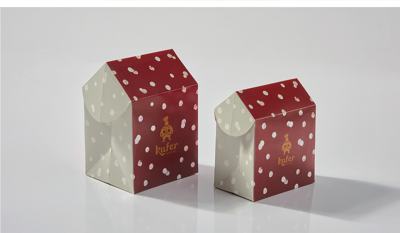
KAFER HOUSE (BREAD) / brand identity - packaging design
objectives:
Kefer House a brand of homemade bread, was born from the intention of providing a healthy option for family members to enjoy. There is nothing better than choosing quality ingredients for our loved one’s well-being. This gave rise to the brand 'Kefer.'
concept:
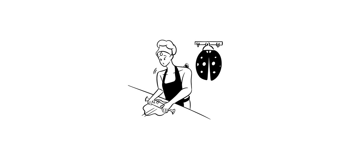
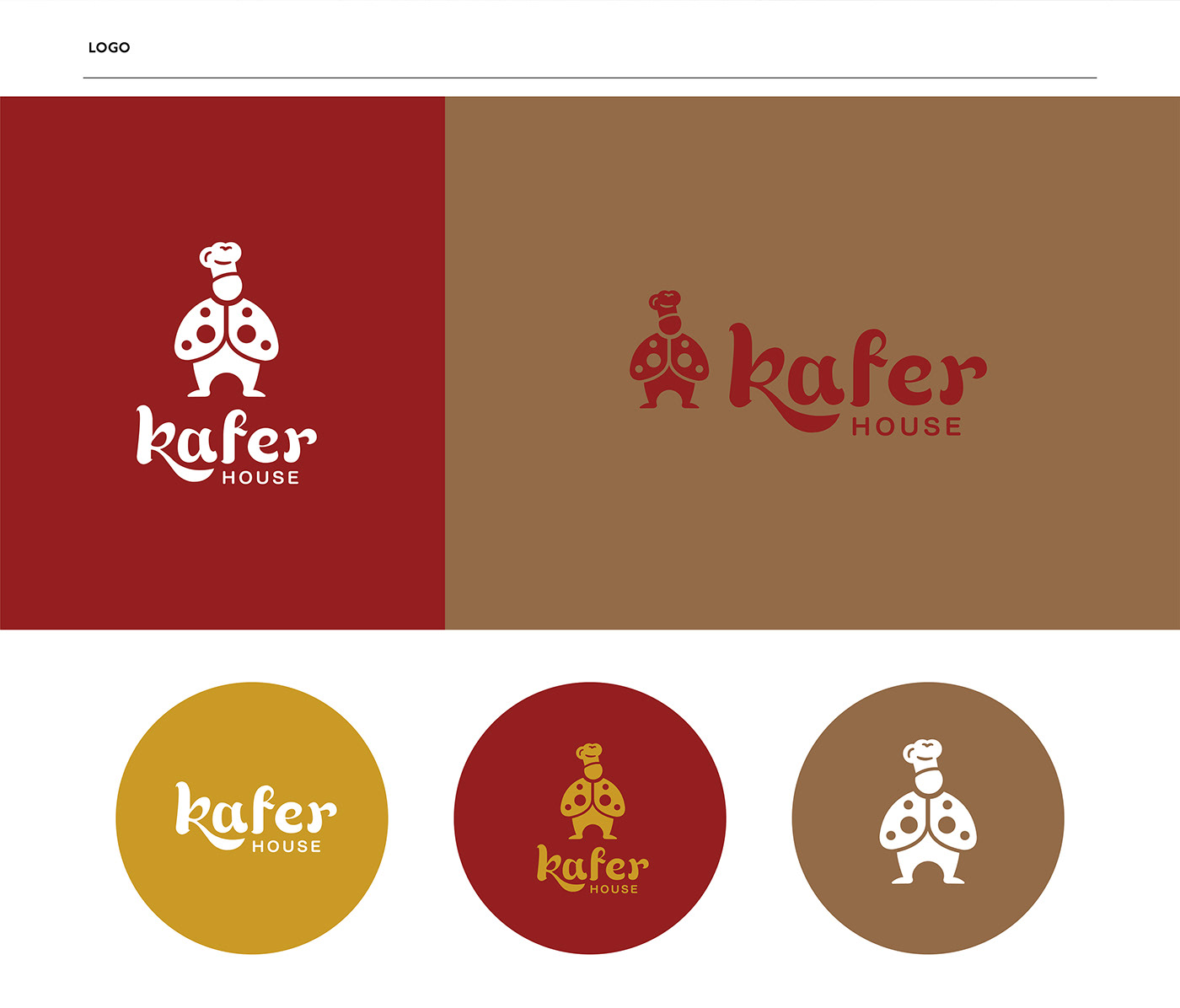
The brand utilizes the ladybug as its symbol because the nature of the ladybug inherently selects only the best. The logo portrays a chef dressed as a ladybug, combined with a natural-themed typeface resembling leaves. This reflects the brand's concept of prioritizing natural ingredients.


AGENCY :
Andon Design Daily Co.,Ltd.
CREDIT :
Design Director by Pongtorn Wachirapoka
Photographed by Parinya Kawsrito
VIA :
https://www.facebook.com/kaferhouse
https://www.instagram.com/kaferhouse/
Copyright © Andon Design Daily Co.,Ltd. All Rights Reserved.


